Later this week, Nintendo will be treating us to a very special Direct presentation focused on the new Super Mario Bros. Movie, where we'll be feasting our eager eyes on the debut trailer for the upcoming film.
We've already gotten a glimpse of what it will look like via a pretty hectic teaser poster, showcasing Mario himself standing in the midst of Mushroom Kingdom surrounding by a whole bunch of adorable Toads. If you've missed it, be sure to check out our feature on everything we've managed to spot!
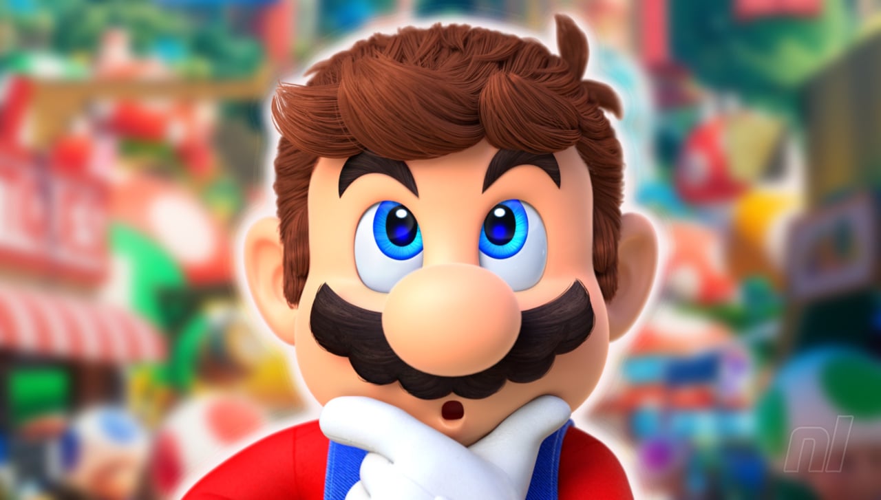
What we don't know, however, is what Mario's face will look like, but according to an image posted on Twitter, we may at least have an idea. At the time of writing, the original source for the image is unverified, so we're currently unable to confirm its authenticity. Keep that in mind while you're deeply entrenched in moustache analysis.
So there he is (possibly)! It certainly looks like Mario, but there's undoubtedly something a bit off about the image. Could it be the slightly more realistic arm proportions? Maybe the highly detailed moustache? And what's with that collar on Mario's shirt? It's certainly not as egregious as the original design for Sonic in his own debut movie, but it's going to take a bit of getting used to if this is indeed the real deal.
Nevertheless, we'll know for sure when Nintendo showcases the trailer, which isn't far off now! As a reminder, it will take place on October 6th at 1:05pm PT / 09:05pm BST / October 7th 4:05am AWST.
- Read More
- Random: There's Something Missing From The Mario Movie Poster, And The Internet Has Noticed
What do you make of the image shared online? Reckon it's legit? If so, what do you make of Mario's design here? Share your thoughts in the comments below!
[source twitter.com, via gonintendo.com]


Comments 130
Thanks for the "Warning: unsettling content" heads up!
I didn't like it at first but the more I looked the more I started to like it. I think I had something like an uncanny valley reaction at first, because I'm used to see the game model version of Mario and this is very similar but still a bit different
Wow, what a way to start my morning with a good chuckle.
...Oh God. I hate it. Hope it's better in motion.
Edit: Actually, I'm kind of warming up to the look ...It's no original Sonic Movie, that's for sure. I think it's the angle that made this one look weird at first, but it's not bad at all.
Eh, haha.
Nothing "wrong" with it I should say. But I did expect things to change here and there. I mean Sonic, even with the new face and minus the teeth, still looks weird to me but hey it grows on ya.
That is just…. wrong.
Could be worse, it's no og movie Sonic design. I guess I could get used to it.
But I still don't like the whole "making a cartoon character more realistic" push. It can lead to uncanny valley. Hoping it's not the same here.
I just compared it to game renders and think it's the lack of visible upper teeth that makes it looks weird and different to Mario as we know him, but it's not terrible and might just be an awkward still/angle. It's hardly Sonic movie trailer bad.
I don't really see the issue here.
If someone told me that's how Mario looks in the next Super Mario game, I would have believed them. He looks perfectly fine to me.
they literally took that Realistic Mario head that was making the rounds years ago and modelled it after that
@Dom_31 It's called joking around. Lighten up a bit mate.
compared to the atrocious first design of Sonic for his first live-action movie, this design of Mario is very faintful to the games(it just look a bit realistic, very PS4 for us,)
Nothing is unsettling after Sonic
<shrug>
It looks like a movie version of Mario would look. Not sure what people were expecting, tbh.
Has a bit of a "mascot costume" look to it, but I'd need to see it in motion
@Keveseunie yes, that what i would imagine Mario look in his next game on Switch sucessor, is very faintful to the games.
Can't believe the internet has doxxed Mario. Did we learn nothing from Dream?
The proportions are off. If you compare it to how he looks in the poster, it definitely feels off. The head needs to be bigger in this screenshot. And his eyes are kind of close together. It definitely looks strange. We just have to wait like one more day to see it in motion though.
Been spendin' most of their lives,
Livin' in the Goomba's paradise.
I don’t know why but mario looks like a human in suit. Why can’t just nintendo make movies within its own premises. This design is odd
So Chubby face but no ass. Hmm ok then
Christ that’s horrifying. Looks like a character from a match 3 mobile game.
I like it, it’s different and has its own style which is good. Can’t wait to see the movie trailer, genuinely excited for this. I remember seeing the original with Bob hoskins and my parents taking me when I was 10yr old lol, my cousin had the figures which had the jump boots on. Going to take my 9yr old daughter to see this one. Let’s be honest, like the original, even if it’s bad it will still be good lol
Hope it isn't his face, although Nintendo might have recommended he looks different to the videogame version.
Reminds me of the 'off' Mario on the cover of Mario+Rabbids.
A little bit of uncanny valley going on imo
I wouldn't have even noticed there was anything "wrong" if you hadn't written an article about it. Just looks like plain old Mario to me.
Looks fine to me. The poster looks good too. I'm sure the movie won't be a timeless masterpiece, but I think it'll be fun.
When I first saw it, like clicked on the article, I thought “What the heck did they do to you” but looking at it, it’s not all that bad, and I disagree that it looks unsettling, he looks fine.
Nothing wrong with it. Now I'm just waiting for the Dino-Goombas.
"Warning: Unsettling Content"
...looks like Mario.
Mario's eyes look more anime here than he ever did.
Then again, this is still a US-France-Japan co-production with both Nintendo and Toho's (Godzilla, Your Name., Weathering With You, My Hero Academia, SPY x FAMILY, Jujutsu Kaisen) involvement.
I just wonder how this will perform in Japan compared to Toho's other animated film: Makoto Shinkai's Suzume no Tojimari.
It's really not that bad. People expecting Mario 1:1 from the games, but this is fine for the transition to the big screen. It's NOWHERE NEAR Sonic levels. I think the subheader is unnecessary.
Its a me Morio!
It isn't that bad, they at least paid attention and didn't pull an 'ugly sonic'.
I don't really see the problem with it, looks like Mario. If there's one thing Illumination does well, its unoffensive animation.
It’s comparable to how the Paw Patrol Movie “updated” their characters - which felt weirdly unnecessary at the time, but is probably more appropriate for the larger canvas. It’s still Mario, just a different artistic rendering, gonna take some adjusting.
It’s worth noting there are stylistic differences between the Smash-series amiibo for him and the Mario-series amiibo. Ditto for the Mario Strikers artwork, Paper Mario and the Mario & Luigi RPGs.
It’s all Mario.
Nothing wrong with it still looks ok to me certainly not terrible. He looks pretty good.
The more I look at it, the better it looks.
Just seems like another Nintendolife attempt at band wagon clikbaiting
Yeah, looks absolutely fine to me. 🤷♂️
Its not a complete fail, but I do agree somethings a little bit off.
By the way: Mario movie 2023...possible next Mario game 2023...Nintendo's first movie tie-in?
Personally, I don't think it looks that bad. If we're going for a fully voiced Mario rather than him just saying "It's-a-me" and "Wahoo" for the entire movie, then the slightly more realistic design suits it.
Now Chris Prat makes sense.
Considering I hated the idea of this movie when it was first announced to be from Illumination (and this was well before the voice actors' reveal), the fact that I looked at this and thought, "Huh, a lot better than I feared!" is a very, very good feeling. Whew! Well, it's just me, of course. And speaking of "it's just me," I thought this looked like a mish-mash of Nintendo's Mario and Captain Lou Albano's Mario from "The Super Show." So, I'll Do the Mario for the remainder of the day.
If it’s good enough for Nintendo then it’s good enough for me.
Looks fine.
I’ll never sleep again … 😳😳
But seriously I don’t see anything wrong with it. Lol. Maybe proportionally looks a bit more like a guy wearing a Mario costume but all in all, if the movie is actually good then I’ll be fine. I’m more curious to hear the voice.
If this qualifies as unsettling, we've truly become a culture of wusses. Different, sure, but we haven't seen the dude in motion yet. Let's give the trailer a chance and freak out less. Save panic mode for things that are actually worth it
I mean Mario's face will not change into Handsome Squidward style for the movie version.
@sleepinglion
Humorous: Causing lighthearted laughter and amusement; comic
Hyperbole: Exaggerated statements or claims not meant to be
taken literally.
It's shocking people actually think the author of this article is being serious with that warning.
I like it! Sure, some things look at bit off but it's nowhere near Ugly Sonic levels of bad.
Hey Nintendo Life, STOP trying to seed people into hating it.
Its NOT unsettling. LOOKS FINE. Miyamoto approved this.
It's subtle...but yeah there is something here that just makes this look like a Westernised character...which I guess it kind of is. Nothing super wrong with it I guess, but it is odd seeing Mario look pretty much exactly the same for so many years now and then him looking a bit different suddenly, it doesn't take much for that to be jarring.
Sonic has gone through more changes over the years, and the real-world setting of his film made it all far less jarring (plus I guess we were all just super glad to see it not be the original design for the film).
I'm cautiously curious about this film. Mostly because I'm already pretty sick of toads and I think this is going to make them the new Minions.
That is a very faithful design. Good job Illumination.
Definitely looks more like Chris Pratt now
I really don't understand why they have to redesign something that isn't broken. Mario has looked like he has for so long. Here's hoping this is just a fluke
Its the anatomy correct arm that does it 😖
I think it looks great. We’ve seen how bad these things can go with Sonic so to me, Illumination has done wonders.
Things always look a bit different in movie adaptations! It took me a little bit to adjust to Sonic's (fixed) design in the movies, but now I really love it. I think our eyes just need a little time for adjustment 😅
It's Sonic alllll over again!
It looks like Mario, but if done by the FMV team instead of using the in game model if Nintendo actually did FMVs in the style of Square games of the past (and present).
I see nothing wrong with it. Even if I can't get the image of Mario doing a dance off with Bowser just like Star-Lord did with Ronan in Guardians of the Galaxy.
It looks like Mario. This is getting ridiculous.
Looks great. Do people really want Mario to have a "settled" look? I've been bored with the plastic CG look since they used it AGAIN in Super Mario Bros. U (and it has barely changed in all Mario games since). Until they settled on this look, it was always interesting to see the different takes from generation to generation.
I really, REALLY hoped that the next big Mario game would mix up the visuals more and I'd have expected Mario to have a very new design.
So, I'm kinda disappointed if fans want more of the same and reaction to this incredibly small set of variations for the character in a different medium makes me think we'll be stuck with plastic CG Mario for decades more.
Hopefully it is just typical knee-jerk-reaction-hot-takes that social media has trained the masses to partake in, and nothing with any substance.
@aaronsullivan
Exactly my thoughts. Now this movie Mario looks just like he is in the games unless you nitpick about some irrelevant stuff, but I would be glad to see a serious redesign of the character for the next game. I'm kind of bored of the design they use.
It just looks like Mario without any significant deviations. I guess some people dislike it because it's not a perfect 1:1 depiction (that would look silly anyway) and can therefore feel uncanny, but that will go away fast
I think this is definitely a case of NintendoLife creating news where there is none. There’s nothing ‘unsettling’ or ‘off’ about the Mario image, but because you’ve mentioned this in the headline and during the article it’s going to create a controversy where there was none. If anything the new image is remarkably ordinary in how they’ve translated it to the big screen.
Looks alright. I think the more realistic arms and face is more to make all the animations and voice synching look better, as I can imagine if Mario kept his normal odd proportions more of the "actiony" stuff he'll be doing would look off.
It's better than Bob Hoskins and John Leguizamo wearing boiler suits and rocket boots
It looks different, but still very familiar. Considering we are already getting a different Mario experience with Chris Pratt voicing him, I think this works well (if it turns out to be real).
His face looks off...
Oh man, it's like they want to repeat the Sonic fiasco, just to get the same buzz in advance.
The collar will make sense when we watch the origin story part of the movie
Oh wow that was a bit of a jump scare when I first got a look at it. It’s ugly but it can certainly grow more favorably in our liking.
I feel like the poster looked awesome but as we learn more when we see the trailer tomorrow there might be even more things about the movie that will seem off putting.
@daebiya it will be really cool if they have him starting out as a typical day to day plumber in the movie.
That's definitely a mustache
Honestly, after the initial shock, i kinda see where they're going with this. Sure, i would have preferred the Odyssey style, but this isn't that bad( assuming this isnt fake and is actually in the movie). At least he doesn't look ultra-realistic.
Something feels slightly off about his face but I really can't tell what, even when putting Mario from Odyssey next to this picture. Detail by detail it looks like a fairly faithful design, yet it feels wrong. Maybe it is the more chubby cheeks or just the pose. Maybe it is just the lack of shading details due to the print + picture.
No, this is absolutly ugly.
I think it's fine? Certainly better than Sonic's first design xD I think it's ok.
that is terrifying if real
Looks okay. The title to the article is misleading. I clicked expecting something similar to Sonic's reveal. This isn't even close to that!
The face is actually fine. The body proportions (specially the arms) is off. And it doesn't match the official poster. Look at the arms in both images. They're clearly different. In this, the arms look more realistic. In the official material, the arms look more like they look in the games. I don't know... That's just my observations...
Looks like an Illumination interpretation of Mario. I don’t love it, but I recognize that it could have been far worse. I really want to not hate this movie.
@Dom_31 The unsettling content warning could just be used, because it might ruin the surprise.
@Richardwebb Yup! NL just divided the whole community just like that. Now its nothing but debates and criticism till release.
Lol I've already looked at it enough for it to look perfectly normal. It's actually a pretty good design, give him a chance
I think his odyssey look is better but it looks alright. Something does seem a bit off, and he could look better, I think? But it's not too bad, it's alright. I don't see this as making or breaking the movie nor something too bad. I wouldn't mind them experimenting to improve the design a little, but it's fine. Or, we have to wait for a trailer reveal and see. If this is Mario's face, it's a bit different and could look better, but still okay.
He's going to have to be more expressive in the movie than in the games. The way his face emotes in the game is pretty limited and plastic, and this poster face just looks weird because it has a more elastic, expressive feel to it than what we're used to. But it's also the right decision.
I guess the face is... fine? It just looks like Mario. But the body proportions are weird. they've gone down that *slightly realistic route that Hollywood insists on imposing onto cartoony-looking characters, always with unsettling results.
I'll never not be utterly baffled by the thinking 'You know this iconic, recognisable character design that's crazy popular? Let's alter it.'
This really isn't bad, I think the only edit I would make is just make the eyes slightly bigger. But I'm sure this looks fine in motion.
Looks fine to me
It looks okay to me. Can't wait for the trailer tomorrow. Wonder how Luigi, Peach and Bowser will look like.
I just want to see the trailer so I can see what horrible direction movie Mario will be headed, to sate my curiosity. That’s all this movie is really going to offer, anyway.
I wonder if they are going to make a game based off this movie. It wonder what genre it would be.
@Dom_31 its a joke. I swear every article NL makes on the mario movie that makes a joke everyone in the comments start getting butthurt and serious like we're talking about shawshank redemption and not the mario movie.
The body gave me uncanny vibes
Here is a better comparison I don't see anything wrong with the new look maybe that's why his back was turned in the poster........
https://twitter.com/GAMEandRODO64/status/1577540633106862080?t=E5b3cjPFXtLt3NvkMzU8Qw&s=19
It's weird. I can't see anything wrong with it, but my brain is telling me it is.
Giving it a few looks over, it kinda looks fake.
Doesn't look as bad as I feared, thats something.
looks fine to me. Just the tasche looks a bit weird.. but I have no complaints.
I still want a R rated Metroid horror movie…
Or a R rated Kirby one lol
My god...he looks just like...Mario!
@WaffleBoat I would watch R rated Kirby lmfao
While I don't like the look myself it might look better in motion. I just have to wait to see the trailer. Just by the screenshot it has this uncanny valley look to it.
Looks good. Reminds me of those old anime-style commercials with Mario.
Looks like mario alright
At least it's not as bad as movie Sonic ver. 1.0 was. I expected Mario and gang to have a look that at least slightly differs from the game artwork, so I'm not too bothered if this is indeed accurate.
Probably be fine in motion but he definitely looks weird. Don’t understand why they wouldn’t just stay as close to the game models as possible but whatever
I actually like the addition of his collared long sleeve shirt, it’s a small change but I like it.
@Dom_31 that’s unsettling though 😂
Yeah it looks like Mario…
If it’s real then I’d say Mario looks very good, I love it when these characters are evolved more and are able to show more personality, I remember Mario from Odyssey being a stark change from 3D World, the hair details, even nipples lol, but it was good seeing Mario express himself more in Odyssey, where in 3D World he looked more of a plastic toy, now I know this change is for the movie but I’m sure he will evolve more for the games in the future, the same goes with other characters
@aaronsullivan Spot on with what you said. I remember watching the first trailer for Mario 3D World and being so underwhelmed with the character designs, that plasticky shine look, almost toy-like. Mario Odyssey’s design was much better and Mario had better expressions but there is so much more they could do with evolving these characters.
I’m hoping Mario on a more powerful console will be even better
At first i was like uhhh..???
But then i watched again, i was thinking about mario 64 and then googled mario 64 🤣
Yeah this looks actually good!
Cant wait for the trailer!
There's clearly way too many mixed opinions. Cancel the film.
Egad. Really? It’s a ‘shot’ ‘taken’ at an upward angle.
People need to take more water with whatever they’re on of an evening.
Did Mario gain weight for the movie? 🤔
@Fulkaffe there’s still something in the face, but yeah if you cover the arms and just look at his face it’s waaay better!
It actually HURTS to look at. And I mean, HURTS. I should have listened to the warning.
Yup, sure looks like Mario through an Illumination filter. Did people expect this film to NOT adopt their style to any degree?
I feel like the red flags started at the announcement of a Super Mario movie.
my eyes spongebob meme
am I missing something?
it looks like ...uhmm....mario.
You know what, I like him. I like this Mario guy.
I love it! I really hope this it, and I’ll be a bit sad if it isn’t.
Looks like Mario to me. He”s obviously going to have different proportions and mechanics for a film and a video game.
I think it's just a weird upward angle on his face. We're going to see him in motion later today, and I'm thinking it'll look fine. I mean, the toads look great (in spite of people pretending to be put off by the teeth), so why not Mario?
Its kind of a acceptable interpretation of Mario, anything really wrong about it, but I think it looks weird because of a few details:
-The mustache is too brown, should be almost black.
-Arm too human proportionated
different head proportion
It almost look like a human in a Mario Costume with a big mask… like a character in Super Mario world park.
Oh dear lord!!!! It looks like…. Mario.
I think it's fine. And I think that some of the "weirdness" people are sensing might just be due to the angle/perspective. The test will be to see it in motion. It has to have Mario's characteristic expressions.
Show Comments
Leave A Comment
Hold on there, you need to login to post a comment...