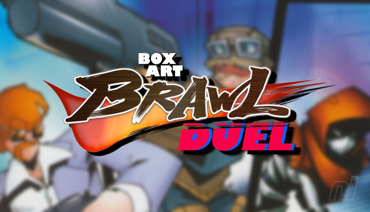
Hi folks, and welcome to another edition of Box Art Brawl!
Last time, we took a look at the fourth entry in Capcom's Mega Man franchise: Mega Man 4 for the NES. It wasn't a close one, either; far from it! A whopping 79% of you preferred the Japanese variant, with the EU version bringing in 15% of the vote, and the North American version trailing significantly at 7%.
This week, we're going to be looking at a classic FPS for the GameCube: Timesplitters 2. It's hard to believe that this game is now 20 years old, because in many ways, it still feels as fresh as it did back in 2002. Featuring a story mode and the classic arcade mode, it gained legions of fans and remains one of the most fun experiences you can have with an FPS title to this very day.
Obviously, this brawl will be a duel between North America and Europe, since Timesplitters 2 was never released in Japan. Enough talking though, let's get cracking!
Be sure to cast your votes in the poll below; but first, let's check out the box art designs themselves.
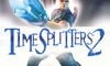
North America

North America's box art for Timesplitters 2 features a single character front and centre, pointing a pretty huge gun towards the viewer. There's a whole bunch of strobe effects coming from the centre and moving outwards, but otherwise, there's not a whole lot of colour going on here. The logo itself is nice and bold in the centre of the image.
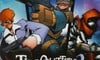
Europe

Europe's variant is quite different, featuring three separate characters in a composition that resembles comic book art, with panels separating each of the characters. Not only that, but the artwork itself is more stylised; it's busier and there's more going on, but it makes for a pleasing image overall. The logo is a bit smaller here and sits lower than the NA variant, but we wouldn't want it to cover that stunning artwork.
Thanks for voting! We'll see you next time for another round of the Box Art Brawl.


Comments 48
Such a great game.
I don't remember ever hearing about this game, and after seeing such different artstyles used in the box art I had to go search what it looks like.
I've watched a short gameplay video and now I'm extremely interested in the development story of this game. Everything in it, from enemy AI to background music to the bulletproof vest pickup sound effect, scream "Goldeneye on the GCN"
Edit: alright, I did a quick research and the answer is: same key developers formed another studio
One of my favourite games of all time!
Great game. Awful covers. Umm...yeah, not bothered who wins this week lol.
That's the most American looking boxart I've ever seen
It definitely looks nicer, but stunning? Really?
A remaster or a new game would be great
European execs: “Let’s make an artistic cover that represents the game but in a uniquely stylised way.”
American execs: “Big gun. Power. Macho. Hoorah!”
What confuses me: I own a PAL version of that game with German text on the box. So clearly European. Part of the description on the back of the box also says „English version with German subtitles“ (written in German). But it has the North American art according to this article. Does anyone know why this is?
Box Art Brawls Current Total:
Europe: 41
Japan: 47
North America: 48
Australia and New Zealand: 1
I actually got used to the Europe cover so I think it's okay in an average way and certainly better than the NA one
Cube magazine,
that takes me back.
That American one looks absolutely terrible... But... On closer inspection it seems to be actually a character model from the game. You can see the polygons and everything! Anyone bold enough to put their polygon model on the front of the box is a winner in my book.
I... kind of hate them both, but I'll go for the American cover because it gives me 90s FPS vibes.
@Uncle_Franklin : It's disingenuous to include Australia on that list unless you tally all of their covers (most of which are identical to Europe or NA).
And we often get the better cover of the two, which would probably place Australia on top.
Interesting that this never released in Japan
@Silly_G
@Logical_G
I want Silly_G back.
This might be the first NA vs Europe brawl?
Not sure about the box arts themselves, but any box art that has to show awards, review scores and comments in the cover almost always loses me instantly. That's an issue I have with my copy of Mario + Rabbids Kingdom Battle.
Ignoring those, I guess I gotta go with the American cover, it takes some guts to show what seems to be an in-game model in your cover.
@Uncle_Franklin Speaking of that winner Australian cover, which one was it? I think I joined the site after it happened.
@Kienda The American one actually looks like the in game characters more, I’m actually pretty sure it’s partly an in game character model.
@HammerGalladeBro : I'm pretty sure it was Kuru Kuru Kururin.
https://www.nintendolife.com/news/2021/03/poll_box_art_brawl_79_-_kuru_kuru_kururin
And funnily enough, you joined about a month after the poll was posted.
@theGamerPad I get that. I had Time Splitters 2 European version and I remember not finding the box art to actually match the game.
But I just thought the contrast between the two was quite striking.
This is one game that needs to come onto the Switch, either as a virtual console release (if they ever do a GameCube one) or better still as a remaster.
Neither are great, but I went with Europe's comic book style. At least the box art team seemed to be trying there. North America's....Big, big oof.
Europe's is better art, NA represents the actual game better. Both are pretty terrible, which is a shame because TS2 is one of the best games of all time.
Guess I'll go with EU this time.
I don't get hte hate for the European cover.
But I guess it's a generational difference I mean there are people liking the same type of art as presented in Return to Monkey Island
I voted for the European cover as I'm digging the cartoonish look of it.
It scares me to think of a modern reimagining of this franchise, full of horrific loot boxes and IAPs.
The original was "play = reward" and that was perfect, and there was SO MUCH to unlock
Beautiful..
Modern games. Grrr...
TimeSplitters 2 actually did receive a Japanese release, as "TimeSplitter: Jikuu no Shinryakusha", with its own distinctive box art, but only on PS2.
http://psxdatacenter.com/psx2/images2/covers/SLPS-25207/SLPS-25207-F-ALL.html
The European version has more effort put in. I like the cartoon art for the characters.
The PS2 version was released in Japan (no dub, subtitles only), and here's a different cover: https://images.app.goo.gl/9Ah9fGqwdihEEpKe9
There was also a Korean version for the GameCube, which uses the small Japanese packaging, region is Japan (which is what the Korean GameCubes were), but the game is in English.
https://twitter.com/necrosofty/status/910981804391354371?t=srVzY2uGMP4aNzgs_-pRCQ&s=19
Both rubbish couldn't even vote !!
Are the people voting for the US one ok? Do you need a hug?
Wow. I remember the US box art. This s the 1st time I’ve seen Europe’s version. And we’ll… Europe wins. No argument
While I have my issues with the European artwork, it's not badly done for what it is and I appreciate them having someone actually draw a cover. The NA cover is all kinds of awful. Did they not want people to notice the game in stores?
That USA box art is actually hurting my eyes, whoever thought that was a good idea is beyond me.
European box art by far.
I know everyone hates these covers but I actually mess with the European version quite a bit, the art style is cool and has just the right amount of goofiness imo.
Man, this was such a great game!
@Tenma220
It did get a release in Japan, but only for the PlayStation 2. It was called "Timesplitter" since the first one didn't get a Japan release.
Sadly, the voices were not dubbed, and are the same English ones.
I have too much nostalgia for that NA cover. It might be objectively bad but that game was one of the main reasons I got a Gamecube so I can't possibly be objective here.
Both are meh, but at least Europe has some imagination at least, so that gets my vote.
Man, Free Radical. The true successor to N64-era RARE. This game did feel like GOLDENEYE in it's shooting and mechanics. Also, the first excellent level editor in a game. My friend Rocky made some truly excellent experiences in that game. Would love to see this brought back.
Yeah, they both suck but the North American one was what I had and I played it to death, so it gets my vote.
Voted for Europe, it has a very 2000s vibe to it.
@87th that art is a lot better than the two put here.
I played TimeSplitters Future Perfect, that was the sequel to this game, and on every aspect, was a superior game. Great spiritual successor to GoldenEye and Perfect dark, since it was the same development team, they got crazier and crazier with each game.
As a side note, the back of the box (at least the NA one) is pretty terrible too. It shows a bunch of beta guns that aren't even in the game.
Europe, but they're both kind of underbaked.
@RadioShadow Oh interesting, good to know!
Tap here to load 48 comments
Leave A Comment
Hold on there, you need to login to post a comment...