Hello folks, and welcome to another edition of Box Art Brawl!
In last week's edition, Metroid Prime - one of the greatest console games of all time - entered the ring. As we'd predicted, it was a pretty close battle, but Japan's more action-packed (if you can call it that) design just managed to beat out North America and Europe's more restrained approach with 53% of the vote. It just goes to show that even the most iconic box art design is not necessarily the best one.
This week, we're going to be looking at another classic entry in the Castlevania series: Castlevania: Circle of the Moon for the GBA; known as Akumajō Dracula: Circle of the Moon in Japan, or just 'Castlevania' if you're in a PAL region. Released back in 2001 as a launch title for the handheld console, Circle of the Moon was critically acclaimed by critics and fans alike and is still held in high regard today (though it's safe to say that Castlevania: Aria of Sorrow takes the title as the GBA's very best Castlevania game).
Subscribe to Nintendo Life on YouTube845k
North America and Europe are once again teaming up for this week's brawl to go up against Japan. Despite the fact that the PAL release of the game removed the 'Circle of the Moon' subtitle, the actual design of the box art itself is near enough identical, so we won't be pitting these two against one another.
Be sure to cast your votes in the poll below; but first, let's check out the box art designs themselves.
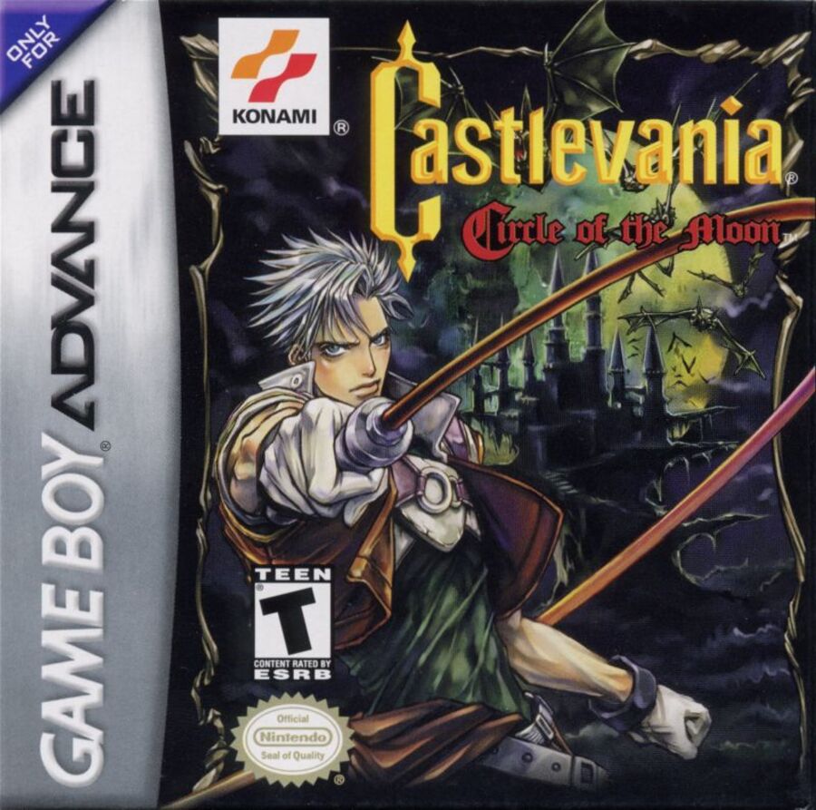
North America / Europe

This is the box art you're all familiar with, right? Given the form factor of GBA game boxes, Konami naturally only had so much space to work with. We've got the game's protagonist, Nathan Graves, front and centre weilding the franchise's iconic whip. In the background is, of course, Dracula's castle, which is suitably dark and gothic with a bunch of creepy bats flying out towards the viewer. Finally, the greenish glow of the moon (which is also circular, eh??) provides a nice atmosphere to the image overall, and you can see its hazy light hitting the surface of the castle walls and its surrounding environment.
It's a great image, all told, and if it weren't for the stiff competition from Japan, we'd be quite happy to sing its praises all day long.
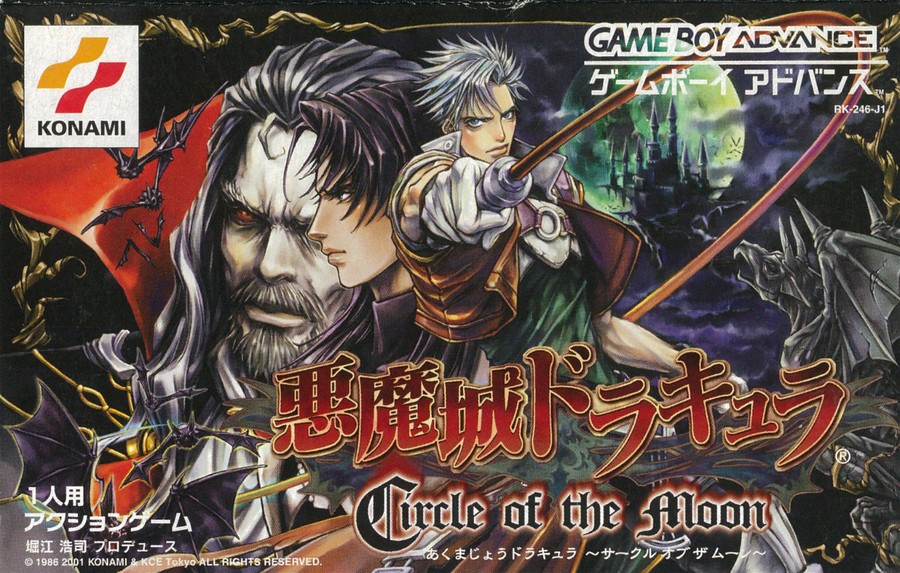
Japan

Publishers generally had much more to work with in Japan when it came to GBA game boxes; the landscape orientation provided a lot more space for additional artwork, and this is perhaps most evident in the box art for Castlevania: Circle of the Moon. Nathan Graves is still there, of course, in the exact same pose and against the exact same background as the US/EU box art, but we've got so much more here. Directly to the left of Graves is a side-on profile of his training partner, Hugh Baldwin, then next to him is a man that really needs no introduction: Dracula himself.
The addition of the extra characters brings a lot more variety to the artwork, both in terms of composition and colour use, not to mention the infinitely more striking 'Akumajō Dracula' logo. In a lot of instances with box art, less is better, but we're prepared to go out on a limb here and say that for Circle of the Moon, more is definitely better.
It's probably obvious which one we prefer this week, but what do you think? Make sure to cast your vote and share your thoughts in the comments below!
Thanks for voting! We'll see you next time for another round of the Box Art Brawl.


Comments 46
The Japan art is a bit messy IMO but still looks really good, especially compared to the NA art.
This one is kinda tough because I like them both, but ultimately I have to go with NA. I prefer the simplicity of it. That said, can we all agree that the Konami logo is hideous?
Konami: How many faces should we put on the box art?
Japanese box art team: yes
It's a shame most NA boxes pre-GC/DS era were cardboard. All of mine were tossed.
Japan's feels way too cluttered for me.
The JP box is way too busy. The NA/EU box has enough going on while keeping a focus on Nathan and the Castle, it’s eye catching and striking. The JP box, while pretty, doesn’t seem focused enough to grab the attention of an uninitiated passing customer. I think the yellow color of the English title logo stands out more than the red as well.
Have to go with NA/EU, it's way more focused
Both are just really ugly, but i guess I'll go with NA/EU since it has less bad artwork on it
I generally prefer Japanese box art but not here. The Japanese one here has some pretty egregious design choices. Hugh's face creates a terrible tangent with Dracula - his hairline basically meets up and his nose is poking Dracula's eye out, and in both cases these seem like unplanned coincedences rather than deliberate choices. I also think Hugh and Dracula are too close in palette to Nathanial so he doesn't really read well, unlike the NA box art.
The Japanese one is just very messy and unfocused.
Oooooh boy I never saw the Japan one but I think just because it has more going on, it wins. It’s like we got a shortened version in NA when the whole picture was out there.
I love this entry, especially how some of the music carried over from the N64 version, a game which I still and always will adore.
@SoManyHaveDied 😂😂
Definitely the NA one here. The Japan one is too messy.
I have SUCH fond memories of this game. Not having had a PS1 I did not know where Castlevania had gone with it’s direction, I got this game for my birthday one year and was a little reluctant because all I’d played was Castlevania 1 on NES and Castlevania Adventure on GB but I absolutely fell in love with it and it has now unfolded into being one of my favorite genres all due to this game.
I voted North America because the Japan one is honestly a bit scary.
I voted for the western cover. Japan's is way too messy and cluttered in composition. As someone else mentioned, Hugh's face in profile causes some issues and doesn't really work. It likely would look better without Hugh and with just Dracula there.
I don't know? They're both too busy.
I always like seeing Dracula, but honestly the JP cover is too busy, and I don't like how Drac seems to be getting his eye poked by Hugh's nose.
I squealed with joy when I saw this week's brawl. COTM is my favorite CASTLEVANIA title. It has my favorite castle layout, some of my favorite boss encounters, and a great soundtrack full of classic 'vania tunes! It just flows so well. This was GBA launch title and I play it at least once ever couple of years. I have even pushed the limit and beat the water area WITHOUT the purification upgrade. I digress. The Japan box art is killer. LOL
Going with Japan, here. Sure, you could call it cluttered, and I agree that Hugh's face is a bit much and oddly placed. But that stark yellow Western Castlevania title is so tacky, and I'm grateful they moved away from it starting with Aria. Much prefer the style of the Japanese title here, along with the ultra-ornate nature of the whole box design, even if it's kind of a lot for some.
@Tailesque Funnily enough, I thought the Japanese goofy blood drop font looked tacky.
Voted for US/Europe mainly because the Japanese one looks cluttered and my eye doesn't know where to look.
For fans of quantity, the Japanese box is about five box covers crammed into one!
Japanese boxart every day of the week!! On this one.
The japanese one is a mess tbh. Even though there are more characters on the cover.
Box Art Brawls Current Total:
Europe: 35
Japan: 42
North America: 44
Australia and New Zealand: 1
Love 'em both, but the Japan cover is just too busy for me. I voted NA.
i think the japanese one is too noisy
Lose Hugh and the gargoyle and you’ve got something. I still went with Japan, though, as I like the font graphic elements more.
Not crazy about either. On one hand, the Japanese cover has more art in it, but I am a massive sucker for the international GBA banner, but it’s otherwise quite boring-looking.
If both had English support, I’d still default to a Western copy in this case.
The one with a guy or the one with all of the detail? 😆
@Branovices Different strokes and all that. The handful of blood drops are thematically fitting and well-incorporated into just a couple characters in the title from a graphic design perspective. Not to mention the palette and gold outlines just suit the rest of the art better than the unaltered yellow copy paste of the Western title. It's obviously Gothic at a glance, but a little playful with its elements too; essentially Castlevania to a T.
After seeing the Japanese box art, it's hard to look at the Western box art and see it as anything other than cropped/incomplete.
Both box arts look great, but for me, the game sucks hahaha. The gampeplay feels so janky and esterile, compared to Super Castlevania IV.
Two great boxarts that are very hard to choose between. I think I'll go with NA/EU for being both more iconic to me when I think about CotM and for being a lot less messy and more organised than the JP one. Both are absolutely fantastic though.
@RudeAnimat0r Wow, I did not see that third face in there at all. NA version is the best, just The vampire hunter, his whip, the moon, and dracula’s castle; that’s all we need.
The other thing about the Japanese box art is Dracula is rendered in a different style than Nathan and Hugh. He's a lot more realistic looking. It all just seems very haphazard to me.
@StarPoint Agreed. A bit messy. I still voted for it though.
Okay, I never realized that the green glow around Dracula's Castle was actual the moon! For that reason alone I voted for the Japanese box art. You can actually see the entire "circular" form of the moon in the Japanese art while even knowing what it is, the US art still just looks like a glowing green fog. The Japanese one is a bit busy, but the game is called "Circle of the Moon" and the US version really misses the mark on that front.
If I saw both at a store, I would buy the Japanese version.
I’d normally pick Japan for the extra detail, but at first glance from a visual design perspective… its too busy with clashing elements. The American box is easier on the eyes, and Nathan pops right out at you. This was also my first GBA game, and I have fond memories of playing it way too much in high school. I 100% it several times over and almost had my main profile at level 99. Until my stepbrother deleted my file to #%^* me off.
I can see why everyone always said this game’s box art was universally terrible.
More GBA brawls! Switch brawls too!
Japan, of course.
@BlackMayge I like the old logo, it's nostalgic to me.
Hugh and Dracula sort of merge into each other, the colours of their face and hair are too similar and their silhouettes are not distinct because of this. I really don't like that aspect of the artwork, so I will vote for the EU/NA art.
Japan in a landslide on this one. Also, is the Advance Collection available on physical media yet??
Wow, loved the NA, but JP proved that was only an appetizer to the whole meal.
Show Comments
Leave A Comment
Hold on there, you need to login to post a comment...