Last summer, the super-talented Philip Summers launched a beautiful hand-drawn game guide for The Legend of Zelda on NES. Available as a PDF or (to a very limited extent) in physical form, the guide featured completely hand-drawn and hand-written pages full of glorious art, tips, maps, walkthrough info and more to help you beat the game in style.
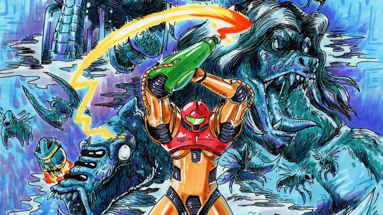
Now, Summers is back with a guide for Metroid. Once again covering the series' very first entry on NES, we can expect more of the same this time around. The guide will be fully mapped, helping you snag every last power-up as you try to work your way through the game, and will also include other "cool stuff" that'll no doubt be a treat for the eyes.
A quick social media tease already has us on board:
We'd expect the guide to be available in digital and physical formats just like before – if you're wanting to get your hands on one, make sure to follow Philip here to keep tabs on those upcoming pre-orders.
If you're playing through the Metroid series in anticipation of Metroid Dread later this year, this is bound to come in handy. Let us know your thoughts in the comments below.
Comments 27
That art style really looks beautiful! I am a sucker for such things!
I have plans of doing something similar about some NES games like Castlevania II Simon's Quest, Faxanadu or Teenage Mutant Ninja Turtles
I have the Zelda one and it’s gorgeous
Is that kraid on the cover? Why is his hair so fabulous?
Not a fan of the art style or the liberties taken with Samus' character design. Looks like they tried to give her under boob armor in that cover shot...
I'm curious how this isn't copyright infringement? Is he paying Nintendo for using their characters? Getting paid to draw fanart sounds like a dream come true, good on him.
Why tf does Samus' armour have an under boob situation going on? 😬
Looks good, i like it!
By the way, the word stunning is a bit often here haha
I have his three previous guides (Ninja Gaiden, Contra and Zelda). His art is incredible in my opinion and he's very generous when it comes to pricing. He deserves all support!
The red looks like a sports bra a few sizes too small
For all you underboob people claiming he took liberties..
https://th.bing.com/th/id/R.6e58d78a472f54bb390da6a1d3977e5b?rik=B0qcvpE%2bYX%2fpMg&riu=http%3a%2f%2fwww.racketboy.com%2frandomracket-images%2fmetroid-poster.jpg&ehk=bG%2buoc%2blODE2jrzJSBCF0%2bfhHfiC86w7cmaPN3JVAEY%3d&risl=&pid=ImgRaw
@Viichan Uhm, yeah, that is not the same. The original is to the side, more under her shoulders and emphasize her ribs, and does not look like it's squeezed together by the red plate, which actually looks like a plate in the original.
@Fiskern Earlier samus' red chestplate only covered the top,so if she's bending backwards and lifting her arms,they would appear that way
I played through zelda using his guide last summer. Not sure i ever beat it as a kid. It was great.
Will look to do the same with this - but i definitely beat metroid when i was younger. I could never forget that last bit after beating mother brain.
I think this guys stuff is great and hopes he keeps at it.
@AnnoyingFrenzy Because that's what he looked like in the game?
I don't want to rag on the art, it's not for me but I can see the appeal. But I do agree the word 'stunning' is used too often here, to the point it basically just means "fan art".
@Viichan Thanks. I was going to say something similar, though I'm not familiar enough with the original art to know exactly what to look for. I knew that her original armor was different, and I distinctly remembered the cables on her arms.
That's gonna be a good dollar spent.
@Dr_Corndog no problem! I'm a huge metroid fan so I'm pretty familiar with all her changes to her design. This one was actually the third design they used for the first game,with a more chibi style being her second(they're in the famicom manual) and her first literally being a robot
@The-Nate I will concede that Kraid has some pretty luscious locks in the manual for the original game (which I completely forgot about due to his later appearances looking completely different) although I still maintain that his hair is looking even more fabulous on the cover than in the manual. Probably because of the larger amount on his head and how much it flows, he clearly uses great conditioner.
Ooh, I love it. Wonderful artwork.
I got his Zelda one, and it is absolutely gorgeous. The art is so beautiful, and it even came with a separate map of the overworld. I keep it safely in it's golden shipping package on my shelf, but I'm wanting to use it to replay the original LoZ when I have a day
@tabris95 I didn't notice till I saw you say something.
Phil has been doing bang-up jobs on these and I’m glad I was able to at least get the physical book for the Zelda one.
For those that say he changed things too much, he’s working from original art used in Japanese and US promotional materials from when the original game was released as that was what we had to go off of when it came out. Back when we had to imagine what these things might be like in full detail we didn’t have all these updates and changes over the last 35 years. This is a guide for nostalgic purpose, not your official collectors edition artbook with the same art reprinted from the cover/manual/game card.
Hope he fixes any and all typos before it’s released (I see “enhancment” here).
Jeremy Parish did this for FanGamer several years ago.
@Viichan Hey thanks for sharing. I forgot all about this design! So it's definitely less liberties taken, and more just his interpretation and execution in the character design that I don't care for. It's small things here and there like the red chest plate supposed to be connecting to the shoulders, as well as have the green symbol, the "under boob" part is too rounded here and should be more to the sides to go along with the design's aesthetic of simulated muscle definition similar to how super hero suits did at the time. The torso honestly bothers me the most with it's straight card board tube design when it's actually supposed to be more slimming. This is clearly a very talented artist but details like this are very important when handling another's IP in order to get the feel right
@AnnoyingFrenzy Kraid had some kind of green moss on his back and head in this game.
Show Comments
Leave A Comment
Hold on there, you need to login to post a comment...