Welcome back to Box Art Brawl, our regular dust-up between regional variants of video game covers.
Last time we celebrated the 25th anniversary of the original Resident Evil by taking a look at the GameCube REmake of the classic original. It was a relatively close call with the minimalist European design in last place with a 24% approval rating and North America taking a third of the vote. Ultimately, though, Japan took out the competition with a rocket launcher and walked away from the ordeal with 43% health.
Subscribe to Nintendo Life on YouTube845k
This week, as we continue our Zelda 35th anniversary celebrations, we thought we'd look back on one of the underdogs of the series: The Legend of Zelda: Spirit Tracks. It's very literally on-rails gameplay might not have struck a chord with everyone, but we've always had a soft spot for the game, and its soundtrack is up there with the best in the series.
All aboard! Come on, ride the train, hey, ride it...
Europe & Japan

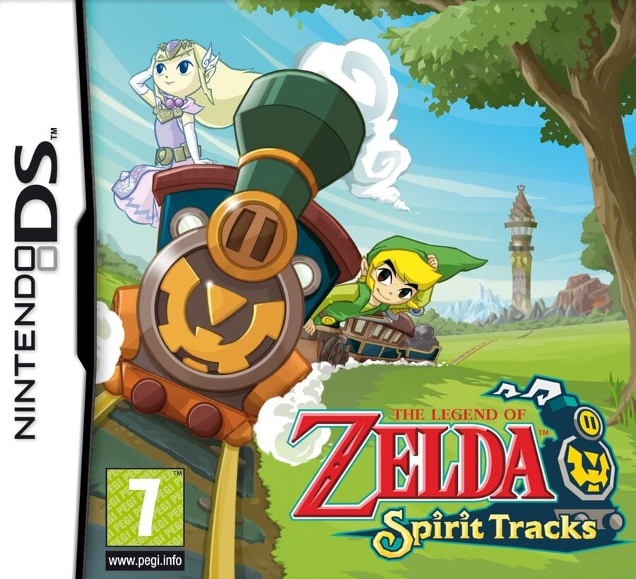
With the train steaming towards us on the left side of the picture and the Tower of Spirits sitting on the horizon on the right, the cover used in Europe and Japan gives a sense of the romantic railway adventure Link and Zelda (in spirit form) are about to embark on. It carries the same key art style as the previous DS entry — a softer version of Wind Waker's toon aesthetic without the thick black outlines.
Loads of colour, an awesome logo that features the Spirit Train running along the 'Spirit Tracks' subtitle, and a spot for the ratings logo to sit where it's not disturbing anything — this is a very strong opener.
North America

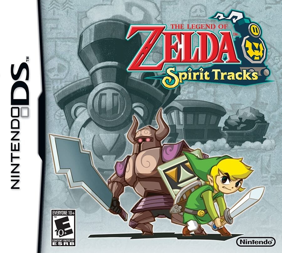
The North American cover features Link grimacing and ready for combat, but Zelda is replaced with a Zelda-possessed Phantom. They're positioned at the bottom centre of the square cover, with the choo choo visible behind them, but blended into a grey-green-blue background which feels like a charcoal sketch.
You get the same great logo repositioned in the top right corner, and it's all quite pleasant taken as a separate piece of key art; it's just a shame to lose Princess Zelda herself, especially considering the active role she takes in the game (as opposed to so many others that carry her name).
So, you’ve seen the two options, but which one has the momentum of a runaway freight train? Click on your favourite below and hit ‘Vote’ to let us know:
We hope you enjoyed that trip on the Zelda hype train. Have a lovely weekend and we'll see you next time.


Comments 40
Just clicked on this article to see the vote count not realising I was the first vote.
Anyway, europe/japan all the way. Way more expression.
I prefer the EU/JPN version over the NA cover.
It has the train aspect front and center, more color and even has Zelda with Link.
The NA cover is just fine, but the EU/JPN cover has so much more of the game’s personality. Love it.
I don't play Zelda games but the PAL / Japan version looks more colorful than the USA version.
One of the few entries I've not played, but I always loved the cover art (European). To quote a famous geek, "everybody loves trains."
I'm usually all for grim and dark things but the colourful cover seems more promising, adventure-wise, with the mountains and tower in the distance.
edit : AND we need more Zelda casually sitting on top of a locomotive feeling the breeze in her hair, while the steam from the chimney is magically avoiding her, sparing her from 5th degree burns
EU/JP is an easy win this week!
Europe and Japan. The American one just looks insecure about colour and happiness, like when Nintendo used to replace smiling Japanese Kirby with angry Kirby for his Western boxarts.
Part of me hopes these polls are to show Nintendo that the USA doesn't need edgy cover art for every game.
The only thing I like about NA cover is that it kind of doesn't spoil Zelda's fate early game, but EU/Jp is overall better at everything else
Easy win for Europe/Japan here
european/japan is the best box art of the game, show how the actual mechanic of the game.
Australia also got the Japanese/European art, and it's easily the best.
Easily going with European/Japanese box art. While the North American box does remain consistent with the North American TWW and PH box arts (as well as the European TWW box art), it doesn't really show off what the game has other than its main characters.
To this day, I never understood the necessity for regional differences.
Europe Japanese. Keep meaning to go back to this but didn’t like blowing into the mic and sliding stylus xxx
Although the japan ones nature background is pretty dull (although accurate to how it looks ingame) it has two important aspects on the cover, ghost zelda and trains. I picked Japans this time.
I find funny how Americans boxart always have the characters angry or pissed of in the cover.
I voted for the more cutesy cover of the European/Japanese version of the game.
I wish Europe/ Japan 's cover had been standard all across the board. It's bright and colorful and looks great.
The Japan/Europe cover this time.
Europe & Japan easily here though both box arts are good. I love how the Europe&Japan one is fun and sets the scene for the game.
Japan/Europe since it's more pleasing to the eye. I never have been fond of NA's box.
Yes sir another brawl! Don't stop!
Princess Zelda's spirit on the train on the tracks, Link hanging out of the train in such a way it is physically impossible that he doesn't fall out entirely, and open green field,... OF COURSE Europe wins this one! It captures the game's soul much more than Link in a fighting stance, a Phantom, and a colourless train.
@Radbot42 @GoldenSunRM Careful what you say, the box artists may send you pictures of them looking angry at you next...
Europe and Japan win this for me.
J/E for sure. Makes me wonder tho, why is the box art for many games different by region?
If the focal point of the game is the train, why stick it in the background and grey it out? Europe/Japan all day long!
EU/JP takes the cake this time.
I chose North America because I feel like having a ghost Zelda on the cover would have been a mild spoiler (albeit one that comes early in the game).
I bet they thought us Americans wouldn't want to buy a game with a kiddy train on the cover or something. Man, Nakey Jakey had it dead on.
A shame that the NA box art is rather good, yet it is the weaker option for me. The other one has excellent composition and does a great job of depicting the defining feature of the game and communicates the right feeling in the art that the game is trying to give to the player. It's a very strong interpretation of the game.
Ghost Zelda was in all the ads for this game, it's an important detail (aside from trains) that makes the game easy to recognize, not putting her in the cover feels very "no too girly, need more serious" and I hate it.
Box Art Brawls Current Total:
Europe: 28
Japan: 31
North America: 33
Australia and New Zealand: 1
Very easy vote this time around EU/JPN for the win. Expressing the adventure and the fun ahead. Colours just pop.
Europe & Japan all the way! It looks so much more appealing and is a great representative of the adventure ahead.
@echoplex I mean, you haven't played yet I guess, but she isn't worried about the burn I can tell you xD
@garfreek Yes that's what I gathered from reading the later comments! She does look yellowish on the cover but I thought it was motion sickness — or hepatitis.
Even though the NA box looks pleasing with the silver/platinum finish... the box art for the other regions is just hands down better. It’s way more expressive, the train and ghost Zelda mechanics are front and center, and the background vista just looks gorgeous. It’s a shame we didn’t get that box art here in the states.
I think North America’s box art does a better job of conveying that this is a mainline entry in the series, but the European/Japanese version is so much more appealing to look at.
Show Comments
Leave A Comment
Hold on there, you need to login to post a comment...