You may be familiar with our weekend Box Art Brawl series where we pit regional versions of the same game against each other in a gladiatorial poll to find out which has the best cover art. That's all well and good, but there are a great many terrible examples that will never experience the glory of combat in our crucible of public opinion. So, we thought we’d take a mid-week look at a collection of lowly souls that demonstrate the very worst of video game box art.
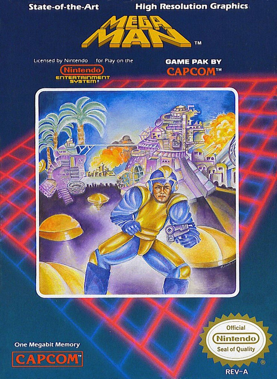
You can vote at the bottom of the page, but there's no honour for any these contenders. You should also be aware that you'll find no 'so bad they’re good' candidates here, either - we can all joke about how terrible the western rendering of Mega Man is on the original box art, but it’s a stone-cold masterpiece compared to the no-hopers we’ve got lined up for you today.
Regardless of their relative failures, few of the contestants we’ve looked at in Box Art Brawl are irredeemably awful (except, perhaps, Street Gangs) and even if their composition or colour palette is lacking by comparison, there’s generally evidence of talent, effort or at the very least some thought that’s gone into them, however misguided.
The following collection is largely bereft of redeeming qualities, though. We choose to believe that the people responsible for these ten covers simply didn’t care about the game or the box or anything at all. We choose to believe this because the idea that somebody sat back after a hard day’s work and said to themselves “yep, nailed that one” is too depressing to bear.
So, allow us to resurrect these wretches for your education and entertainment before returning them to the vile dust from whence they sprung, quite rightfully unwept, unhonoured and unsung.
Real Madrid: The Game (Wii, 2009)
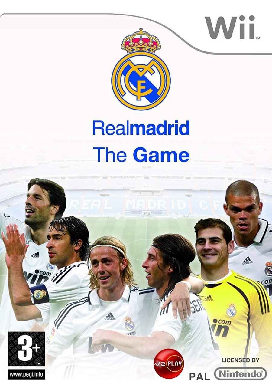
We begin with this official cover for the officially-licensed Real Madrid: The Game. We get a handful of the white-kitted Spanish team in a crudely photoshopped horseshoe in front of an image of the Bernabéu Stadium which is fading to white - presumably to make the players stand out? - as the white sky rubs against the standard white strip with the Wii logo.
Plenty of white, then. It looks like something you might print for the cover of a school project if your dad didn’t want you to waste the colour ink. As we’ll see, the Wii era was plagued with an abundance of abominations, but rarely was so little effort employed.
Jovial Race (NES, 1991)
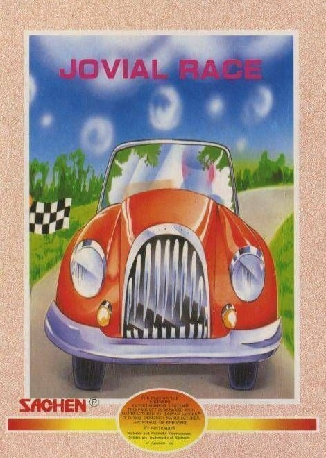
At a time when Sonic the Hedgehog represented the speed and overt 'cool' that was in vogue, it's hard to see this getting off the drawing board, but here it is. Jovial Race (we'll forgive you if you didn't catch the title from the box) is a port of arcade game Rally-X. Perhaps communicating the sedate nature of this top-down maze-chase game was the goal here; if so, mission accomplished. Welcome to Driving Miss Daisy: The Video Game. Pedal to the metal, gearheads.
Russell Grant’s Astrology (Nintendo DS, 2009)
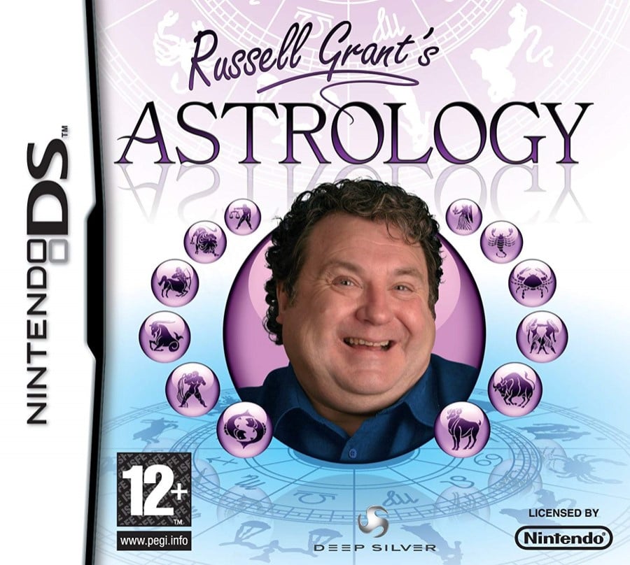
Readers from outside the UK (or anybody under the age of 30) may be unfamiliar with Russell Grant, but he has been arguably the country’s foremost astrologist since the 1980s and has appeared on breakfast shows, in tabloid newspapers and, more recently, on a variety of reality shows including Strictly Come Dancing and Celebrity Masterchef. If you’re after a minor celebrity astrologer and Mystic Meg’s not picking up the phone, Russell’s your guy.
In all honesty, there’s evidence of compositional consideration here, the font and background betray some thought and UK residents may even experience a shot of nostalgia at the sight of Russell Grant on a video game box. It’s still rubbish, though. Nothing against Russell – we’re quite certain we wouldn’t make great cover material either – but this headshot looks like a cropped screenshot from the Strictly intro. He's inviting you round for a nice cup of tea and a sticky bun, not to ponder the mysteries of the Zodiac. Perhaps that’s what they were going for.
The cover makes us wistful for British household names from the ‘80s (the remaining few who haven’t been exposed as prolific criminals, that is) who never got their own DS game. Yes, we got Golden Balls and several Deal Or No Deals, but Beadle’s About had incredible potential as an open world sandbox, no?
If you’re selling your game on the strength of a portly British celebrity, the next cover is another example of how not to do it…
Cheggers Party Quiz (Wii, 2007)
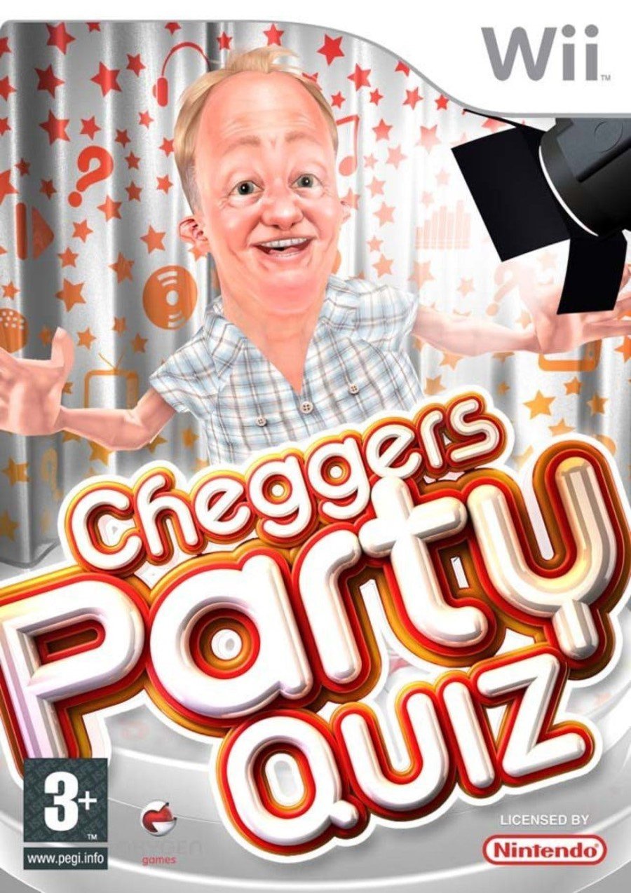
Ah, the perils of CG. Keith Chegwin or 'Cheggers' was an affable television presenter known for his exuberant style and happy-go-lucky personality and this cover plays on his recognisable visage. If you have no clue who Cheggers is, you may find it alarming; he should probably get that thumb seen to as well. Too much white is a running theme with the worst box art, but the grammar of the title here also winds us up. The lack of definitive article suggests an apostrophe is needed after Cheggers’ name (see?) to show the Party Quiz is his. It’s not though – it’s the Cheggers Party Quiz, just without the ‘the’.
We can only apologise to non-UK readers for inflicting these on you, but it’s important to have plenty of material to throw the next time some wag says the North American Mega Man box art is ‘the worst thing ever’. Oh no. Oh no, my friend – tell me, are you familiar with Cheggers?
Karnaaj Rally (GBA, 2003)
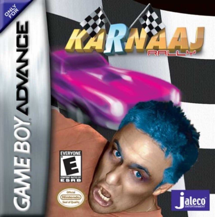
Let’s not dwell on the awful title. Let’s not dwell on the checker flag background or the two checker flags poking out of the ‘R’. Let’s not dwell on the minuscule ‘RALLY’ or the blurry mess of the car or Vinnie Jones’ little brother who got halfway though his Halloween make up and then thought “that’ll do - now to the pub”. Let’s not dwell on how he appears to be sneezing up the Official Nintendo Seal of Quality...
Damn it. We dwelled on everything. Let’s move on.
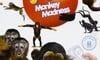
Petz Monkey Madness (Wii, 2009)

Try as we might, it’s tough to avoid the Wii for too long (be sure to check out Chris Scullion's round up of Wii covers for a host of hammy horrors). 2009 seems to be a convergence point in the space-time continuum for particularly terrible box art.
Looking for all the world like your gran typed 'monkey' into Google Image Search, Petz: Monkey Madness (or Petz: Crazy Monkeyz in North America) shows a bunch of simians and a couple of Wiimotes. It comes from the same lineage as the Dogz and Catz series, but there’s a swathe of irritatingly pluralised animals to choose from, from Horsez to Hamsterz and beyond. We’d make a joke about Ballz, but that happens to be the title of one of the developers’ first 16-bit games.
The Petz games sit in Ubisoft’s stable alongside the Imagine series (the Babiez games being particular stinkers when it comes to box art) in a category aimed primarily at young girls. Apparently that demographic really responds to poorly photoshopped images and blank white spaces. Kids deserve better. Poor show.
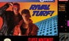
Rival Turf! (Super NES, 1992)
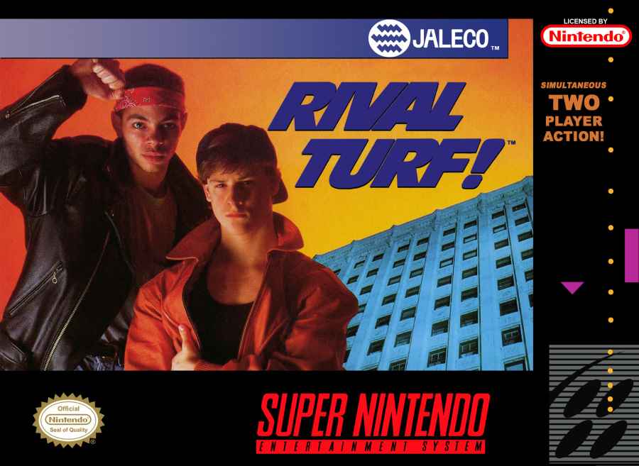
Another one from Jaleco. It appears that the North American cover for Rival Turf! involved getting two cast members from the local school production of West Side Story over for a quick photoshoot at the office before escorting the kids off the premises and snapping a shot of the building on the way back in. Three minutes later: voilà!
Julie Finds a Way (Nintendo DS, 2007)
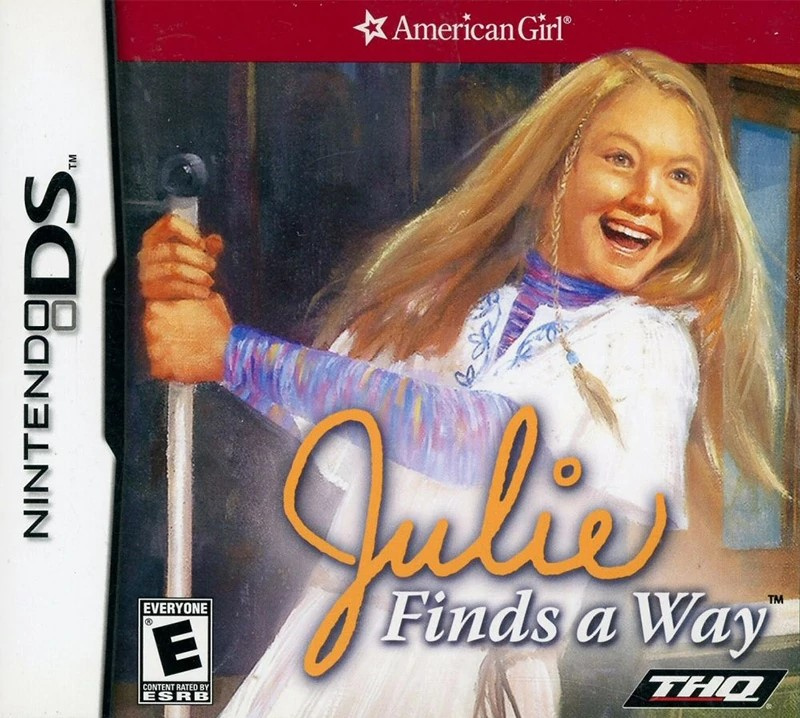
It would be easy to fill this list with games aimed at kids, which would be unfair, but the Wii and DS libraries in particular are filled with real stinkers aimed at that demographic. Julie Finds a Way is part of the American Girl Julie series which includes books and dolls. This kitsch cover is a simple copy-paste job from one of the wholesome books with a logo thrown on top. Julie looks somewhat maniacal, and we must admit we found some enjoyment in imagining that she’s driving the pointy end of the pole she’s grasping into the eye socket of a zombie or other such ghoul. Julie found a way, although we really wish she hadn’t.
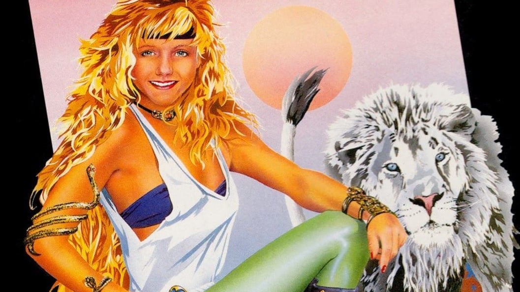
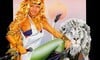
Ghost Lion (NES, 1992)
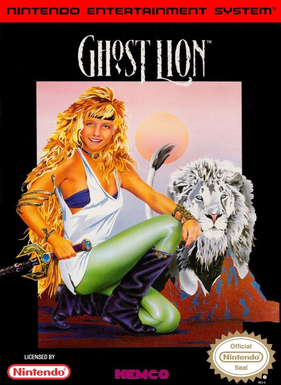
Blimey, it’s hard to know where to start with the North American cover of this forgettable Dragon Quest clone. The logo’s not bad, and the image has some interesting elements, but the face of the blonde-haired lady appears to belong to a 12-year-old boy. In fact, it looks like his mates cut out his photo and pasted it on the box to make fun of his luscious goldi-locks. Some random mountains appear in front of the lion - that is unless he hasn't been let out for a week and those mounds are of his own making. The huge black border feels unnecessary until you realise that's the only thing tying it all together.
It’s memorable, we’ll give it that. It reminds us of Phalanx, a game cover which typically finds itself on worst box art lists, but for which we have a surreal fondness. Would we even remember this game if it weren’t for the cover art? Look at it long enough and you may even start to think it has some merit. Would it be okay without the face of a young boy pasted onto the lycra-clad woman's body? No, it wouldn't. It would still be riding that razor edge between ‘awful’ and ‘truly dire’.
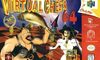
Virtual Chess 64 (Nintendo 64, 1998)
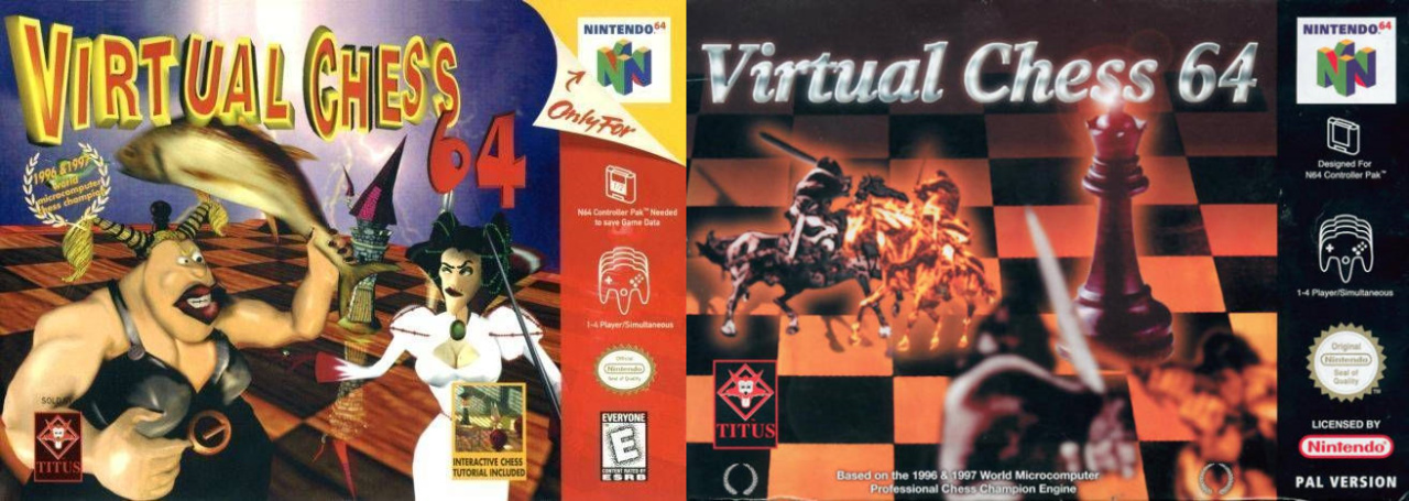
We understand the desire to make video game chess a little more exciting, but the unsightly mix of crude models, fish and questionable boob-window on the North American cover of Virtual Chess 64 (left) looks like some horrific low-poly fever dream. It's what you get if you tell someone with poor IT skills to 'do a Dali' on the computer. What’s going on with that logo? The European version (right) is hardly scintillating, but you could argue it communicates what players could expect. We imagine chess enthusiasts took one look at the North American box and stuck to their trusty physical board.
Quite a wretched line up, we're sure you agree. But which do you think is the absolute worst? Click your candidate and hit the vote button:


Unfortunately, there are plenty of other candidates, but that's more than enough for today. Feel free to let us know your opinions on the entries above, add your own proposals for the lowest of the low in the box below, and be sure to join us at the weekend for the next round of Box Art Brawl.


Comments 103
As bad as these are, they're light years ahead of the Master System's streak of "random doodle on junior high graph paper" motif Sega had going.
Ghost Lion's cover is actually kinda rad in a very Xanadu sort of way, but the rest... my god.
Looks like I'm with the majority so far. Some of those aren't all that bad.
Thank heavens the writers of Captain N never saw any of these boxes.
@koaeinferno ARMS is great, you don't know
@Jin15 agreed, whilst the structuring is off it goes into the "so bad its awesome" category and makes itself quite comfortable. Hell, I want the game now to own.
I can defend most of these for trying, except Petz and realmadrid. Julie Finds a Way seems like it would be at least a serviceable game to its demographic. And since Petz had a running theme of white backgrounds showcasing animals, that leaves realmadrid with its poor edging on the players and font-setting issues.
Lol astrology
@koaeinferno I agree the game could be better, but come on, man. The art is AMAZING!
I knew megaman would be on here.
I cannot vote for Cheggers to be the worst, rest his soul. Karnaaj is unbelievably atrocious and makes the rest look bearable. That monkey one totally looks like a George @ Asda kids T-shirt so if it was going for that, it struck gold.
@Kalmaro I think at least one of those MM boxarts would be top on a "Worst Conveyance" or "Worst Accuracy" list.
Ghost Lion is one of the best video game covers in history!
I want a poster of it on my wall.
Most of these covers are examples of how bad British popular culture is with Cheggers and that Astrology guy. I’m so glad I don’t watch TV anymore.
Also, what is Greta doing on the cover of Julie finds a way?
You forgot Phalanx. The one with the old man and his banjo.
I don't know what your talking about when it comes to Petz Monkey Madness. It's totally adorable too me.
I'd give Ghost Lion one of the best box art awards
@Kienda Fret not - we have plenty of mind-boggling "celebrities" that buy media time here across the pond.
@KingBowser86 Seriously, they just looked so horrid!
Don't be fooled by the cover. Karnaaj Rally is a lot of fun.
Avgn likes this. However, I've chosen Karnaaj, but the Real Madrid Game it's ridiculously awful.
@Kalmaro I'd far, far prefer "ugly on the outside" to "ugly on the inside," if you catch my drift. I keep waiting for Kardashians and such to just drop off the face of the Earth.
Where’s Phalanx lol
These arenˋt Nintendo games.😐
@Kienda Stabbing an imp from DOOM five ways to Sunday.
Karnaaj, easily. Whoever designed THAT had way too much to drink that day...
Jovial Race seems to be quite accepted haha To me, it looks like an old interpretation of Wind in the Willows, just missing it's anthropomorphic amphibian driver. I voted with the majority, though it seems.
@PBandSmelly Touch what?!
@KingBowser86 Yes, celebrity culture is really the most vacuous thing. Too bad it's prevalent in both the UK and US.
All of them look like crap but my vote goes for Karnaaj Rally. Not only the name is stupid but the artwork, even if we're allowed to call it artwork, is baffling lazy and bad.
@PBandSmelly hahaha wow. At least it got a retitle! You wouldn't want to offer a game of the original to anyone... "Want to play a game of..."
@StarmanSSP As a lever? A walking stick/cane?
As per usual, when a fan blog stumbles across (or clickbaitingly seeks out) something they don't enjoy enough to gush about for the time being, the posts and "reviews" become an avalanche of questionable witticisms. I have my own extensive and shameful history from the old fanzine years in this regard, so this stuff is recognizable at first glance.
In reality, some of these covers can raise your eyebrows enough to trigger a chuckling reflex, but in general they all look forgettable at worst. Maybe in part because I grew up on 8/16 bit bootleg cartridges whose box art, and the sheer audacity thereof, could feed a dozen articles - all of which would be legitimate points (you can debate artistic stuff, but a GTA IV logo selling you a Motor City Patrol copy has few to no excuses). But nonetheless, it can come to the point where you start rolling your eyes at the description much more often than at the pictures. Sure, LotGL cover lady doesn't really look like Maria (American Kirby is hardcore and all that), but "the face of a 12 year old boy"?
PS. Speaking of LotGL, I remember it well enough despite the generally mundane box art. I, a JRPG nerd with classics like FFIX and Shining Force behind his belt. I know NL deems all Kemco games forgettable clones, be it the staff or the commenters, but that DQ follower had its own traits and moments (often pretty surreal), and last time I checked, 1992 wasn't exactly teeming with female protagonists in action video games just yet.
Oh geez, that Petz Monkey Madness cover. That monkey is T-posing in the cover. Also, where is Imagine Party Babyz? I know that game is a joke, but that box art was pretty bad too.
Yeah, those are utterly terrible. At least the Mega Man one actually looks kinda retro cool and quirky when viewed through today's lens.
Great read! The opening paragraphs almost had me rolling on the floor.
While the Ghost Lion could be a prized piece of art on some modern art museum, I couldn't shake the "12 y.o kid on the body of a woman" feeling even before you mentioned it.
I'm having a hard time choosing which is worst, Karnaj or Real Madrid, but I guess I will go with the later. It looks like the poor Photoshop spoofs I make to mess with my friends
Where is MY RIDING STABLES?? That game cover is an abomination as much as the game itself.
There all bad. Make me feel sick
For the last time, idiots, chimpanzees and orangutans are NOT MONKEYS!! Not that I expected any better from the Petz series, I mean absolutely no one involved with that series was ever aiming for quality.
So, "Monkeyz" gets the vote for scientific stupidity, Cheggers gets the grammatically challenged award, and Karnaaj gets the what the hell were you smoking nod. It's really hard to pick one worst out of the lineup here.
Some of these are not totally terrible, though. The American Girl is exactly what it needs to be for brand recognition. I guarantee you either of my daughters could look at that picture without any text and say that's an American Girl cover. Doing anything different would have cost them a fair number of sales.
And I think we can all agree that Ghost Lion is a serious contender for So Bad It's Amazing and should probably therefore not be on this list at all.
These are awesome compared to the old Sega Master System covers.
Rival Turf has some redeeming qualities.
Damn, this was a box art maul.
the guy on the Rival Turf cover is hot!
@dartmonkey I never played Ballz but oddballz was great!
The Ghost Lion girl looks every starbucks customer
Virtual Chess 64 is a legendary cover
Julie looks kind of creepy, but other than that the artwork itself looks nice enough. (at least if we're just comparing it to the other games on this list) Ghost Lion is another that has a weird kind of charm to it.
That Karnaaj game is definitely the worst, I don't get how anyone could look at that and think it was ready to be sold. Somehow the Nintendo seal of Quality label being on it makes it look even worse.
Ghost Lion:
Kirsten Dunst drunk in Vegas.
Those are all pretty repulsive I agree, never seen them before. My personal least favorite covers that I've seen are the Breath of Fire 3 European cover and Advance Wars Dual Strike japanese cover.
Mega man does suck but it’s classic. The Russell Grant’s is just creepy
Had to go with Real Madrid. It looks like a bootleg game.
Rival Turf seems rather ok considering the year (1992) and judging by the screenshots of the game I can't see much reason to complain.
But as for Karnaj Rally and Virtual Chess 64: 🤮🤮🤮🤮🤮
Lazy design is one thing but producing such visual cowpats is a crime.
The Rival Turf boxart is what suburban parents in the 90s thought inner city gang members looked like.
Pro Wrestling on Master System....DEAR GOD. The Ghost Loin art is more odd than horrible. The games character is a teen Victorian era girl but reimagined on the box as a 80’s pop star. I’d wager Valis III on Turbografx 16 is worse with its middle age woman cosplaying Red Sonja.
@Roronoa11 I'd have to agree. Except for the two you mentioned and I'd add Cheggers Party Quiz, the rest aren't awful. And that Ghost Lion from 1992 would have been perfect for people not quite ready to let go of the 80's. I'd actually give credit to Jovial Race for having simple charm at a time where many games had garish neon colors.
Definitely Phalanx on the SNES USA version. It's a great space shooter but the cover is an old hillbilly playing a banjo on his porch with a UFO flying above. WTF?
Jovial Race is a great title for a game. The graphics don’t look jovial enough though.
I was laughing out loud a whole minute when i saw that karnaaj rally game cover. Truly WTF
I actually like most of these!! Lol
I KNEW I'd regret Clicking into this one. MY EYES!
Great job Nintendo Life. You have murdered the owner of this account.
CAUSE OF DEATH: LAUGHTER
I looked up the Japanese box art for Ghost Lion. Not great but way way better. Really doesnt look like the same game at all which is par for the course. Also there's like a whisp of smoke that looks like a lion so at least they tried to make the name make sense
Rival Turf was a decent cover for its time.
European BotW with link looking towards you, is just plain awful.
I voted Ghost Lion because the girl looks like the little sister on Family Ties
@Zeldafan79 I love that one
Box Art Maul Current Top 3:
1) Karnaaj Rally
2) Virtual Chess 64
3) Cheggers Party Quiz
Difficult to choose between Realmadrid (how lazy can you get?) and Virtual Chess 64. Great article btw!
@koaeinferno
What? Arms is great and the box art sums up the game well.
None of these are as bad as the cover of Pro Wrestling on the SEGA Master System.
Ghost Lion vs Dave Lee Roth
Cindy Lauper on a NES game box? Sold!
Btw nothing beats the US NES Mega Man cover art. Whoever did that crap must be jailed for crime against humanity
My eyes!!!
...Rival Turf does look a bit badass though.
Hahahahah!! Nice post!! Why Mega man was so bad really??
We got a Beadle's About game. But it happened so long after he died that the protagonist had to be replaced with a goose.
Nope, sorry. I stand by the Mega Man cover.
The others are mostly just lacklustre or plain weird, and I personally feel that in such a top 10, you shouldn't really include regional games. Those are pretty much exclusively terrible anyways and mostly only known in their country of origin.
Anyways, had to look up some titles and Karnaaj Rally actually looked like a pretty decent game, with a surprisingly accurate cover.
It's too difficult to choose...
Mario Kart DS has the worst box art of any first-party Nintendo game in my opinion.
If Ghost Lion changed the face of the woman to be a bit less happy, it would make a great 80's heavy metal or power metal album cover.
I think you could also get a 10 worst box arts for just the Wii and DS alone (separate lists for each). They were filled with so much low effort shovelware...Heck, I would go with an easy 25, 50 if we're talking about the games quality as a whole.
Note: I'm not saying Wii/DS games were bad, just that the systems were home to a hell of a lot of money grabbing turds.
@Daniel36 To be honest I'm glad they included regional games because the entire point was to showcase bad box art and this makes for a bigger pool to draw from while also providing entries which many people might not be familiar with - obscure games is where it's at as you already said yourself. But that's just my humble thoughts here.
As for those entries, I... I don't even know what to say. Most of these can be justified to some degree at least, even that poor monkey getting clobbered with WiiMotes (which still doesn't make them any good but you can... kind of see where they were going with it), but that Real Madrid lettering is the most atrocious thing I've seen since our design-focused subjects at university.
@KarateLuigi Well.. FINE!!! >_< Honestly though, I can't choose. The Madrid and Chess ones are pretty bad... Fine, I'll go for the Madrid one then.
This was a fantastic story, hilarious! Thank you Nintendo Life!
Urban Yeti GBA
@koaeinferno The boxart is great, shows exactly what's going on in the game (spring-armed people punching each other).
Why is Real Madrid written as one word? Who signed off on that? I get typos getting through in the small print or game descriptions, but the title of a licensed game when the title is literally the name of the licence-holder?
I'm with the majority here, though. Karnaaj is the true abomination. Ghost Lion is fricking awesome.
Our K8 had one of the American Girl dolls, which came with stories.
I don't remember pole dancing being in there.
Yeah I voted Cheggers as number one that's some nightmare fuel. Also I'd never even heard of the guy (NA here). The one I think least belongs here is Rival Turf, that one just feels appropriate for the times lol.
I legit thought the 'Cheggers' cover was of a guy standing in a bathtub behind a shower curtain, like the spotlight caught him in the buff but he's not too sad about it...
Oh,... some of these are just atrocious, while others are a product of their time, like Ghost Lion.
@Geobros: The western MM cover was done quickly, just so the release had a boxart.
Karnaaj Rally was clearly meant to be a joke. They made up a mock cover with that horrible picture of Ted from the last Christmas party and then unveiled it in front of everyone had a few laughs said it was a joke (much to Ted's relief).
However the laughter quickly turned to horror when they unveiled the actually cover and realized that there was some some kind of mixup, and now every single game was going to have that picture plastered on it.
Poor Ted was mortified.
Some of these are horrendous. Karnaaj is so horrendous it's offensive. A few of them are "bland" but nothing really bad. Just cheap and uninspired. And the writeups were hysterical for them.
And there's so much we can do with Julie.....I feel the start of a beautiful meme blossoming here.
But for crying out loud don't you dare touch that Ghost Lion cover. That art is totally b****in'. If you don't like that art, you don't know the late 70's, early 80's. It's rock & roll. It's metal. It's Xanadu without roller skates and better music. That art style, was everywhere, and especially on black velvet in the day. That's a timeless masterpiece of a lost era. It's so righteously rad! It's a masterpiece in with the common rabble here. It captures its time.
@Jin15 Jovial race doesn't look bad
Julie only got 4%? I'm disappointed, she clearly looks insane!
Voted for the Petz one. Because MONKEYS AREN'T PETS! Irresponsible.
Actually perhaps Julie isn't insane. If you look carefully enough you realize what's going on here. The way Julie has found, is via pole dancing!
Phalanx' (by which we can assume the American SNES box art, since that's the only one anyone remembers) boxart has the explanation of at least being intentionally bad to make it stand out on the shelves.
It was a tough call, but in the end, I chose Russell Grant's Astrology.
Before the boyish face of the protagonist was pointed out, the only thing I thought Legend of the Ghost Lion was guilty of was looking way too 80s, and I didn't think that was much of a crime anyway.
Is it just me or does the girl in the cover of "Ghost Lion" look like Tom Holland with a blonde wig?
@koaeinferno ARMS is a very good game with a totally fine box art though.
@KingMike I always loved the Phalanx cover art, even when it first came out. It’s a fun way to show the ship fighting in space from an Earth perspective. I never understood why that was so reviled.
What fresh hell is this ?
A tough choice as they are all so bad and some cringeworthy on top. The Cheggers one and Virtual chess one disturb me the most. I'll go for Virtual Chess.
What embarrassing boxart, lol
Show Comments
Leave A Comment
Hold on there, you need to login to post a comment...