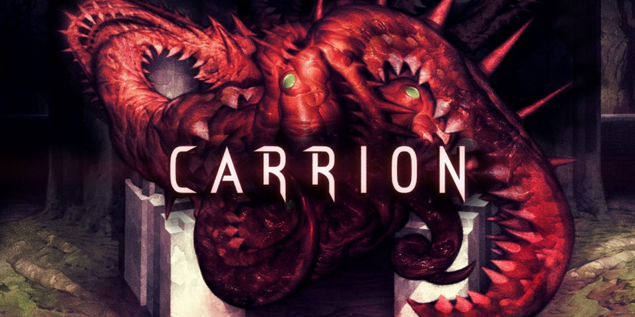
Towards the end of last month, Devolver Digital released Carrion on Nintendo Switch, a reverse horror game where you play as the final boss. With an intriguing concept, great art, and even better gameplay, it topped the list of our favourite eShop games of the month, but it has had one glaring issue not related to the game itself.
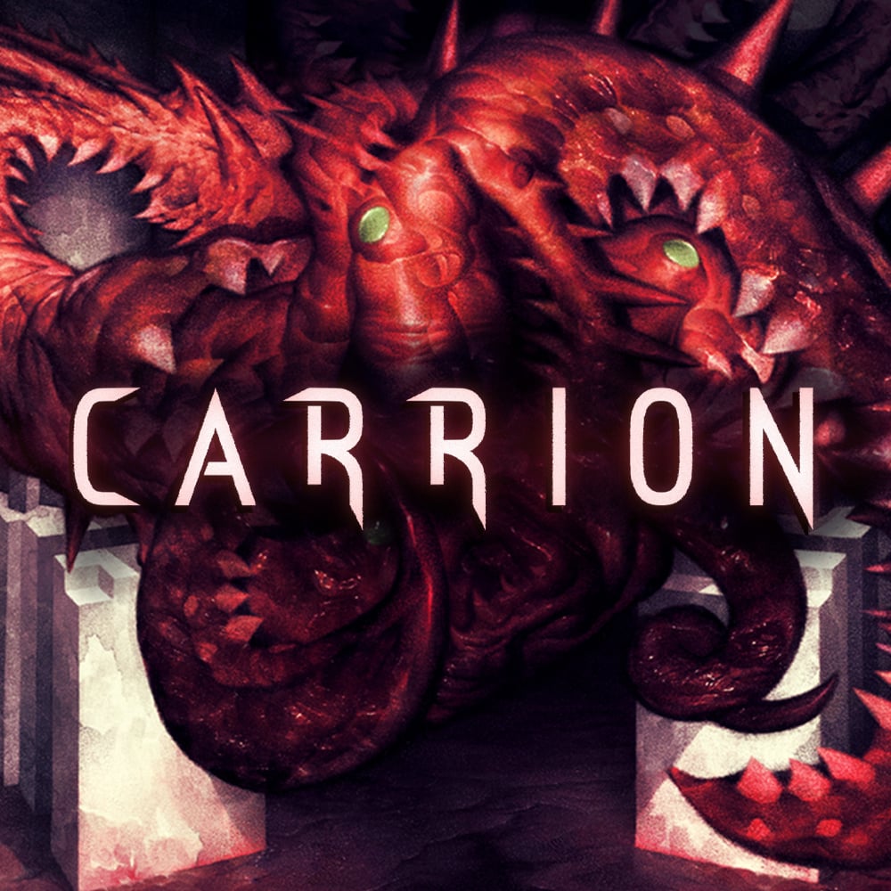
You see, players spotted that the game's Switch menu icon looked like... Well, something you wouldn't necessarily expect to see on your system next to the likes of Animal Crossing and Paper Mario. A quick search for comments on the icon online shows that the design has been rather controversial with some players calling it 'disturbing' and '[messed] up', while others questioned how it ever got through Nintendo's vetting procedures.
Subscribe to Nintendo Life on YouTube844k
We'll let you make up your own minds. The tweet below shows how the original looked, and here's how some press sites initially responded.
As noted by Devolver Digital itself, the icon has now been replaced. If you buy the game from this point on or allow your copy of the game to update, you'll now be treated to this new design. If we're being honest, this does look nicer anyway, right?
Nintendo Switch menu icons have been a pretty hot topic over the last few years, with each game's menu appearance being super-important to fans. Last year, we shared a feature looking into the weird world of these icons and how some developers have been put under pressure to change them - so make sure to give that a read if you're interested.
Do you prefer the new design? Are you shocked to see that the original design even made it onto Switch? Share your thoughts with us below.


Comments 104
At least it stood out
Yet a bunch of uncensored hentai games make it to the shop.
Yeah, this was clearly deliberately done for publicity. And here we are. I guess their marketing manager will get a bonus.
If you look at that original icon and your first thought is that it looks like a part of a woman's anatomy, you clearly have never been laid...Or you have been with some seriously ill women and should call them right now and advise a trip to the doctor.
I honestly never even saw it until it was pointed out just now. I thought it looked like a facehugger from alien but done Carrion style.
Can see why it was ultimately changed but not as bad as people are saying.
Edit: since everyone keeps commenting I am yes, fully aware that facehuggers are based on H R Gigers very sexualised work. My point stands. Everytime I see a facehugger I still don't instantly think of a vagina. I know that's what it's based on, but it's not the first thing my brain sees.
@JHDK If you look at that original icon, and your first though isn't that it looks like a part of a woman's anatomy, then you need to see your optician.
i dont get it. where is the problem?
I don't think the original icon looked like anything in particular, but I really dislike icons that don't have the title logo in them, so I think it's a good change.
Just looked like a well fed face hugger to me. Didn't necessarily have any sexual connotations personally.
Meh, they could have just made teeth more visible in the original icon and called it a day.
Where's all the users mad about censorship? I expected great things from them. Instead there's just shaming for seeing a reproductive organ resemblance. Looks like a pitcher plant to me.
Just waiting for my physical from Special Reserve to turn up
I thought it was a sphincter after curry night to be fair.
I don't see a problem with it being controversial...it just doesn't look great in general
Sincerely grateful for this news!
I just downloaded the game last night and was repulsed by the icon. Just a gross looking fleshy donut (being polite here) with no title or logo overlaid, it just looked like a lazy effort to me. It doesn’t even capture the look of the alien life form that well due to the lack of spiky bits or the endearing green eyes. 😅
Good riddance I say!
Good change, lol.
Yeah I don't see it. But if you liken it to a facehugger... well... THOSE were clearly inspired by anatomy. Haha.
@AhabSpampurse lol "well fed face hugger"
I have a new name the missus won't like. Thanks!
@HobbitGamer "Meh, they could have just made teeth more visible in the original icon and called it a day."
You should watch the film Teeth, it might change your opinion about adding teeth.
I to hate it, if they don't put the game's title on the cover. But I wouldn't go so far as calling it "disturbing".
Nonetheless, good to see the new cover art has the title on it. 👍
@JHDK pretending it doesn't even partially resemble what you so boldly claim it doesn't implies you're aware of the vague and intentional resemblance whilst simultaneously claiming superiority and bragging rights at the same time.
@6ch6ris6 It looks like a vagina basically.
LOL this is funny more than anything. I actually think this new art is better but I'm fine either way. The colors in this new art vibes more with the game. Long as Carrion stays on the eshop.
@HobbitGamer The people who whine about censorship don't know jack about actual censorship. The government didn't intervene here and the developers/publishers had no problem swapping it out. This is literally a NON ISSUE.
Thank goodness something vaguely sexual-looking has been replaced with an icon that portrays the more wholesome theme of blood, guts and horror.
@Folkloner @Coach_A fans having their minds in the constant gutter is no news, but your tenacious snarky defense of this phenomenon is quite a level-up. It's not always about superiority, even merely being above thirty or not spending all free time on PornHub can "affect" other people's eyesight and perception.
@jimtendog I did that with Snake Pass, Switch eventually autoupdated it in the background. Be careful about leaving the icon on home screen when online.😆
The white line on the left bothered me way more on the old icon.
Like, how hard can it be to scale the one picture properly to resemble your whole game?
Yeah no one likes the vaginal icon but it gets more stories about the game. Like how Bayonetta 3s development going fine gets more stories.
@WCB That movie is what I was thinking of
For everyone just saying that it’s an innocent copy of the face hugger from alien, that may be true, but Alien’s art style was specifically designed to elude to sexual anatomy. The horror of the face hugger specifically was supposed to make the viewer feel uncomfortable. So carrion might be innocently emulating alien, but alien is not innocently non-sexual.
If it wasn't for the article explaining things don't think I would've thought anything about the icon. Looks like the rest of us can just Carri on gaming 😁.
People are so damn conservative and uptight nowadays. So what that it looks like a vagina, never hate on the vagina!
I thought it was fine, but I wanted the games text on the icon
@wazlon Your comment deserves a like.
Can only imagine what they'd come up with if they made a sequel where the monster was more of a sausage/worm like design
it's a weird icon but people should not be so anal about it.
@pip_muzz and when you once dive into the lore of Alien (the idea behind the movie and as well as the intentions of Hans Rudi Giger) you will even better unstand.
Edit: Oh sweet humor of life. Your nick name reminds me of the German word Piep Matz which means simply "bird" but has another more delicate meaning. Hilarious. xD
The original looks like my mate Dave when he tries to pronounce ‘aubergine’.
Glad they changed it, as I’m fairly sure he never received any royalties for his likeness being so flagrantly appropriated.
@boredlizard
So? Nintendo has a parental service. Jeez, people has turned so prudish in the last 20 years.
@wazlon haha this made me giggle
I don't see the issue, if the player is old enough to download it, any horror game icon can be visible. The icon itself looks like the titular mass you play as.Problems arise if it is a family Switch and the icon is shown on your six year olds account. Nothing a folder system with security couldn't fix e.g Dad's horror games folder (no access without a pin). I understand why they changed it, but nothing wrong with the original. There's more dodgy icons than that floating around...
The only thing I thought when I seen it was this is the first time I have ever seen an end-bosses genitals lol. Actually my first thought was that this is the last thing you see before you die in game...
I just hate game icons where the name of the game isn’t front and centre.
If only because almost all other games have decided to do that.
It just doesn’t match.
Like when some stupid game decides that the spine of their game case will have spacing issues or not follow the format of how it should be labeled and looks off from every other game!!!! (I think Bomberman does that, damn you!)
@JHDK lol something is wrong work you
@Uwii Yes I'm well aware of the sexual and phallic nature of H R Gigers works. I'm a big fan of them. Was simply that I just didn't make the jump when I saw the screen image (probably because I only see it for a few seconds before launching the game anyway)
The new logo does look better anyway I have to say
@TAndvig If this looks like a vagina to someone, it's really them that have a "dirty mind" (though I'd argue a vagina isn't necessarily a dirty thing), and / or have only ever seen some very, very sick women. Why can't people just accept that there are such things in the world as "genitalia", and get over the idea that everything that even remotely looks like a specific type of genitalia is "dirty" or shouldn't be named, or draw them everywhere and see them in everything? (that's not an attack aimed at you, by the way, just a general remark / wish)
As for the article itself, there's plenty of icons on my Switch I don't expect between Animal Crossing and Paper Mario. That's not a bad thing, especially not since I don't have either of these games, and while I'm sure I'd enjoy them to a certain degree, I also enjoy some games that simply don't fit in any row that includes AC and PM, and wouldn't be bothered by seeing them together. Even if it's to protect the sensitive eyes of the kids I don't have, if I had kids, a vagina would've literally been the first thing they saw when being born into this world, and sexual intercourse would literally have been the interaction that started their life.
"Game Journalists" kicked up quite a bit of a stink. No one else really cared besides these poor little babies with perverted minds.
@pip_muzz Ah very well then! (y) I guess I wouldn't have seen this this way when NL didn't make this article as well.
Remember the snake pass Icon wars... The good old bad old days when we had few games on our shining new switches !
@Uwii Definitely. Once it was pointed out, I also can't see it any other way now... Its clearly an angry vagina...
However I was so hyped to play the game I just missed it completely. As someone else here pointed out, the white line on the left of the image is also something I can't unsee.
The original icon looked terrible. Also, yes, I definitely see the sexual connotation. Obviously it's not a literal depiction of human anatomy. Neither were Geiger's xenomorph designs and the innuendo is hard to ignore there. Not that I'm offended by the sexual connotation, mind you. You might say I'm a big fan of sexual connotation. This was just an ugly design. New one's better.
Also, I love how Devolver broke the news with a picture of Carrion's old icon sandwiched between wholesome Paper Mario and Animal Crossing. It's hysterical.
Some people have too much time on their hands.
I'm surprised the original icon even made it past Nintendo's quality control. Nintendo has a strict policy on icons where it can't be too simplistic.
People saying, "It doesn't look like female anatomy, it looks like a face hugger from ALIENS!" you do realize that the face hugger from ALIENS was deliberately designed to resemble female anatomy, right?
If your female genetalia looks like this, go see a doctor asap.
Also, if you want to draw conclusions to human anatomy I'd rather say it's the "back-exit" with a severe case of hemhorroids.
All in all I think it's just another stupid outrage about nothing. Like 90% of what's in the media and on the interwebs nowadays.
I think trees are too phallic. Lets get those icons next 🤪
Cancel culture at its finest.
Agree with most, I don't know how you could look at that and not immediately think "that."
@Shambo It looks like a vagina dude. Sorry to say. I noticed that maybe a couple days after having the game and even my wife said so. It's the silhouette. I highly doubt anyone thinks that's what a real vagina looks like texture and color wise. Nearly everyone has seen porn at some point in their life.
@JHDK First, I doubt it was anyone's first thought, it took me 2 days to think that. Second, no one in their right mind thinks that's what a vagina looks like. It's the silhouette. Are we going to play dumb here or play "let's be the snobby one with the moral high ground". My wife even thinks it looked like one and she has one.
This was controversial? Where?
@Lordd_G It's not "cancel culture" which isn't even a thing to begin with. Two, I think NL overstated the article. I have yet to see anything about that icon. I think the devs just noticed and had second thoughts before it blew up.
@Beaucine What makes it even funnier is that it was actually someone's job to boot up Animal Crossing, close it, boot up Carrion, close it, then boot up Paper Mario, close it and finally take the snapshot.
it looks like the bottom of a facehugger
The more I think about it I'm seriously betting on the possibility that this was all planned by the developers to keep their game in news feeds. It's real simple to create your own cycle of news.
It's exactly how all these "influencers"/celebrities play the game to a T. They (generally female) post the typical bikini picture and it makes the round of news. Within the week there's another round of news articles about their responses to all the body shamers and trolls in regards to the said bikini pics. If they're lucky there will be a 3rd round of articles within another week about how they're now so "brave", a icon of body positivity, a real role model for girls etc. blah blah blah blah blah.
As you can see it's real easy to create your own relevance in news feeds for about a month. Many do it to get their names in the news because they have something to sell like a new movie, book, product, and/or just to get attention to hopefully land a new media gig somewhere. Very easy for game developers to do the same.
@Shambo I think I agree with everything you just said. I don't really think people who react to this have a "dirty mind". I just find it immature and kind of conservative, so what if they show what migiht look like a vagina, or if your mind thinks that is what you're seeing. It is art. If people want to debate and believe that video games are art, well then they have to accept all the things that come with the definition of art.
Genitalia is a natural part of art and art history, depicting the human body or using parts of the human body in art is as natural as it gets. And if this was on purpose then they aren't doing anything wrong, also, isn't this a 18+ or 16+ rated game? So what the hell.
As a european, I think this is more an american thing and something that is slowly influencing some europeans.
@RustedHero
Given how cheeky they're being about the "forced" icon change, it might well have been intentional, yeah.
Only sexual if you decide to make it that way. I don't see the big deal whatsoever.
I only thought it was sexual because of a polygon article I saw where the author made an innuendo with the clear intention of making people think about vaginas, and then accusing people of thinking about vaginas.
At first I thought it was just outrage culture but after about an hour I decided it was a good thing they changed it. Somebody would have accused them of trying to associate women with something terrifying and grotesque.
Ahhhhh, MUCH better!
I totally understand menu icon drama, and I'm guilty of buying and passing games over the icon art.
The Crypt of the Necromancer icon annoys me so much that I even emailed BraceYourselfGames with many suggestions to fix that monstrosity.
2020, and people are still disturbed by the site of something that vaguely resembles a vagina. 🤦🏽♀️
I liked the old one. It looked like a bergina
I'm very perverted and into fanservice anime/video games and even I think the original icon just looks like a horror monster mouth thing. lol
That is one seriously toothy vagina.
To be honest I prefered the OLD icon, as its disturbing and messed up nature fit with how the game is. I'll miss the old icon
@TAndvig I'm an American and view video games as art. Do I like all art? No, and to me that's perfectly natural.
I agree with you though, if you view/listen to art you should be able to accept what comes with it
@Aiodensghost Thank you! I am so tired of the "video games are art" argument and then the same people get so outraged whenever video games does something that provokes a feeling/emotion they don't approve of. So hypocritical.
Looks more like a prolapsed anus, IMO, but tbf I've not had a lot of experience with female anatomy, so meh🤷🏻♂️
Assuming people think it looked like a vagina is all well and good but it doesn't look that much like one.
@Coach_A I'd personally not notice it and still don't it's just that this article implys it looked like something and that something can only be one thing.
I downloaded it this morning and my Home menu still shows the original icon! Whew!
Yeah, I always prefer when Switch icons have the name/logo of the game somewhere in the design.
@sikthvash Curry night?! Can I come over for the next one? Over here we’re stuck in the world of Taco Tuesday in desperate need of a revolution.
@pip_muzz facehuggers are literally vaginas, with penises that come out from inside them to impregnate their victims. Check out HR Giger's designs.
It is much better now, previously it looked like Bolsonaro's mouth after saying some *****.
@chardir Isn’t that their job? I think they should have grown a pair and left it. Then again, it’s possible that Nintendo may have pressured them to change it, so who knows.
@dagooh HR Giger is pretty genius as an artist. A truly unique direction that is rarely emulated.
People throw a fit when they see a naked woman’s breasts and genitals but almost always turn a blind eye when it comes to wanton bloodshed and needless violence or naked men.
Humanity just loves to make everything worse for humanity it would seem...
Hypocritical oafs...
EDIT- the female form and all of her features are beautiful and should be admired and respected as such.
It's a little short length ways, even if it is errr fully dilated? Also, never quite seen those bulbous objects of various sizes around the edge of the anatomical area we are thinking of... I mean maybe I have only seen a number in the early double digits in person but I think I'm qualified enough to know this would be an odd sight to see when exploring a certain region of the body for the first time xD
There was nothing wrong with the original image. Smfh, People are too f**king sensitive nowadays. 🙄🤬
Oh it looks like a vagina.
I am afraid of vaginas, change the icon.
Thank you very much, now I can continue my anti-vagina campaign in every form of art!
@JHDK is that what people saw a womens bits! Thats to funny. Damn what planet are these women from with bodyparts like that! Think they been watching the movie teeth to much.... 🤔🤣🤣Oh my
reads comments
"Yet a bunch of uncensored hentai games make it to the shop."
26 people liked that, 26 people don't know what hentai is or know the rules for games on consoles.
Probably same 26 people think everything japan, minus Nintendo is "hentai"
Some things will never change, but this is tiresome to see how some people think on a wednesday morning.
Oh well back at the icon, I wouldn't say it looked bad but it didn't really fit the game neither, but there are more Switch (and PS4 games) using game icons on the menu that do not represent the games so that problem already existed.
As for people ofended by this, you see what you want to see, or what you think it is in your opinion, I see a alienlike icon that doesn't tell anything except maybe that the game is not for me...
It should have been that in the first place. Personally all home icons should be the same as the box art, numerous times I’ve looked through my digital games and thought “what game is that?”
New icon looks better (same art as PC version)
But people getting offended over that original home icon? Wow, kids today are way too sensitive and thin skinned
@JHDK I may be a 34 year old virgin, yet if I ever see a woman's nether region looking like that, I would strongly suggest to her to get it check out ASAP, as it's no way healthy.
An icon gets changed and it's considered news worthy of an article?
@WCB oh noooooooo I had managed to forget that abomination Teeth
@boredlizard What uncensored hentai games? I'm not sure what you're referencing, I'm just aware of one puzzle game with a couple tits here and there and some raunchy T-rated VNs.
That's just a vagina. Thats a meat vagina. How did they- I suppose meat dragon looks better.
@boredlizard can u give me the names. For uh. Research
The meme-activated part of my brain just thinks of the Magic School Bus vine clip, “girl, that’s a bootyhole!”
@WesEds the moment I look at the icon if it doesn't look like it'd be any fun I refund it then and there. I like that they're trying to stray away from what's on the box in favor of something different
Show Comments
Leave A Comment
Hold on there, you need to login to post a comment...