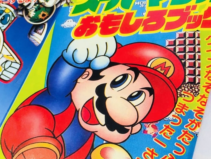
The Nintendo preservation experts at Forest of Illusion have shared some interesting Super Mario artwork, apparently dating back to the 1980s. The artwork was featured in an issue of Televi-Kun, which was a Japanese magazine for children.
https://twitter.com/forestillusion/status/1094459689436274694
According to the source, the artwork was never featured in any other released media. There's also no mention of who exactly provided the artwork for this publication. Take a look at the rest of the images below, which have been provided by Twitter user KazzyKazycom. As you can already see, Mario isn't the only character on display. Peach, Bowser and a few other characters and items are also shown.


Would you like to see Mario look like this in a future outing? Does this bring back any memories? Tell us below.
[source twitter.com]


Comments 22
"Would you like to see Mario look like this in a future outing?:
As much as I'd like to see Mario sound like a New York Italian again. Which I don't want at all.
It's a bit manga-ish in style, is it by that one guy who did the "Super Mario-kun" comedy manga?
But no, while this style is fun in comics, i'd rather Mario keeps his current style in the games.
Why does the lake on the left in the maze picture look like a giant sperm?
Those stairs in the panoramic artwork are really trippy, but they get their job done. Now I feel like playing Super Mario Bros. for some reason.
@Blofse only for the dirty minded
@Blofse ...It's is a circle, with a line going to it.. Maybe you need to get out more!
Nice! This proves that mario never ages just like the real japanese people look at sakurai, etc! Whats in their food i need it too lol. Or i need those mushrooms mario eats all the time 🤣
Mario still looks like this in modern day manga. Corocoro has a Mario cartoon that looks like this even today
I just love this older Mario art.
That maze looks so hard!
This is about as cool as art gets.
LOL That is amusing. Thanks for sharing.
It looks nice, but absolutelynot
I am still unsettled by the old manga style of making a character wink with their pupils rather than entire eyes.
This Mario is the same Mario they use for the DiC cartoon and the cover art for both Super Mario Bros. 2 games (Lost Levels and Mario Madness). You can tell cause he's wearing red overall through blue shirt instead of blue overall through red shirt unlike the current one.
Love this old manga-ish look.
@Mrtoad Sounds better then high pitched annoying Mario.
I like the artwork. I feel all nostalgic.
There's something really charming and appealing about this that modern 2D Mario games lack. I wish Nintendo could capture a bit of that charm and appeal in any new 2D platformers it's makes going forward, because the "New" Super Mario platform games have a very generic, almost cookie-cutter Photoshopy, and kinda "twee" look to them at times that I find off-putting (especially the background and level art). I'd like to see a 2.5D side-scrolling platformer (3D graphics but 2D view) that is as visually appealing as in the art above, although maybe actually closer to the old art from the likes of the Super Mario Bros. 3 and Super Mario World poster art and the like:
You get that idea: Keeping that charm while still going 3D.
As opposed to this:
@impurekind: I wholeheartedly agree 1000%.
@RickD no, not really... Mario looked more or less like this since the first SMB artwork...
Very interesting; its always cool to be reminded of how classic video games got their start.
Show Comments
Leave A Comment
Hold on there, you need to login to post a comment...