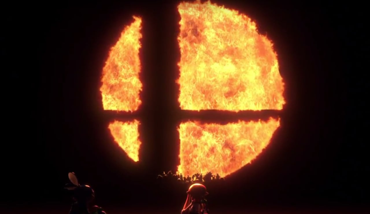
For many Super Smash Bros. fans, the logo depicted above isn't just a circle and two lines, it's a way of life. Okay, perhaps that's going a little bit far, but this little icon has been used as an official representation for the series ever since Super Smash Bros. on Nintendo 64, forever imprinted upon the minds of those who hold the franchise close to their hearts.
But what actually is it? Well, in a recent YouTube video shared on Nintendo's official channel in Japan, series director Masahiro Sakurai has given a clear explanation. As noted and translated by Twitter user @FarmboyinJapan, the two lines forming a cross represent the crossover of the various Nintendo characters and properties present in the game, while the four outer sections reference the four-player aspect of the games - which was the norm until support for up to eight players was added in Super Smash Bros. for Wii U.
 Watch on YouTube
Subscribe to Nintendo Life on YouTube843k
You can see the video in action for yourself below. Everything is naturally in Japanese, but you can likely understand what's being said thanks to the hand gestures anyway.
This explanation of the logo has been shared before, most notably on an old website for Smash 64 back in the day, but we're sure there are many fans out there who have never heard about this before. To be fair, some of our readers might not have even been alive when that website was published - excuse us while we go and tell some young 'uns to play in their own garden for a change.
Did you know the meaning already? Are you surprised at its simplicity? Tell us below.
[source twitter.com]


Comments 45
That's interesting, and it's actually news to me. I always wondered why they chose that for the logo, makes sense now.
But its most important meaning is that it's just a really cool logo.
Wishes he were at home playing Smash instead of being at work
"To be fair, some of our readers might not have even been alive when that website was published"
That's it make some of us feel real old!
@Giygas_95 not the only one I'm sure
@Giygas_95 I'm wishing it was Christmas already so I can unwrap it and start playing it
Any explanation on the off-center placement of the two lines and choosing a circle over another shape like a square? My guess is that combination just looks cool.
@Giygas_95 by he you mean us (or at least me)! ;( in exacts 33 minutes this will be my friday night!
"some of our readers might not have even been alive when that website was published" - I think it's three years older than I am 😅.
I knew the cross represented the crossover but I didn't know about the segments representing the (initial) number of players - that's pretty cool!
@OfNullAndVoid im eager as well! hehe! it will be a biiig vacation to me! lots and lots of hours winning and loosing in thie beaaautful game! hehehe
A bit of stretch... so anyrhing cross-shaped should do the work...
I was expectîng something more... what about those dissimilar lines ? The fat one ? The thin one ? Please enlight me with some whimsical knowledge
@rex_rex In the meantime I'll just do some winning & losing in Warframe, Ninja Gaiden, and Adventures of Lolo
My friend told me this
This was actually news to me and actually always wondered what the symbol meant, though oddly I did kind of assume the 4 sections represented 4 players.
@SenseiDje
I thought about the thick and thin line too, and if they're supposed to represent the crossing franchises/characters, then I'm assuming big is for the big name franchises/characters and the thin for the lesser known/small franchises, but I could be wrong. The whole symbol at least makes sense in its simplicity.
@OfNullAndVoid good choices ahn?? warframe i want to get and start to play.. but it's hard when you have smash to master.. hehe.
Ninja gaiden i played many many times! I had the second one when i was a kid! uhauhaua! yes, im old! and lolo, i know only by name..
Still doesn't explain the unevenly divided parts. Unless that means something along the lines of that both children and grown ups can play together.
Hey, I actually think I'm on to something here...
And a school shuts down because of a kid drawing the symbol...... https://www.youtube.com/watch?v=4MHsKpZESq0
Huh. I never knew that. Neato burrito.
Still looks cool.
I've never been able to see anything besides a slightly-shifted Fantastic 4 logo in it.
@ReWane its to make each section of the çircle represent a place, since each slice is differently sized from the others to represent first, second, third, and fourth places. And the only way to achieve that would be to have one of the lines be bigger than the other, as well as having them off center.
@SenseiDje its to make each section of the çircle represent a place, since each slice is differently sized from the others to represent first, second, third, and fourth places. And the only way to achieve that would be to have one of the lines be bigger than the other, as well as having them off center.
@Giygas_95 Yeah, really rushed off your feet at work I guess ...??
@Giygas_95 Me too, friday needs to hurry up and be over lol.
@thiswaynow Usually more bored than rushed. Sometimes it's hard finding stuff to do.
I've always interpreted it as a stylised sword in front of a circle, but maybe that's just me...
Wasn't this talked about like 10+ years ago? ... Basically 4player crossover battles ... Getting a tat of it somewhere
It looks like the window of a child's tree house to me.
@InklingLegend If you don't get one for Christmas, finding some work to do is always a good way to save up some money. Is there anyone you know who maybe needs help putting up Christmas decorations or just cleaning up some yards?
Also honestly you're lucky you're probably in the best time of your life! Adult life isn't all it's cracked up to be. It's work...bills...repeat.
I did not know this
I had interpreted it for a while that the cross symbolized the crossover aspect of Smash but the four player aspect was not something I picked up at all.
@InklingLegend Well, it's all relative. When you have your own job and your own place, you definitely have more freedom, but you also have a lot more responsibility. In fact, in some ways you have more freedom, and in other ways you have less. Like I have my own money and my own car, but I don't get to sit at home and do whatever I want during summer anymore. Unless there's holidays coming up or I'm taking some of the vacation I've accrued, it's my office, 7 to 3 every weekday.
My advice though, don't be too eager to grow up. You get about 17 - 18 years to be a kid and then you're an adult the rest of your life. So enjoy it!
Also getting a job that's fun to you is the ideal situation. Shoot for that, but also realize you may have to take some jobs you don't like as much along the way.
At least the reasoning is consistent. I assume the off-centering is either to symbolize small, and large franchises, as many have suggested, or just a way to make the logo distinguishable. Otherwise, it's just a circle with a cross. I have always figured it was to distinguish it, but it could be the other explanation mentioned.
Been playing Smash since the 64 and yeah, that's news to me too. So simple but effective. It's an awesome logo too. Maybe the uneven sections represent how 4 player matches eventually turn out? Someone will dominate and the rest will fall.
Was anyone else more interested in seeing The Kacho (Arino) in that video? I'm assuming it was him with his comedy duo, because he wasn't wearing his normal uniform, but it would have made more sense if he was there as The Kacho.
The logo has always reminded me of the layout of the lost woods in the original Zelda.
Fan since day 1 never knew this
I read on some wiki somewhere that it was supposed to be the shape of the moon being viewed through a window. This explanation makes a lot more sense.
It’s sad to think this could be Sakurai’s last SSB. World of Light has some deep meaning in that regard, specially if you think about the three endings (not gonna spoil anything, don’t worry). Of course we have a whole year ahead, six upcoming DLC characters, a lot of patches... but yeah, I truly believe he’s done with SSB after that. World of Light was his form to say good bye to all of us.
I always knew it meant crossover, it was kinda obvious.
what a phenomenal game !!
It's a beautiful logo. Simple, yet memorable and representative of what Smash is - multiplayer and a crossover. You don't get many logos of that caliber.
Who else just assumed it was a sword?
I call shenanigans.
The supposed player at the bottom left of the logo is tiny for some reason.
@InklingLegend By the way, did you get a Switch and Smash for Christmas?
@InklingLegend Well, $60 is a much more achievable thing to save up for than something that cost around $300, so maybe see if you can find any work to do and start saving for it! Glad you got the Switch!
Show Comments
Leave A Comment
Hold on there, you need to login to post a comment...