
This week we received an interesting email from one of our readers, Victor, which made a very good point. The text in Xenoblade Chronicles X is too small, and it should be improved; it was a lightbulb moment when we realised we should have brought it up far sooner - I certainly should have.
In my preview I referred to the game's user interface (UI) "being a little confusing in nature" while referencing just how dense the menus and systems are, while in the review I barely mentioned it directly. While the nature of the UI (or Graphical User Interface, if you want to be picky, we're using UI as a broad term) contributed to the 9 score we posted, I missed the opportunity to raise what is, actually, an important issue.
As Victor highlighted, about two weeks ago - right as the game launched - some gamers took to online boards to highlight problems actually reading the text in the game, which can be a vital issue considering there's so much of it. The likes of Miiverse, GameFAQs and Reddit have had these debates, all generally calling for an update that gives options that allow text size to be increased. The game allows you to customise the UI a little, in terms of what is displayed, but the text itself remains too small.
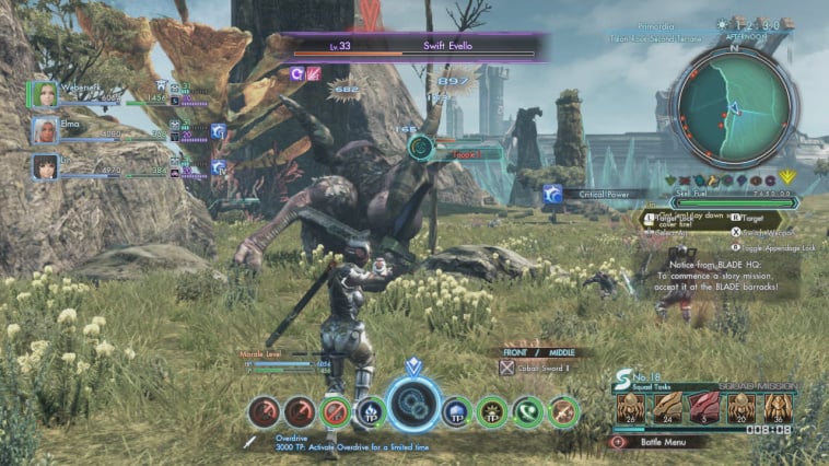
Now, as any screenshot of the game in action shows, the reason for the tiny text is simply the fact that Monolith Soft is trying to share a lot of information. Online messages, button mapping, a minimap, the in-world time and location. Yet it's not optimal, and it's worth pointing out that even sub-menus such as mission listings are hard to read; looking back at my time with the game I've certainly had to adjust my view on plenty of occasions, switching seats so I'm sitting less than a meter from the TV. I may be a 30-something that wears glasses, but when it's necessary to sit so close to a 40-inch+ TV to read some text, there's clearly an issue.
Of course, this isn't just a problem in Xenoblade Chronicles X, as it joins The Witcher 3: Wild Hunt as a game where I need to sit in my second-favourite gaming spot. Of course, some may dismiss this as a trivial problem, especially as increasing familiarity with either game makes the text less important anyway, but it has reminded me that, actually, games need to do more to accommodate players of all types. There are often campaigns and points made that not enough games necessarily support those that are colour blind, or extremely short sighted, or perhaps having difficulty in playing with a disability. This issue of font size isn't relevant to all of those issues, of course, but a minor inconvenience can be a reminder that, for some, gaming as a whole is a challenge - a pleasurable pastime that can nevertheless be tough to enjoy.
From my perspective I certainly dropped the ball in not highlighting this properly in the preview or review, though it wouldn't have changed the score. I failed to take into account that while I can freely sit in comfort closer to my screen others don't have the same setup, or perhaps are shortsighted and struggling with this game regardless.
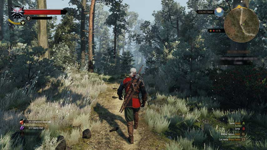
I can imagine it's easy for developers to miss, too. A studio's workspace will typically have its teams sitting at normal desks, working off monitors that are barely a foot or two away from the keyboard. What seems like a sensible UI on a development PC can seem out of place in a TV sitting area, as seems to be the case with The Witcher 3 and Xenoblade Chronicles X. The more complex the game, too, the harder it is to communicate effectively in the UI, and developers don't always get it right.
But it's another aspect of games that needs to be considered more by developers, publishers and perhaps critics. The UI is a silent but important partner in a gaming experience; we may only pay attention to it in a relatively passive way, aware of its presence and instinctively reading text, browsing menus and looking at minimaps. It's tempting, therefore, to take it for granted, or to adjust in order to make it work, and likewise developers may not always consider those that need a little extra help. Visible and clear user interfaces should, perhaps, be considered as mandatory as subtitles - not all can squint their way through a 100 hour RPG, for example.
Hopefully Monolith Soft will consider patching in an update to alleviate the issue. Sometimes the smallest things can be a big problem.
Let us know whether this is an issue you can relate to in the poll and comments below.


Comments 189
This game desperately needs a text enlargement option, especially since I'm using a 50 inch 1080i CRT TV which BLURS THE TINY TEXT.
I play Witcher 3 on my PC, so I don't really notice text issues, but it's a really glaring problem with Xenoblade X. Many times I'm forced to either walk up to my TV and squint or switch the view to the gamepad....and squint, BECAUSE IT IS ALSO BLURRY.
The text isn't the worst, I'd like to see some sort of zoom function, so you can see the monsters from further away, like binoculars or something.
It has zero audio options too, which is amazingly frustrating when you're trying to listen to a conversation that's being drowned out by song lyrics.
I can read the text just fine. Tom I think you need to put away the virtual boy, and go see an eye doctor.
I totally agree with melonarius. It needs audio options.
It is a very small (haha) issue for me. Like, I didn't think about it all until it was brought up here. But now that you mention it, I can see (haha) the issue. I'm totally okay with the in-the-field UI but there are some times when the small text is just completely unnecessary. When looking at the quest board, for instance, the screen does not need to remain uncluttered at that moment so the tiny text just seems like an oversight more than a design choice.
The text can be way too small at times. I think it would be even worse for somebody with a smaller TV screen too.
I just switch over to Off TV play when I can't read something important like a quest log, then I switch back.
@AVahne Which TV model do you have? I was looking for a good HD CRT TV recently, but couldn't really find anything.
I can barely see the game itself behind the UI in Xenoblade. What a cluster...
I absolutely agree with this. Normally I don't have problems with playing games while sitting 3 metres or so away from my 32" TV. With this game, I sit a meter or so away and STILL have problems reading some text. It made me worry about my eyesight but I'm confident now that it's just the game. It's a frustating thing however as you're just not able to sit comfortable and enjoy the game at it's fullest.
I don't think the chances for a patch are too high, but here's hoping!
Love the game but yeah, there are two issues I have, the miniscule text being one. The other one is the music which is nowhere near as good as it's predecessor. Still, fantastic game and I guess the soundtrack stays put, but it would be brilliant if I wouldn't have to squint to read everything.
@Kyoto Well they never really patched anything in the Japanese version, so probably not. Which is kind of amazing btw that this huge open world game didn't need one or even several big patches, like pretty much every other open world game nowadays.
I never noticed the problem, but my Wii U is hooked up to my 1080p PC monitor and I sit close to it so it won't affect me. Still, games should be accessible to players without having these sorts of issues, so a patch to add an option to change text size will be welcome.
When I was at uni playing XCX on my monitor I didn't have a problem but at home on my 50 inch tv it is a constant annoyance.
It's not just xenoblade I have this complaint about. My wife knows that I'm settling in for a weekend of gaming when she gets home and the couch is dragged closer to the tv. I'm a 30 something that wears glasses too
YES! I've been so frustrated with the fact that no reviewer seems to bring this up. I haven't been able to play the game because of the text size.
@ThomasBW84
I don't ave a problem with it but I have gaming setup in my room so I am about a meter away from a 50 inch screen. The only game I had some trouble with was MH3U, I got used to it though.. Compared to MH3U the font in this is gigantic.
But then again on my tv when I am typing this the "@ThomasBW84" is about three inches long on the screen. So I guess it could be an issue across a room or if you have eyesight troubles.
Same problem with monster hunter. Just make it easier please developers!
I doubt that we will see a patch that increases the font size, because that would break the entire interface. UNLESS they made the interface resolution independent, which I HIGHLY doubt they did.
I do wish however that they make a data pack that you can download for free which gives you the Japanese voices!
The small text in menus and chats are annoying. I thought it was stupid in MH, it's stupid in XC. But this, in their eyes, will be such a small detail, a lot of people would have to come forth to have this actually get patched.
i'm glad im not the only one...i was having problems with this but i heard nothing about it so i thought it was just me
@Kyoto Same problem here, im abit more than 1 meter away from the TV at 32" and the text is tiny as hell. Puts me off playing the game to be honest.
I run the game on a 50" screen and I need to scoot up. I'm moving out to a new place, using a 30some" TV and I'm concerned.
Part of me wonders if they make the text so small so we can appreciate the landscape of the game better. After all, the massive world is impressive. That said, the text is utterly frustrating. People who say it's a passive impression on the gamer: I find ludicrous. It's a map. It's text. It needs to be used.
I remember trying to play the '360 demo for FF13 on a CRT and entirely giving up on it for the reason raised here; you literally could not read it. That's not a 'I couldn't read it from the sofa', it was that the text was small enough that when fed through a standard def TV it became a white blur. It's not the only example but that's the one that really sticks out to me.
I have 0 issues with the text. I have bad eyes and my glasses are a few years past their "get a new pair" date, and I don't really have a hard time with the text at all unless I am distracted, which isn't a text size issue.
It was annoying at first but I persevered and xcx has helped to increase my ability to read small text at a distance! Amazing!
True, when i cant be bothered and want to look up an enemy location for some basic mission, e looks a lot like o and so forth. Ive encountered the issue a couple times there (but no where else)
I found looking at the mission details on the gamepad helps a little, but the text on the gamepad is tiny. On the Television is doesn't bother me
I mentioned this the day it came out, and have gotten more than one splitting headache just trying to read the text. It's really silly that they didn't think to include a resizer, or at least have more of that information available on the gamepad
Haha I'm glad I'm not the only one. I thought I just needed new glasses.
Yes, XCX has given the term 'squint' a whole new meaning, at least for me.
I didn't buy the game for this very reason. I can't stand forcing my sight to read that no reason whatsoever to be this small!
What bothers me the most is that europe has spanish subs, but american version doesnt, considering that all latin america has to import american games, I am convinced that NoA is doing a terrible job, I mean, its not like they need to localize to a new language, just pay NoE a percentage and take that localisation and past it on your game.. Its like they are brothers who hate each other and try to compete.. I almost sold two friends on getting a wii u so we could play splatoon together because they wanted XCX, but when they asked me if it was in spanish and i realized it wasnt, they gave up on the idea and went to a ps4 and a psvita.. so yeah, im alone on it, thanks nintendo of america.. you guys keep doing that amazing work!!
@manu0
It's a Panasonic Tau Cinemavision. I THINK it's a 50 inch version. Sorry I don't have an exact model number; it's quite an old TV.
EDIT: Forgot to mention, overscan is rather big problem with these TVs so I think you should try other brands instead.
I got no text issue on my end. My only issue is the music muffle the cutscenes voice acting quite often, this game need at least a music and voice audio slider.
Witcher 3 had this issue at launch and they fixed it, Im sure this will be addressed son as well.
The text is tiny, but I've played plenty of games with tiny text. The main thing that needs to be patched in is sound options. I'd like to hear the dialogue over the soundtrack. Thank god for subtitles.
Then they could work on giving the online multiplayer a COMPLETE overhaul.
@AVahne To be fair, reading text in next-gen games on CRT screens has been an issue since Dead Rising dropped on the 360 years ago. My point being that these are games designed to be played on HDTVs or monitors.
Fiou I thought I needed glasses... I play on a small television (maybe 24") I had to bring it closer when playing xenoblade because I couldn't really read the quests...
My biggest criticism would have to be the audio. I would much rather have the option to change the volumn of the music in relation to the speech and sfx. Most parts of the game are fine but places like new LA could really do with having the music toned down.
They should at least give you the option of changing text size.
Finally someone in the press mentions this. I was devastated the first weekend I played it, getting an eyestrain headache almost immediately and having to give up after a couple hours before trying again the next day on the gamepad. The lack of sound controls is frustrating too, but I can't think of any Nintendo game that lets you turn down the music. I mainly play it muted for that reason, especially in NLA where I have my "choice" of imitation hair metal during the day and imitation alt-hip-hop at night. And the tracks with vocals, especially during battles... ugh.
On the bright side, now my wife can play Fallout 4 (which has surprisingly enormous text, almost as though they actually tested it on TV/couch setups) on the 46" TV while I play XCX on the gamepad right next to her. But I would have loved to actually play this game in HD. (Sitting closer isn't an option. Our couch is 9 feet away from the screen and the TV is placed such that even sitting on the floor right in front of it like we did in the '80s would be uncomfortable for someone a third of our age, never mind our arthritic bodies.)
I assume that Monolith Soft, and most reviewers, playtested this on large computer monitors a foot or two away from their eyes, but it stuns me that Nintendo never got any pushback about it during QA. Unfortunately, NoA seems like they're not really into doing the right thing anymore, so I guess the first time I'll be able to really see this game in all its glory is when the cemu guys get it going someday and someone comes up with a bigger text (or better font) mod.
The game is amazing even in 480p on a 6" screen, though. I've started over twice and am still 16 hours into my current playthrough. Just wish I could play it as intended.
If I play Xenoblade on the controller and not on the TV, I do notice the text is a bit small.
That's normal, @ThomasBW84. Simply put, the market wants to force HD down our throats, simple as that. The subtitles for DuckTales Remastered are another major offender.
I'm playing it on a 50" plasma sitting about 2 meters away, don't have any problems reading any text, but my eyesight is excellent so.
I totally support an update to text size and sound options though, but given (as far as I know) the game was never updated in Japan with these in mind, I wouldn't hold my breath.
A larger text size would be most welcome!
So far I didn't have a problem reading the text when I was playing on my projector (upscaled to FullHD on 4*2 metres) and (after the lightbulb exploded recently) later on my 22" PC monitor (with 720p because it wouldn't recognize the signal otherwise) that's standing on my desk.
But when I was at a friend's, it was actually hard to read the text on his ~40" TV (which isn't that small really). Then he stood up and said something like "Ah, I forgot this trick that I have for Xenoblade" and pulled the console cabinet (with the TV on it) nearer. After that, the issue was resolved.
What I'm trying to say is: Yes, there can be this issue, but it can be resolved pretty quickly. I doubt it is improvable (or at least not much), but it's just normal for an RPG.
I disagree that games should be as accessible as possible, I actually like how XCX doesn't hold your hand.
What I would strongly like to have in this game though would be free button configuration. The button layout is not smart in my opinion, there is definitely a better configuration possible.
Also, the game's sound should be mirrored on the Gamepad too.
These are my two main issues with this game. Other than that, I have no issues whatsoever.
Well thats not good. Not good at all. I can hear my wife complaining already. Small text in videogames has always been a pet peeve of hers. Music over dialogue doesn't bother her too much b/c we always play w/ subtitles on and read everything anyway. Just used to doing it that way as I always play w/ with Japanese voices when given the option.
Tiny text is what ruined the game for me. Played around 6 hours total and then I just couldn't do more. Also the battle music and the one in New LA isn't that good imo. Oh and I have 55" full hd tv. Would lowering the resolution to 720p make things better?
With a 32 inch TV I have been forced to sit closer to the screen, but for me its actually a good thing as I get to use my comfy Sacco chair which I use way too little But would be nice to have the option to get some bigger text...
The small text size is a glaring issue brought up many, many times, hope they fix it!
No need for ignorance ~Undead
@Dankykong Monster Hunter at least it wasn't as relevant, as the stories, quest details, etc were rarely relevant. Once you knew how to get play the game... Well, you can get by with skimming when in town and there is next to no text during quests (which last awhile). Meanwhile this is a story heavy JRPG...
I remember this being an issue with BK Nuts & Bolts and after enough complaints Rare patched it. Fingers crossed...
I totally agree. The text size is uncomfortable given the low resolution. If you have text so small with that resolution it is difficult to read.
I have a 36'' TV and I usually sit about three metres from it. I personally haven't encountered this issue but I can see where the complaints are coming from.
I only have problems with the text when I play on my monitor. On a big (50") TV it's not a real issue. I'm not sure they could actually fix it though. Enlarging that text will make it not fit in many places, and would require doing QA on the entire game again to make sure it's all okay.
If they did patch anything, I wouldn't mind some kind of in-game storage option. I have a lot of gear I wanna keep, which clutters up my inventory when I go to sell stuff.
this was a big issue in monster hunter 3 for me
@melonarius Agreed. Not only is it hard to hear things sometimes, but not all of us are fans of the different themes/tracks in the game. IMHO, most are great, some are awful... The game definitely needs an audio options pane.
I've got a visual impairment and this is causing me real problems....awesome game but I'm having to constantly adjust settings on my TV and/or use a magnifier to see the text properly, and my TV is 50".
An update would be most welcome.
Yeah, I have a 35" 1080p TV and it doesn't matter how close I get to the darn thing I can barely read it. I can't read it at all on the Gamepad so that's not an option either.
I have yet to play the game, but I know this was probably my biggest complaint with the original Xenoblade.
To be honest I just thought my eyesight was going since none of the other reviewers mentioned this issue. Had I known I would have warned gamers and given the game a lower score on a certain website.
@walrusballs You sir, are a nincompoop, but don't worry I reported you.
I can read the text just fine if I have my glasses on. I really don't see the problem.
@Chaoz that's because eyeglasses and reading glasses act as a magnifier. The text without aid is so small that it's nearly illegible.
When I first started playing it was an issue, but after hours of playing I just adjusted and isn't noticeable to me.
It looks just fine on my TV and if there's a sense I have confidence in is my eyesight, but I can easily imagine some of the text is small enough to give people headaches.
Ya, the text is borderline a little small, but it's not a major issue or anything. Just a minor inconvenience.
And ya, the audio can play a tad loud during cut scenes but again, very minor issue.
If that's the worst complaints that can be mustered I'd say we're doing quite well.
It's not really an issue to me, the only problem I have with XCX is the music in cutscenes (which can disrupt them at times). Though considering how much I've enjoyed myself with the game, this is only a minor gripe.
I couldn't play monster Hunter wii u for the same reason
I personally don't have any issues with small text, although if other people do, then it should probably be a teensy bit bigger. Then again, this game has been out for, what, a year now in Japan? I doubt any patches are going to happen anymore.
I will echo the complaints about the sound-mixing though. It got really silly after chapter 4 or 5, where a bunch of exposition is dropped on the player... but we can't actually hear the people talk because the music decided it needed the attention more.
Give the player the ability to customize the display as they see appropriate, including the rest of the UI. This should be standard for a game with the scope as large as XBX.
I agree, the text is small, but it isn´t that annoying for me. If I need to see something with more detail, I switch to the gamepad and see it there. The music isn´t a problem either - since english isn't my first language, I usually rely on the subtitles to make sure I'm understanding. I'd like an option to customize the UI, though - deciding what should or shouldn't appear on the screen would be helpful.
@melonarius Yup, this is my biggest complaint with Xenoblade. I have a 7.1 Surround system going through a nice audio box, and on rare occasions the game actually makes use of the stereo effects. But most of the time, the game sticks all noises through the front channels, including the extremely loud music over-top the extremely quiet voice audio. Thank goodness for subtitles, but it's really disappointing how little effort was put into making the audio awesome when the actual music and such is so good.
My other personal issues are UI related. One is that Skell Arts are not displayed when managing Skell Gear, especially during purchasing, which forces you to guess and go through extra steps to see what something even does. Two is that looting items sticks Enemy Parts in the same section as Gear. I don't like the process of selling gear through the shop either, but it would be made so much easier to have an option for 'Loot all Materials' and then be given the choice to choose which gear items you want to loot. Instead, I kill a ton of enemies, loot 20 treasures, then painstakingly loot all the materials while ignoring the gear because I really don't want to have to sell it through the shop later on. Maybe if they gave me a filter option in the shop's selling menu to say BLADE Gear, Light Gear, Casual Gear, etc... As well as one to filter for rarity.
On topic: Text doesn't bother me. I just play on a 40"-ish TV from a distance of about 6 feet. Plenty readable then. However, it's unable to be read on the Gamepad mode, so I will not be playing on Gamepad Only until I'm done with all of the missions and have reached the point of grinding end-game gear.
Yeah, I think game reviewers should heap out hefty amounts of criticism for games with text that’s impossible to read from a sofa. I understand that some people sit by their screen or have huge screens, but I can’t read the small texts when sitting in my sofa. The font size in the new Nobunaga’s Ambition game is just silly. That’s seriously impossible to read at a decent distance from a 40” screen.
http://i.kinja-img.com/gawker-media/image/upload/s--oYj5Gskd--/c_scale,fl_progressive,q_80,w_800/1340785503365454693.png
Nintendo usually does fonts sizes great. But somehow then their UI gets bashed online for looking childish.
I'm at 41 hours and the only issues I've noticed are the aforementioned font size, the lack of audio balance options and the glaring one for me, the inability to fast travel without the use of the gamepad. My game pad is damaged and I only see half of the screen. I would like to get it repaired but that would make traveling completely impossible for me, at least until I got the gamepad returned to me.
Hmmm...sounds bad. I've heard about these kind of complaints, which is especially bad for me considering I can't really see out of one eye that great, which makes me have vision problems. I don't mind getting up close to the TV, but dang...they could've at least given a text enlargement option. I wouldn't mind a slightly more cluttered interface if it means I get big text.
This is a problem with a lot of HD games.
I have amazing natural vision and I honestly think it's way too small.. on the gamepad it's an absolute joke!!! It definitely needs to be addressed. I can't imagine people with legit reading glasses or what have you.. terrible decision and it really is like they never tested it out..
I play the game exclusively on the gamepad, so the tiny text is definitely an issue for me. It's not literally impossible to read like, say, MH3U, but it still strains my eyes to read it, and I can't read quite as quickly than if the text had been larger.
@melonarius Easily one of the most annoying things about this game. I don't mind music during character's speaking but when you can barely hear what they're saying, and with no audio options, it's just ridiculous especially when it's a basic feature in most games.
I totally agree with this article. I thought I was the only one. The game gives me headaches after a while...
The difference between Witcher 3 and Xenoblade X is that one can actually adjust the UI, aspect ratio, and text sizes properly with Witcher 3, as well as move and remove UI pieces at will. (On the PC version, at least... Can't speak for the consolized versions.) You don't necessarily need everything up at once; it's not an MMO, they're just conveniences. The Witcher 3 text font is also easier on the eyes than the Final Fantasy XIV -esque and Word editor looking text of Xenoblade X.
Xenoblade X, on the other hand, seems to be trying to demand as much incoming information as an MMO, while biting off more than it can chew. It also seems to be a victim of poor resolution scaling- that is, if you have a larger screen, or a screen with a high default resolution, then a high resolution setting in-game will almost invariably make text sizes smaller. This is not a unique problem to Xenoblade X, but it's unfortunate that their QA department did not extensively test to ensure they didn't ignore the pitfall of poor resolution scaling. It's not as if it's an unheard of problem.
Monolith Soft should have just retained and refined the original Xenoblade UI and text format. It wasn't cluttered, it gave you enough information to go on, and more detailed information was filed away in menus, instead of crowding the main UI. The Wii U is obviously not as configurable as a PC, so it's a shame that Xenoblade X was not given the proper tweaking options beforehand, along with simplifying the UI as much as possible.
I believe the old adage which applies here is, "don't fix what ain't broken."
I've managed with this. Witcher 3 however is a nightmare. You quite simply can't play that game with remote play on the Vita because it's so small.
Its even hard to read when you switch the the Gamepad. I had to move my TV in the living room.
@AVahne ...and that is why I got my 24 inch 1080p monitor with HDMI support. I am already looking at my screen close up so moving a little closer is no problem. But I do agree that the text in X is WAAAY to small.
@melonarius Yes you're right, the loud music drowning out conversations is a problem I've run into a lot of times myself.
As for the point of this editorial; yes the text is WAY too small, I'm actually having to switch seats and sit much, much closer to my TV than I ever do or have done with any other game. :/
A patch would be much appreciated.
To be honest, I do agree that the text might be a tad too small, but I am fine with the size. Just had to use my bean bag chair (in front of the couch) than the couch but then that is hardly half a meter difference, and the newer option is much more comfortable. I can read the text fine from a 3 meter distance on my 46 inch TV.
There should have been an option for others to enlarge the text though. For me, the text size is perfect and much larger would just look odd, but yea more options is always better.
Since my TV got busted (and getting repaired next week), the biggest problem I have is that in off-TV play, the smallest text gets blurred but then that is probably due to the gamepad not being HD.
I thought it was just me. im trying soooo hard to shake off this "stasis". I just saw my eye doc 2 weeks before launch and he said no change in my prescription. I thought my eyes were playing tricks on me. Im liking the game so far but I NEED A PATCH FOR THE SMALL BLURRY TEXT! Its frustrating!
Yup. I'm on a 60" Samsung and I can barely read the text. But, for as much as that bothers me, the fact that there is ZERO audio options, is both perplexing and supremely irritating. The unrelenting looping music makes me think that very little audio is being used for ambient noise. So to cover it... Pump up the jams!
Imagine playing the game in Japanese! I speak (and can listen to) the language just fine, but my reading's not so great... so every time I play this game I feel like I'm taking some horrible proficiency test and I end up ignoring most of the tiny, tiny text. Which is too bad because I have great vision and would love to try to read everything, but laziness prevails.
You people need to adjust your TV settings or something...
I play on a 40" Sony Bravia that's a couple of years old, and I do sometimes have trouble with text in older PC games I get on Steam that weren't designed for an HD interface...but not Xenoblade Chronicles X.
Also note, I wear prescription glasses and my eyesight is not anywhere near 20/20.
Seriously, it took an email from a reader to alert Nintendo Life to this?
Wow.
OK, here's another "hot tip". The audio mixing is terrible when a loud song with lyrics plays during a voiced cut scene. This is when using a stereo TV's built in speakers. Maybe all the dev's developed the game with 5.1 simulator headphones.
1. Get a bigger HDTV.
2. Stop sitting across a football stadium when playing game.
Yes, this ls definitely a thing that needs to be changed! So many people besides myself are complaining about it on the places I frequent. For me it is actually painful...I have a decently large tv and turned the sharpness and contrast up high and the text is still too small to see without having to squint and get up close. I get headaches easily from this, and it is severely limiting my enjoyment of the game. I actually haven't played for several days just because I don't want another eye headache.
@Megumi When we are already using fairly large tvs, getting within a few feet to read and still having trouble means there is still a problem.
Meh, if the text is too small so is your TV.
All good games have tiny text. Monster Hunter 4!
@melonarius
I swear i saw in the options BGM volume and voice volume sliders. I could be wrong though.
I haven't had many issues with it since I sit relatively close to the screen as it is, but having it bigger would definitely be helpful.
Know what would be even more helpful, though?
A way of checking the descriptions of the effects that are on our gear pieces for both humans and skells.
There are some buffs and stuff in there that I've had to search the internet for because the game doesn't outright tell me what they do.
Also, the first Xenoblade had a function where if you got or inflicted something, you could press the + button to check out what it was and how it affected whoever had it.
Why isn't that a thing here?
Seriously?
It's an awesome game and these issues don't take it down from that 10 out of 10 I've already given it, but they would definitely be welcome improvements.
I noticed the issue but it was no more than a quick thought. Dont know why people are making such a huge deal of it. But yeah...I am playing on a 48" HDTV and my couch is about 5 feet from it. I had to sit in my banana chair right in front of it to play comfortably.
Moved my couch just in front of my 60" for this game so I haven't had any problems. As mentioned in the article though, reading text in Witcher3 was killer for my eyes.
Thank you for posting this! YES! It's painfully small. Truthfully, I had the same problem with MH3. I would enjoy Xenoblade if the text were bigger and if I had an option to lower or disable the music. I like some of it but not all of the time.
I don't have problems with the text, maybe because I wear glasses and you people need them?
Pro tip: Use this game as an excuse to get a bigger TV
@manu0 I love my Older Mitsubishi. CRT projection TV. 57". I am surprised more gamers don't use them as they provide amazing visuals for HD content. It does soften edges. And it's 1080i, but movies are stellar. Also very projection had very very fast response time compared to even high end LCD and plasma. And the CRT projection HD tvs can be found on eBay and crashed line for about $100
Witcher 3 is really bad example, because they already made the text huge with the option to be bigger. The size of the text wasn't that much of an issue in TW3 in the first place, but it's nice they thought about people having problems.
Better example is Dragon Age: Inqusition - the text is smaller than in Xenoblade. Just think about that for a minute.
I raised that issue on the forum, some noticed it and agreed, while one individual said to f-k off, because I trollin',
Anyway, is it really that hard to implement UI/font size to whatever the size you want?
I could agree on the point that they don't notice it on their small screens, but what is a problem to go 2 meters away from that and see if it's readable?
Since I'm gettin' sleepy, I'll just put this scenario in here: When Humble Bundle allowed you to designate which charity you can default your purchases toward, I set Able Gamers. While I think that deals more with device inputs, this would definitely fall under usability for all persons.
Look, I have a rather large tv and even I have problems reading it. It's not as tiny as, let's say Nuts N Bolts but there's definitely room for improvement. I mean, I lay down while playing most of the time and I most certainly don't wanna get up to read a mission description or something like that. Fix please!
While they're at it, how about they give locations to those damn fetch quest items?
Oh no... I haven't bought XCX yet, but I plan to get it soon. However, one of my biggest problems with Xenblade Chronicles for Wii was how small the text is. Aside from the daunting task of what many people say is a 100+ hour long quest, the text size was definitely one of the main reasons why I stopped playing and probably won't try to pick it up again for a long time
Funny story: I was super-hyped for this game and I can't play it because it physically hurts me. Between the intentionally tiny text despite a moderate-sized monitor, and the built-in motion blur (seriously, even camera rotation makes characters ghost), I have an immense migraine after 30 minutes of this.
I wound up having to return the game. I'll be the first to admit that my eyes are sensitive, but 99% of titles from Splatoon to Beat Hazard have no effect on me. That this does is a giant oversight on Monolith's part.
@Cobra No not really. 37 inch 1080pHDTV isnt exactly huge, but its no where near small. The only normally readable text in Xenoblade Chronicles X is the subtitles and maybe the skill names. The character menu text is microscopic as is the character HP/TP display on the left. Mission data too.
So far I only started the game up for the update (I simply don't have the time at the moment to play it sadly), and when the title-screen came up on my television, I couldn't read a thing! On the Gamepad it wasn't much better!
Please, make the text at least as big as it was in Xenoblade chronicles (Wii). There I never had any problems.
Not to mention the god awful music...
The first game that convinced me to get a HD tv was Street Fighter 4. It was literally impossible to read the inputs in training mode on a CRT screen. Maybe you guys should invest in a HD screen.
@LUIGITORNADO
oh god yes!!!!
the Intel menu is close to useless since it doesnt give locations
THIS.
I know there are many people out there that, yes, already have a HD screen, and yes, do not play games from a 10 m distance, and yes, are struggling to decipher the Xenoblade text on-screen. I believe too that a fix is needed, and I created a petition for this purpose. If you believe you can make a difference, take one second of your time to sign it too: https://www.change.org/p/nintendo-monolith-soft-release-a-patch-to-fix-font-size-in-xenoblade-chronicles-x
@Megumi The text isn't readable on the gamepad screen when playing off-tv ; what about that?
It is frustrating, but the absence of the audio mixer is even more.... Sometimes the music is too loud and it isnot possible to turn it off
Time for an eye test, Tom!
What makes no sense about the text - is that there is a huge border around it - like just empty space - fill the empty space with larger font!
And yes, I would love to be able to adjust the Music / Voice /Sound FX volumes.
Why would they ever NOT have these features?
To everybody saying "wear glasses", "eye test", etc. You should know that there is a limit to how much you can improve you eyesight. My eyesight is not perfect, I am already wearing glasses, and I can play other games without problems.
The text size is a problem here, and if you have perfect vision and it's good for you at least you should realize that not everybody does, and by forcing your "meh, I can, you should" you are doing something as jerkful as telling a person on wheelchairs that you can climb the stairs so he should stop complaining the elevator is broken.
PS: I stopped playing the game, it gives me strong eyestrain related headaches. Such a pity, I really wanted to play it.
I have no problems with my vision what so ever and I still find the mission summary text on the right side of the screen a slight issue at times. I can completely understand others having issues with some of games text though.
The size doesn't bother me too much unless I'm playing off TV but the actual font could do with being adjusted so it doesn't blend in to the scenery.
Thank you for bringing this up, Thomas.
I first became aware of tiny text as an issue with the PS2.
"Designers", in quotes, yes, thought it looked awesome to have fonts be only one pixel wide, on CRT TVs, with resolutions of 480p.
It did not.
Tiny text has been a huge turn-off for me in games the past fifteen years, both on consoles and PC. Most post-World of Warcraft online games are virtually unplayable to me for this reason.
A game like Wildstar does a LOT to be an unattractive game, but the smattering of tiny text all over the screen the first time you boot it up is the single biggest detractor.
Tiny fonts not only say that you don't have the ocular comfort of you player in mind, but also that you don't consider text an important part of the visual universe you're trying to create, instead trying to convince yourself and the player that it fits snugly underneath things or smack-dab on top of the action.
It's a terrible trend, but it does help me make decisions on what NOT to play.
The font size is small but this talk of unplayable, eye strain etc makes me think gamers have bad eyesight and need to calibrate their TV better
With my gaming set-up, the text is too small for me to read comfortably. I hope there is a way it can be resolved in the future.
I haven't had a problem with the text size. It's only from reading people's thoughts online that I've been made aware of it. The only thing I have an issue with is the conversation text appearing at the bottom of the screen means I have to keep looking down whereas if it was at the top it would be eye-level for me. Sounds silly I know because many games put the text at the bottom including Zelda but with this game I find it a bit annoying. Maybe that is a text size issue.
...anyway, I'm a nincompoop cuz you got a small arse TV LOL 32 inches? No wonder you can't read it. The game is massive, the world is massive, you need a massive TV yo. My TV just fyi is an 120 inch. I read the text beautifully. The game is beautiful. I, am beuaitufl.
Don't be gross ~Santa
@antipop621 big tv, bigger words dog
The text is fine for me. Then again, I have quite a large tv and I'm not too far from it.
I Agree, even tho i do have a big TV to play the game i like to relax on watching tv and playing on the gamepad with xenoblade, although the text is so small that i can't do that.
@walrusballs So? Not everyone is rich enough to afford a $10k+ TV. I've heard people complaining that have 72" TV's so yes it IS a problem. So again you're a nincompoop.
@walrusballs Plus I said 35" not 32"...
Had zero problem with the UI. Maybe I already sit too close?
@walrusballs A word of advice, those people with badges in their avatar images are staff members. If you treat them the way you're treating us normal members you'll be banned in an instant.
If there were to be a update to the games UI I would like to have access to the map via the main menu, had to look up a few maps to see where exactly some paths where before I got my flight module XD
Please devs:
Fix audio options and text size-ui options, so we can give your game the time and love it otherwise clearly deserves!
I actually like the music....
I read somewhere its probably suited better for anime, but I like it- its unique and suits it well.
ok, now you all can make fun of me, lol.
I am playing FFXiii right now, and the menu text is barely readable on my 32" HDTV (using HDMI connection) when I'm sitting less than 3 meters away. I do think it's a problem, not limited to XCX (which I haven't gotten yet)
As the text size you see decreases linearly with the distance (like with anything you see) the text will appear 6 times as small on a TV 3 metres away than in a computer screen 50 cm away. The text where it says "Morale" would be about 6 mm high on a 40" screen, but when viewed at 3 metres distance it appears as big as a font just 1 mm high on the computer screen, that's equivalent of 6 pt.
Game developers need to be wary of this and design for comfortable readability, even though it maybe looks too big on their computer screens. It's not a question of people getting new glasses and shouldn't be about moving the chair closer, most people would think a 6 pt font is too small for comfortable reading.
How's about the music that seems to be a bit too loud during some of the cut scenes and you can barely hear whatever it is that the characters are discussing.
Yes! this actually is a lot worse than TW3...sometimes I have to walk near the TV.
@Megumi I've got a 35" 1080p TV and I have to be within 1-2 feet of the screen to read it "and barely at that". That's hardly a stadium distance away...
Well don't know what to tell you then, I've never had any issues at all. It was the same story with Monster Hunter, I could read the text just fine.
Not to mention playing too close to a TV can cause long-term eyesight issues so it'd be nice if the text were larger.
@Megumi Not even close I can read the text in MH3U just fine even on my tube TV, whereas I can barely read the text in XBCX on my HDTV.
I thought the Witcher 3 was bad (even after the update) but this game is even WORSE!
I hate the font size. For generic menus, it doesnt bother me, u learn those off by heart. But for story info it makes it so hard for me to dive into the games depth.
Monolith are in cahoots with TV manufacturers to force everyone to buy bigger more expensive displays
This is the definition of a slow news day. But the truth has been spoken.
Agree with others that the lack of audio options is an issue. Would love to have the audio go through the gamepad for headphone usage. Literally just started the game today, and with young children, this is already an issue for me.
Yes, the text is too small and I hope they fix it or add an option to fix it. 36 inch TV and about 6 feet back... hard to read, I though it was just me needing my glasses but even then, it is still small, I switch to the gamepad... still small.
I'm not getting any younger so please make the text bigger!
I'm in the 'text too small' camp. Off tv play is definitely a viable option but it really doesn't look the best at all on the game pad screen so I try to avoid this.
I haven't even opened my collector's edition since I'm so busy with my Xbox One. I hate it when the text is so small. The Witcher 3 reportedly had the same problem and it was fixed through a patch. If it is that big of a deal, hopefully this developer will do the same.
@AVahne
YES! man i asked people around at work and miiverse and no one agreed, its horrible. now yes my left eye is only 16/20 vs my right eye at 20/20, but i can read text still ok on a 48" tv.
Not sure if people have shitty TV's or shitty eye sight but I can't see the problem here.
I can see my text but if im sitting back just relaxing and some text comes up i have to lean in to read it. Specially when there is a bunch of text on screen. So i welcome the update !
I was playing last night and I actually decided to shut it off because my eyes were blurry trying to play. Maybe at 35 I`m just too old for this game.
Eh haven't had a problem on my 60" 4k from 3 meters away.
But I have had a problem with the soundtrack blaring over the dialogue. And the music frequently contains lyrics during the main story cutscenes. Amazing that developers and testers didn't notice this...
I have not read comments yet...but will in a second...I have a 46 in TV in the living room...I have perfect vision, the eye doctor told me that so long as I keep my diabetes under control it will prob stay that way...with that said...instead of sitting on the couch which is closer than 10 feet away...I sit on the dang coffee table which is much closer...just to read it a little better...I can read it from the couch, but I have to focus a little more instead of just skimming...so it's an issues for a 31 year old without eye problems, so anyone who has a few more issues with their eyesight...I feel would be a little aggrievated by it.
I hope there come an update, not only for the small text but also to turn off audio + the option to start multiple accounts!
@Neko_Ichigofan tsk tsk tsk... OHHHHHHHH kone ichogoboshan. I am not rich, I play on an HD projector at a reasonable price. And its actually about 75 pecent cheaper than a HDTV that's 2 times smaller than my screen size... LOL in otherwords... I paid what you paid, for a Hella Big screen. But! That's not even the best part, you see, my projector is a DLP. Which stands for digital light processing. Whereas an lcd projector is its competitor. Simply put, dlp puts out a better white definition while lcd has better color when compared. So I think you can figure out the rest.
Call me what you'd like really, cuz in the end all I was doing was trying to help a bunch of grand idiots enjoy a grand game that has no problems whatsoever.
Y'all can be babies and complain all day, or you can quit your whining, and ask for an hd dlp projector from yo daddy for christmas. BRAJ
Oh, and I could care less about the people with shields on their picture. Imma say what I want cuz I am a cyborg and you're not. Once again, your welcome and merry x-mas ya babies.
Thank you for taking this issue seriously. The text in Xenoblade is inexcusably small and I was really disappointed to see a long-standing issue that you find in games on other platforms come into the Nintendo sphere.
@walrusballs Reported again. Also basically saying that you have no respect for the staff is insulting to them and is liable to get you a warning.
@walrusballs also the image quality of projectors are typically worse than an HDTV and making the picture even larger will make the text blurrier so I don't think that'll help most people who're having trouble reading the text. The larger the screen the less sharp the image will be and 120" is WAY TOO BIG. FACEPALM
Watching a few gameplay videos now, sitting a meter away from my 27" monitor, I can read everything perfectly fine and would even if the text was a lot tinier.
It is a huge monitor though, and I do have 20/15 vision with my glasses on, which are very optimal too. I had the right lens exchanged under warranty because it was 5 degrees off axis; they didn't believe I could notice the difference that much before I manually set the axis on that thing they put on your head, which turned out to be the exact same axis as the computer measuring thingy had read. I don't have to mention that they cut the new lens VERY carefully. And wow do I feel like talking about myself today. Sorry.
This game needs the font size AND audio balancing fixed like yesterday, Nintendo!
@manu0 @AVahne Maybe you guys should give the Panasonic Viera line of TV's a go. I currently still own a 42" HD plasma from that series, but their newer models (LED/LCD) are also quite good. Obviously they're flat screens, but if there's no reason in particular to still want a "boxed" screen, then why not try a flat screen? Saves a lot of space too...
Panasonic is still one of the brands that scores high in tests worldwide, so you can hardly go wrong. As a good alternative, I would also look into the higher end LG's. Hope you guys find what you need. Happy gaming!
@Neko_Ichigofan reported shmorted.
( n _ n)/ I don't give a damn brajjjjjjjjjj
It's probably blurry cuz you don't know how to set up a projector... that or you never even used one. Lol I tried to help but it sucks to be you to not try something else and baby it all up
I had this problem with the Witcher 3 too. As well as basic readable text size (these aren't PC games, guys) developers need to wise up and cut back on UI in places. I'm real sick of games where it's difficult to look around for want of white space.
It's really not a big deal. I haven't even had to wear my glasses to play the game. While I'm not saying that people's issue with it doesn't exist, I do think they're getting their panties in a wad over something very minor.
I'm glad others have mentioned it, I was just thinking it was me getting really old being unable to read the text properly!
@Genesaur That's just an excuse you gave for Monolith's poor font size on the game. Don't defend them when they're doing something wrong and atrocious, it just means that it's OK and they should keep on doing. It is not.
So much for being the Fallout 4 of Wii U.
@ThumperUK That's what Nintendo fanboys would have you believe because they assume Nintendo and its developers do no wrong.
@SuperSaiyanPT Whatever, man. I'm hardly defending anything. I legitimately had no problem with it. Does that upset you?
@Genesaur No. You're just trying to defend the company for whats an obviously flaw and it isnt just "minor".
Nintendo fanboys can be just as bad as SJWs and PCs.
I bought Monster Hunter 3 Ultimate for Wii U several years ago. I played it for maybe 10 minutes and never played it again because of the small text. I can see someone doing the same thing with Xenoblade Chronicles X. If I wasn't such a fan of the Wii title I think I would have given up already. This is a huge problem that is easy to fix.
I have an 85" projected screen and this is barely readable. I am mainly guessing when I played this game. The game itself is stunning, but I don't know why they couldn't keep the font size the same as that used in Xenoblade for Wii. This game might have to go to the side until a patch comes out because it's almost painful to try to navigate the UI. The worst is that it's completely unnecessary. There is loads of space that could have been used for a bigger font size.
This most definitely isn't a minor flaw.
I have 20/20 vision and on my 32" TV I strain to read most of the text. It's very frustrating.
I tried playing it on my in-laws' 50" plasma TV. The text is easy for me to read, but still small.
Surprisingly, I also saw a lot more pop-in and texture loading issues on the 50" TV. I guess the Wii U has to work harder to render the same resolution on a larger screen?
The main text I wish was enlarged the most is the victory spoils text. I get excited over loot, but button past these screens because the text is too small.
If the test was any bigger the screen would be 100% text.
/enddiscussion
Yep, I think the text could do with being a little larger. Also, the use of lyrics in the OST is bothering me. Not only are there the really questionably NLA themes but the "main" theme drowns out the conversations during some of the more important missions. I'm loving the game but these are issues for me.
While the size of the text is an annoyance, I think the music is more bothersome to me. It is so repetitive and annoying. As much time as I spend running around in this beautiful world, I only wish the music was as good. Along with an option to increase the text size, they should also allow you to turn down the volume on the music.
Or an option to switch tracks. Similar to the way they allow you to change channels in Grand Theft Auto games.
Don't get me wrong, I love this game. These are just a couple of suggestions to make it even better. When you spend so much time playing a game like this, little issues like this stand out a bit more.
My 60" HDTV with m 6 feet from it and this text is GAME BREAKING pain in the ass. I can't play such a complicated game while missing out so much from this unacceptable oversight.
Stupid!
Show Comments
Leave A Comment
Hold on there, you need to login to post a comment...