Renegade Kid co-founder and game director Jools Watsham professes a love for Nintendo in his recent blog post, which is why he also says it hurts him to see the Wii U struggling to forge its identity in the public eye.
Watsham says he understand why Nintendo would want to keep the Wii brand name — even if “Wii U” might not have been the best way to go about it — but the cosmetic decisions that went into the console confound him:
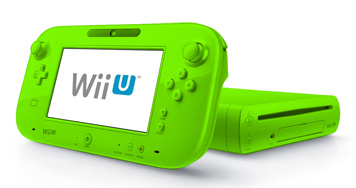
The visual design of the console itself, however, has no excuse. The Wii U is essentially a smoother looking version of the Wii – and that is only apparent if you’re really paying attention. At a quick glance, most people could easily mistake a Wii U for a Wii.
Nintendo’s game development teams, Watsham argues, would have avoided such an aesthetic trap. He uses the recently conceived variants on classic Mario items as examples. A Gold Flower in New Super Mario Bros. 2 conveys both a similarity to the Fire Flower but also implies a different function. The size differences between Mini and Mega Mushrooms tell the player at a glance that they will have very different effects even when in the same “family” of items.
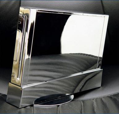
Watsham points to the design variations of the Gamecube and N64 as evidence Nintendo has not been afraid to experiment with visual design in the past. But even if the Wii U model was kept as it is, Watsham says changes in colour could have helped it stand out more. He offers some fetching blue, green and "executive silver" variants for your consideration.
Do you think changing the Wii U’s visual design would have helped it to attract more attention from the general public? If so, what kinds of changes would you have made? And while you’re at it, why not head over to our recent Talking Point on the Wii U’s identity crisis and vote in the polls?
[source gamasutra.com]


Comments 72
A visual design for the console itself would've been a nice change.
I think the look of the console is probably literally last on the list of mess-ups with the Wii U's launch...
That neon green would certainly be... Interesting.
Or this.
It looks pretty snazzy to me. I like their blue as well, though.
Although I do remember there being blue Wiis, it would still set it apart from the Wii if that blue was the standard console.
awh yeah a blue wii u
I thinks this guy might have hit the spot with what could hav gne better for Wii U.
If they ever release a 'princely purple' or 'dark plum' or a WaLuigi model... that kinda colour... then I'll definitely buy a brand new wiiU just for that!
I have an NES skin for my Wii U now, but I'd have shelled out good money for a console with a brushed steel & matte finish.
The shape is fine by me, nice and compact still. The name is what I don't like, would have preferred super-Wii if they had to keep the Wii brand.
I went to decal girl.com and got a cover that makes my wii u look like a retro nintendo as well as game pad. Looks awesome. Doesn't really help out the differential of the two though. Check it out for those of u that already have one if u want some pizazz.
i 100%agree with jools watsham.
Imagine a atomic purple wii u, classic design indeed!
I think he has a very good point. We all must realize that die hard gamers like us who spend significant time on blogs like these who are very knowledgeable on all things video games actually make up a very small number of consumers to whom video game makers target their consoles. To most people (parents predominantly) and kids who only see new consoles at their friends' homes, the Wii U does look very much like the Wii. or maybe the GamePad as an optional add-on to the Wii. And therefore, not really necessary to buy.
i'm not sure another color would have made a difference. just because Nintendo has a good history of releasing hardware in alternate colors. But I very much do agree that a totally different design would have helped tremendously. This is a very good observation and one I never really thought of! Might want to look for a newer design Wii U sooner than most redesigned hardware typically hits the market.
By the way, any update on Mutant Mudds Deluxe for the Wii U?
I think something that stood out a little more like the gamecube would of gone a long way for people not to be confused. Nintendo has been having a hard time telling people about its console. Something very different might of helped.
Redesigned hardware is very much not out of the question. It didn't take long for Nintendo to come out with the DS Lite very shortly after the first DS was released. They changed that hardware several times in a few years. This is definitely not out of the question. i'd bet the farm on seeing a different design in 2014 or 2015. I think jools hit the nail on the head. Yes, it's one of many things that went wrong. But it's something that will make a big splash and give a big bang for the buck. It would definitely give the Wii U it's own image to break away from any association with the Wii
I agree with him. I love my Wii U, but the main reason why people aren't buying it is because Nintendo never really put any effort on designing the Wii U itself. I think the name of the console is also a problem; if the Wii U console had an entirely different look and name yet the tablet controller was still the same thing, customers would know for sure that the Wii U is a completely different console than the Wii is.
i would love to trade my black wiiu for a green like in the picture from this article ))
That image fooled me into thinking there was a Mutant Mudds Deluxe Wii U bundle for a second.
I quite like how the Wii U looks but I agree that it could of in a different selection of colours that haven't been done on the Wii before it, something like a silver or purple would of made people think something like "this is a new colour, oh, it's new console" but that's just me tiredly rambling
Like plenty of others, I changed the backs of my N64 Controllers, In my younger days. It wasn't quite as simple for the Wii, as it needed a Y shaped screwdriver, but I eventually got one.
Colours? They "Define people's personality" (Not my opinion). Adding a selection of colours adds more 'freedom' to their taste. Maybe someone who already has enough controllers will buy more, just because they like... green. Speaking of which, would be a logical pick as a bundle: A Luigi green deluxe model, with NSMU and the Luigi mod built in. That's a Great Windwaker Model, Deathgaze!
True. The design is too similar and the name confusing for the general public.
I think the root of the problem comes in with it being called the "Wii U" in the first place. It could look exactly the way it does now, but if they gave it a name that made it clear it was NOT A WII then Nintendo would have seen a HUGE increase in sales. Even a couple of my friends who stay relatively up to date with gaming news thought it was just a peripheral for the Wii for a while.
When a big part of your demographic is small kids and/or their parents who don't know much about the gaming world, you need to make it clear to them that they are buying something new. My aunt even made a comment to me once about the 3DS saying "it's just another new name to try and get you to buy the same thing again" which obviously isn't true.
Nintendo just needs to be aware that the people they are selling too aren't looking for new information on games, so they have to be shown it very clearly.
The Wii u box is pretty ugly compared o the Wii. Still being similar didn't help the consoles case.
That blazing green would certainly have set WiiU apart from the Wii!
I do have to say... the WiiU system itself (not counting the gamepad) is kind of ugly in my opinion. The Wii display stand had that cool tilt that created a unique shape that was almost like modern art. The WiiU is just a generic-looking piece of hardware. The old Nintendo console designs always caught my imagination, all the way up to the Gamecube. Again, I think the WiiU design is just the next step in Nintendo's attempt to emulate Apple, but it seems to have not paid off. There are so many other design possibilities. I guess we'll just have to wait and see if Nintendo comes up with something fun and original for the next generation.
When it was revealed, I thought the name "Wii U" was bad enough. And then Nintendo went the extra step and made the console look almost identical to the Wii. Friends of mine were already a bit confused at the time thinking that the 3DS was just a DS but in "glorious 3D!" And for Nintendo to go and make the exact same mistake with the Wii U left me flabbergasted. I wouldn't be surprised if it gets a makeover down the road.
Man I wish console makers would get some more crazy designs/slash colors like they used to. It's just more fun. I'm buying a console to play games, I don't need them all to be slick black like some sort of luxury car. The fact that I haven't seen spice orange since the Gamecube really bums me out.
http://i.imgur.com/taNccuF.jpg
I would kill for that lime green one <3
yeah green is my favorite color personally, im honestly a fan of all shades of green and lime green is one of favorites, i woulda got that lime green wii u
I'd agree that this might have helped a little. However I really think that an all out advertisement campaign along with available AAA software titles is what would really make the difference.
I said the same exact thing in a post a few days ago.
That the Wii U should have a different Name, Color, and design.
@Void yes the Blue Wii U should be the next Deluxe model.
"Would a change in colour have set the Wii U apart as a brand new console?"
Not that nasty green color! I do like the blue one that @Void posted though!
I think Mr. Watsham is right. The Wii U does look a lot like the Wii.
I also hope we get some news on Mudds Deluxe soon.
I would've loved a Cobalt Blue or Mint Green/Light Blue Wii U.
@gsnap Oh man, that spice orange is beautiful! I love orange almost as much as I love blue.
I personally don't think that changing the color of the Wii U would make a difference in this mass confusion situation. Calling it "Wii HD" or "Super Wii" wouldn't change the situation either.
Remember that retail map pack for Halo 2 that came out back in like 2004? I remember seing someone in a gamestop pick up the box, shout out loud (at the top of his lungs) that that it was Halo 3. The box said "Halo 2 Multiplayer Map Pack" in huge blue letters on the front. That's what people are like.
playstation 3: everyone knows what it is
wii u: nobdy knows what it is
I dont think name is the problem here.
@Deathgaze i like that
i would of liked a purple color like on the 3DS something else besides using white again
I'ld be thrilled if Nintendo bundled Pikmin 3 with that green WiiU, but I'm admittedly odd.
I also know they couldnt release WiiU in anything other than black or white after the verbal abuse they took for the purple lunchbox that was the Gamecube.
So what you're aksing is, if the Wii U console had different or more colors at launch it would have reached it's anticipated salespoint by now...? I'm think NO! Games and marketing strategies/commercial problems have been the main issues in my opinion.
@demonta4 I see where you're coming from, but with PS3 there's kind of an obvious difference from PS2 and PS. The thing about Wii U is that it sounds almost like an add-on to the Wii. But you're right, it's not just a name problem. It's also a problem with the games library and with advertising.
I'll admit, a blue or red model would have been nice.
@Five-seveN So if they called it the wii 2
I would prefer a matted scratch resistant case. The current case scratches very easy.
When I first saw the wii U, one of my first thoughts was that it looks too similar to the wii. I love the simple design, but it makes it harder to distinguish as a new product for those that don't know anything about it.
I think that would have been better than Wii U. It might have helped differentiate better than Wii U.
I still think crap marketing and the name itself are the main causes for the whole confusion.
Mainly marketing.
@AcesHigh
You took the words right out of my mouth.
The Wii already comes in so many colors that a simple color change wouldn't make much of a difference, people would simply assume its another color variant of the Wii. The name isn't that much of a problem by itself after all the SNES was simply called the Super Nintendo.
I really like how sleek the Wii looks even next to the other consoles but nothing sets the Wii U appart from its predecessor, even Luigi has a distinct appearance despite being a palette swap of his brother. I'm also in favor of it because it makes consoles more fun to collect when they're so different from one another, even the seemingly unimaginative Sony consoles have their own distinct look.
The 3DS has/had similar problems, infact just the other day I had to explain why you can't play 3DS games on a DSi to my aunt but thats more of a problem of video format compatibility than outright hardware confusion (she thought you could forgo the 3D). Unfortunately for the Wii U that was the main problem with the 3DS, along with Nintendo's habit of making handheld revisions.
I'm telling ya, they should've stuck with the name Nintendo Stream.
Marketing, "current-gen"-comparable hardware, & attention grabbing games would have really helped. Also, Nintendo could have better named the console to distinguish it, as a successor to the Wii.
How about they just call it Universe with an emphasis on the U? I guess it could be considered a more personal console in that light, but regardless, they could have chosen a better name.
One problem I see is that the deluxe model almost looks like a big HDD.
My Wii was white. My Wii U is black! They are very different to me! Its like night and day!
There are so many hick ups they had with launch of the Wii U that when I think back to it I literally get a headach because THEY SHOULD HAVE LEARNED THEIR LESSON FROM HOW CRAPPY THEY LAUNCHED THE 3DS!!
I can't stand how the Wii looks, mine anyway. I don't understand how people can call it sleek. It's matte white and clunky as hell, and without the charm the GameCube had. On the flipside, I love the way my Wii U looks, glossy black, rounded edges, with that nice blue power LED and the white "disc in" light. I like the way it looks far more than any other console on the market.
I don't think a different design would've helped, nor different colors. (Sony consoles are always black, after all.) I like the name, but they probably should have given it a different one for the stupid masses. Ah well, too late now.
Terrible name, console which looks just like the last........what could possibly go wrong?!
People that don't know that Wii U is not a Wii are just idiots. Sorry.
I would love a midnight blue or a nice red Wii U. or if I could simply customize it myself online.
@BossBattles
agreed
@Void That blue is awesome! The green is too. I'm okay with the way the console looks, I think Nintendo has dropped the ball on getting the public aware of what the Wii U is. And why people need one.
@SunnyShores a nice RED console would be a perfect fit for Mario Kart U Bundle!
I rather have a "smoother looking Wii" than a PS3 that looks like a george foreman grill or an xbox that looks like it has dents on its sides
@Deathgaze
Please tell me that's legit! That would sell me a right now!
I don't see how they can be confused... Even a dumbo can tell them apart
Now this would be a cool look...
i would love some Wii U color variations.
MORE COLORS will help, anything to make it not look like a Wii will help.
At launch I would have liked to have seen a choice of 56 colours leading to an eventual selection of 32,000.
well i agree that the wiiU looks basically just like a medium redesign of the wii but then the gamepad is a drastic difference from the horrible wiimotes. but yea, i guess you could mistakenly think it was just an add-on for your regular old wii if you weren't too knowledgeable about video games.
personally i think they should have gone with a different name for the system altogether. i know they hope to cash in on the wii brand but that was a name to begin with and cant go away soon enough. a new name says, hey we have a brand new product and platform for you.
sticking with the straight white console color was probably a mistake too as again, it does make it look just like the wii.
I agree with him. Even though I like the name Wii U it confuses casual consumers. Personally, I think that GameCube purple would have been cool to contrast the green one as colours on the opposite of the spectrum! A metallic silver like the DS Phat would be a third option for people who want a less jump-out colour for their console.
And emeralds are my favourite, so I love greens, if that lime one had come out I would buy it cdhssjhdhwdcwhjhdebedcgdgerror:notimevalue
Ultimately, I would just like to see a console that has any easy way to switch shells a-la the GBA Micro. We already play games on our consoles lots, imagine the time you could have customising them to suit yourself! They could bundle several shells with it, and have an option to order more limited edition ones, plain coloured ones, and custom prints via Club Nintendo. It's just a dream... Sigh...
@TobieOBrown Ooooo. I would buy another Wii U for that. I wouldn't even think twice. Even if it was a matte black brushed steel....it would look awesome.
Maybe it's time to bring back Spice Orange, eh Nintendo? (Totally kidding. Don't do that.)
@jpfan1989 Sorry no, it's only a mock up from someone at Zeldainformer or some other site.
As everyone has already stated.
Whatever executives who thought WII U and 3DS were good names that had ZERO confusion, should probably be fired. There's also a ton more, like why the WII was pretty much and offline console, and why everything looks so " user friendly " which in same cases causes it to lack any deep appeal.
WII U has gotten better with their interface but still, Ps4 / Xbone is light years ahead.
@MadAussieBloke
The Silver look I would have bought without even askin what it was.
Also, on that developers examples of different colors to change the look...the Wii U is actually black (Well...atleast the version worth buying is...)
Show Comments
Leave A Comment
Hold on there, you need to login to post a comment...