Hello folks, and welcome to another edition of Box Art Brawl!
Last time, we looked at Star Fox 64, and gosh, it was quite a close match. Both designs are pretty great in our eyes, but ultimately Japan won the day with 54% of the vote, while the Western design managed to nab 46%. Well done, Japan!
We've got a bit of a doozy for you this time folks; if only because one of the designs here is hilariously bad. We're looking at River King: Mystic Valley for the DS, a Marvelous Entertainment game originally launched in 2008. We have Tokyo Game Life on Bluesky to thank for this one.
Subscribe to Nintendo Life on YouTube848k
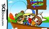
We have another instance here in which the game's titled was altered for its European release, so River King: Mystic Valley is now... Harvest Fishing. Not only that, but the accompanying box art is... well, you'll see.
Let battle commence!
Be sure to cast your votes in the poll below; but first, let's check out the box art designs themselves.
North America
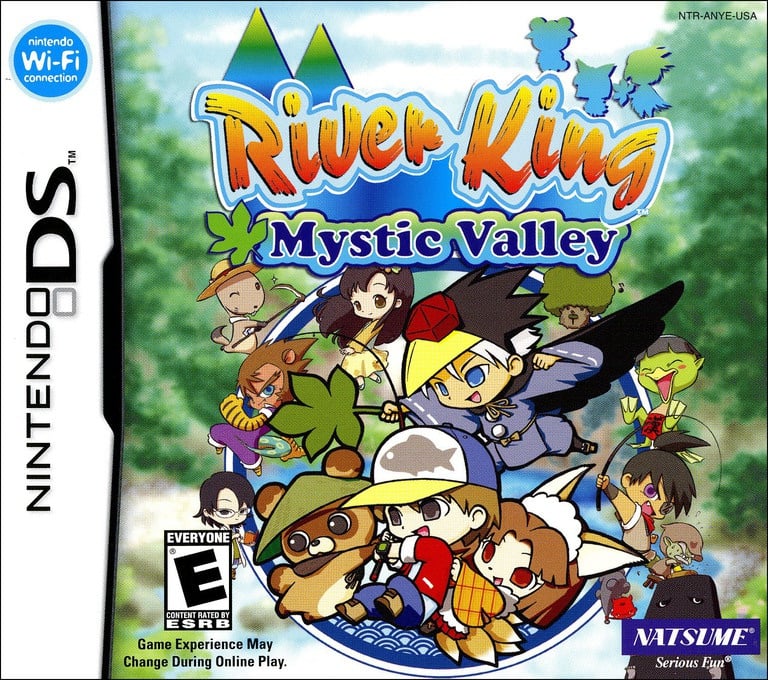
North America and Japan share many similarities with their cover designs. North America has its logo situated on the top, while the cast of characters makes up the bulk of the composition beneath. It's quite busy, but we reckon it works quite well; especially with the slightly blurred out background.
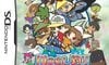
Japan
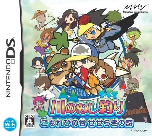
Japan flips things around and has its logo located on the bottom of the composition. We can't speak for you fine folks, but we actually prefer this approach. Our eyes are automatically drawn to the characters above (which are slightly larger here), and it feels like a slightly more natural layout. The background is also significantly lighter, which makes the characters stand out a bit more.
Europe
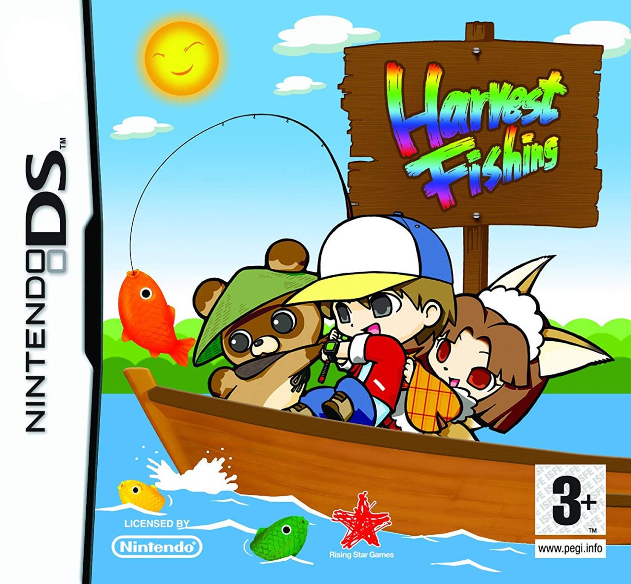
Uhh....
...
Okay, so let's vote!
Which region got the best River King: Mystic Valley box art? (1,703 votes)
- North America
- Japan
- Europe
Thanks for voting! We'll see you next time for another round of Box Art Brawl.


Comments 43
The European one is fantastic! Made in 5 mins by the intern, and proud of it!
Those two European kids and the Bear or is It a Tanuki ??? Need more exercise if it takes 3 of them to reel in 1 fish.
Japan for me as it shows more characters than the North American box art (although I kind of like the somewhat clearer background of the latter) and those are definitely part of the charm of this game - the European one even more clearly shows that the game is about fishing but yeah, otherwise isn't as good as the other ones.
North America, because the colours look more vibrant, compared to the Japanese cover. The main character looks like a classic Harvest Moon main character.
Edit: The European title probably wanted to say, that it is Harvest Moon but with fishing instead of farming.
I voted the USA version, looked the best of all.
The PAL version looked hilariously cheap and amateur.
The EU version somehow doesn't seem like the same game, which is weird, given that the same central image is there.
Voted NA for this one.
If I could make a suggestion for a future one?
Maybe one of the Pocky and Rocky games for SNES?
The european one was pure s***. The japanese one was the most artistic and focused one, while the american one was the boldest. I prefer art over 'money catch', so my vote go to the sensible Japan. In the eighties US too had artistic covers. Eventually it wasn't already dominated by marketing and 'money grab'.
europes getting dunked on but I like how simple it is, just like fishing. never heard of it, might have to try it. my fav fishing game tho is reel fishing paradise 3d for 3ds, a hidden gem.
What I'd like to know is why was the fish erased from the boy's cap in the European version. Especially when that artwork really zeroes in on the fact that this is a fishing game.
Quite Impressive how the EU cover manages to transform the game into what looks like shovelware.
European one is bad but I like the face on the sun 🌞
The US and Japanese have the reverse situation of the PlayStation 2 version of Dragon Quest 8. I think I actually like the clustered roster with the landscape in the background of the US better
But the winner is Europe’s MS Paint cover obvi
These two are nearly identical and ultimately it all comes down to the color for me, which is just a tad brighter on the Japanese one which looks more pleasant, so that one wins for me.
...what's that? There's three?
No no no, you're seeing things. There's only two and they're nearly identical and Japan wins again.
I voted for... the EU cover because it's the only one that makes it clear it's a fishing game. I don't find it that ugly, minimalist maybe.
The EU cover radiates pure “graphic design is my passion” energy.
What on earth? Who ok'ed that Europe one? No wonder I've not heard of this game I wouldn't have given it a second thought with that cover!
So, to me, the shoreline behind our intrepid fishermen on the European cover appears to be a ways in the distance, with a forest behind a dark green meadow which leads down to shore (you could argue it's a row of short bushes or cabbages or something, but...nah...) Therefore, with that perspective, the Harvest Fishing sign is COSMICALLY HUGE! I like to imagine the small agricultural village nearby, living in constant fear of the day a strong wind kicks up and blows over the hastily constructed monument to the harvesting of sea dwelling creatures, sending it crashing to the ground and annihilating them all before they can even scream.
Anyway, Japan wins.
This pick is so hilariously lopsided, I'm genuinely tempted to be the troll and vote for the European art. It does at least get the fishing part right!
But nah. The larger roster of characters in the others genuinely intrigues me. If this were like, an enjoyable RPG or something, I'd be tempted to pick it up to find out about the world, as well as who and what those characters are.
Like, is the fox eared person in all three arts a kitsune?
once again, the "clustered roster" says only "there are characters in this!" so Europe wins by default.
it's a poor drawing, but at least it portrays a scene, an action, a purpose, and a composition. 👍
We've got three versions of the cover to grade and yet the Game Profile says "Cover Unavailable."
The Europe one is brought to you by Microsoft Paint.
Europe got absolutely bodied with this one
Japan's edges out NA, i don't like that NA's circle touches the bottom of the box and the background of the Japan one works a bit better
I expected Europe to be quite a bit worse based on the build up in the article, but it is definitely bad. So bad it's good, perhaps, but not "so bad it's good enough to vote for" which is a saying I just made up.
I'm going to assume Japan's cover isn't as washed out as it appears in this image, and other images I've found seem to back this up. So purely on layout, I think Japan's is better. While having the title at the top is fine, I think it works better on the bottom. Japan's also manages a few more characters, which isn't always a good thing. But the NA cover fumbles with the additional logos at the bottom corners. Japan's logos don't get in the way of anything. Japan is my pick.
Graphic design is Europe’s passion. (I’m normally biased towards Europe’s boxart but I picked Japan this time.)
The European art is so bad you want to jokester (or pity) vote for it!
Otherwise it's pretty much a toss up for the other two, and the votes seem to reflect that.
The European box art is definitely cheap and quickly produced, but I can say with no irony that I like way more than the other options. The design for the NA and Japan box art is an enormous mess of unrelated character art that gives me almost no idea of what the game is. They’re so busy that I would not even consider investigating further. The Europe one is certainly unrefined, but it wins because it’s showing me a video game and not a nonsense collage of anime characters.
I'm pretty much a close 50/50 with the NA and Japan covers. I chose the Japan version though, since the NA one did removed some characters from the original.
I apologise in advance to the artists involved but these are terrible, sorry!
North American one, definitely. I don't like the Japanese one and the European one is just fine.
Could someone point me to the box art brawl that Australia won?
Europe, that what you get when you let your ten year old do your photoshopping.
Box Art Brawls Current Total:
Europe: 94
Japan: 90
North America: 109
Australia and New Zealand: 1
I prefer the Japanese here, the slightly muted color scheme feels a bit more natural to me.
Also, the ESRB rating takes up a tiny bit more space compared to CERO. Every bit of space matters when the designs are so similar.
I voted Japan, but I kind of wish the European's MS Paint one won. If only to teach us a lesson.
@AnonyQ It was Kuru Kuru Kururin's https://www.nintendolife.com/news/2021/03/poll_box_art_brawl_79_-_kuru_kuru_kururin
@HammerGalladeBro thank you!
Europe gets my sympathy vote, it’s so bad it’s starting to look awesome.
Voted for Europe because some of us had to...
Why is European version rated age 3 and up? I don't know the rating system as I am an american. Are there games for 1 or 2 year olds? Where is that one person who knows this answer...
@rvcolem1 Far from the only one that knows the answer, but no, 3 and up is the lowest it goes. It’s essentially the same as E for Everyone. I guess PEGI doesn’t recommend that anyone under 3 years old should play video games at all. 🤷🏻♂️
@-wc- You... seriously voted for Europe? I mean, to each their own, but it is objectively bad. The title looks like WordArt, and the fish are 3D for some inexplicable reason, and clearly pasted in with very little effort to make them part of the scene.
I respect your opinions and enjoy our banter here on this site, but I have to strongly disagree with your opinion on this one here.
@Daniel36
😂 you arent wrong!
but I made my case and cast my vote 😋✌️
Show Comments
Leave A Comment
Hold on there, you need to login to post a comment...