Hello folks, and welcome to another edition of Box Art Brawl!
Looking back at last week, we checked out Star Wars: Rogue Squadron for the N64, pitting North America and Europe against Japan. It wasn't even close either, with the western design winning with a resounding 89% of the vote. 89%! We quite like the Japanese design too...
This week, we're looking at Disney's Magical Quest 3 Starring Mickey And Donald for the GBA. Why? Because that's the one I found first, okay? Released in 2005, it was a port of the original 1995 SNES version and received fairly middling reviews, with most finding it to be a lesser game than its predecessors.
Subscribe to Nintendo Life on YouTube847k
But let's cut to the chase. It's a full blown brawl this week with three combatants. So let's get cracking!
Be sure to cast your votes in the poll below; but first, let's check out the box art designs themselves.
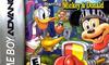
North America
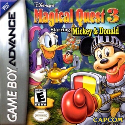
Europe and Japan share similarities this week, but it's North America that went down a different route with its approach. It's still got Mickey and Donald front and centre, but they're chilling out in a forest area, and Mickey is all kitted out in his knight's armour. Rad.
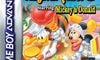
Europe
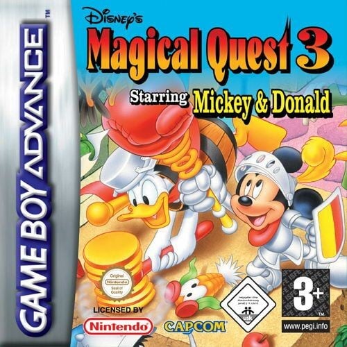
The European design seems slightly more action-packed, and Donald's wearing a different costume here too. Both characters are punching and whacking enemies, while the logo design itself is similar to North America's albeit with a dark shadow surrounding the letters.
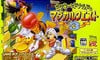
Japan
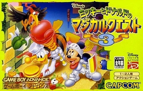
Japan's design uses the same artworks as Europe's, but you can see a bit more of it this time. We love the logo design here too, but we must admit that the yellow background is kinda gross.
Which region got the best Disney's Magical Quest 3 Starring Mickey And Donald box art? (2,009 votes)
- North America
- Europe
- Japan
Thanks for voting! We'll see you next time for another round of Box Art Brawl.


Comments 43
The Europe cover is very bright and cheery, and Don has a saucepan on his head, so that is my vote.
North America for me as it shows also Huey, Dewey and Louie caught by Pete, not just Mickey and Donald - that said, I appreciate the action in the Japanese box art and it showing some enemies, too (unfortunately for it the European one is just the same but cropped)!
Mickey looks off-brand in the US version
I choose USA version.
Oh, so this is not a port of Land of Illusion on the Megadrive? I have never heard of this on the Snes otherwise.
One of the rare Europe wins in my opinion. I find it better than the NA art, and while the Japanese one shows more of it, the yellow bar on the right bothers me too much.
The American version, ironically enough, looks like some hideous bootleg shizz.
I thought Europe was the clear winner until I saw that Mickey's extended arm can be seen punching the crow on the Japanese cover, making the EU art look like a weird afterthought in comparison.
@Mana_Knight Nah, it's the third entry in Capcom's Magical Quest series. The SNES version never left Japan, but the GBA port did. Really sollid platformer, highly recommended!
The US one is creepy
@NicolausCamp Ah, interesting. Thanks. Shame, sounds like one I would have enjoyed co-op with my brother as we loved the megadrive game.
Is North American Mickey threatening me! 😮
American one being a bit creepy with Donald and Mickey having their best time with Huey, Dewey, and Louie trapped three steps behind them 🤭
What the hell is wrong with that NA Mickey?
The USA art looks like immitation knock-off art. You can tell it’s not done by an official Disney artist. Like Mickey’s nose is all wrong.
Japan's cover looks just right and gives me these warm 90's Disney vibes.
@Dom_31 Looks like it’s rubbing Mickey the right way
I voted for Europe, but all of them look at least fine. I have nothing else to say here.
Don't know anything about the game but the forest background in the US one gives me magical vibes, so...
Edit: I do agree it looks knock-offish, especially Mickey...
Not a fan of the cropping on the western releases.
The US art Mickey looks like they used a carnival ride as reference …
Eurpe and Japan for me. The American version is wrong in so many ways. Looks like Mickey is holding something else in that area.
Like others said, Mickey looks off on NA. And Europe almost got my vote, but they just sloppily cropped the Japanese box art (notice the bird feet above Mickey). JP got my vote.
The US art looks like a knock off, Mickeys Face is just so off.
In the others the Face i typically classic Art.
The japanese looks the best
Edit: @1up-husky now i can not unsee it LOL
I had to pick Europe because that is some pretty questionable placement of that boxing glove in the North America version. 😂
I tried playing this a couple weeks back for RetroAchievements and genuinely hated it. I cannot stand platformers that lack any fluidity and punish you for tiny mistakes. Mad to think how the original Mario perfected movement that many years ago.
NA feels aimless and sloppy, went with Japanese cover art.
I also think Mickey looks off on the NA box. Perhaps it's an imposter or impersonator, maybe Morty Mouse or something like that. Mackie Mouse? Anyway, as someone said above, I do like how NA shows Pete and the nephews in the background, but that's not enough to put NA in the lead.
Europe's is way too cramped by all the logos. They just destroy all the space and leave no breathing room at all. The Japanese version is much more pleasant because it's not cropped or crushed by logos. Japan wins.
Well, to be fair Magical Quest 3 is probably the most obscure of the trilogy given that the SNES original was only released in Japan (we can only imagine was due to Disney deciding to get into console publishing themselves at that time in the west, surely taking down Capcom's license except in Japan)
Then the GBA port gave the game its official English debut but was released fairly late in the console's lifespan.
NA mickey holding his "weapon," pointing it at us with that look in his eye... 😬
@Daniel36
It looks like an airbrushed t shirt you'd see at a kiosk in the mall in the 90s
The wide format really brings the image to life for me, so Japan FTW! NA's feels pretty generic.
American box art Mickey looks like Temu Mickey…
Too bad, this one of these games, which are really expensive nowadays. I have the 1st one of these.
I don't know man, that Mickey looks weird on the first one.
And also I always thought that GBA banner thingy on the side of the EU/US GBA boxarts is really huge and ugly. So when it comes to GBA I might just systematically vote for JP just because of that thing.
I voted Japan, I don't like Donald's I Dream Of Jeannie cosplay.
@The_Nintend_Pedant Or at a European fair with off-brand characters next to the Bugs Bunny with a blunt.
Europe looks the most charming and nice to look at, kind of the point with a Disney product.
@larryisaman Dude XD...
@Fiergala
LOL yeah you kinda expect to see some transformers and unicorns in there 😂
I picked Japan but honestly it was a toss up for me between EU and JP (and I like NA usually fwiw👍)
@The_Nintend_Pedant In Germany ripoff Transformers art for car shows and stuff is absurdly popular. Makes sense, as someone who's worked with kids in the area, they love love "Autos" almost as much as "Dinosaurier" XD
Box Art Brawls Current Total:
Europe: 104
Japan: 99
North America: 118
Australia and New Zealand: 1
@The_Nintend_Pedant He's also holding the weapon completely wrong and in the wrong hand and now I feel ashamed I voted US.
It’s nice occasionally having games that I’ve never seen before come up. It allows me to be way more objective.
Was originally gonna vote for the Japanese one. It is very aesthetically pleasing and I dig the green. But after giving each thorough inspection the NA cover has more depth. There are story references with Pete and the kidnapped ducklings. Also Donald’s got that lamp which is just full of possibilities.
Mickey’s face is …. unfortunate.
And that barrel Donald is wearing in the other covers just gets weirder the longer I look at it.
I think they all look really nice
I went with the NA one, because it looks the most like a movie cover.
Show Comments
Leave A Comment
Hold on there, you need to login to post a comment...