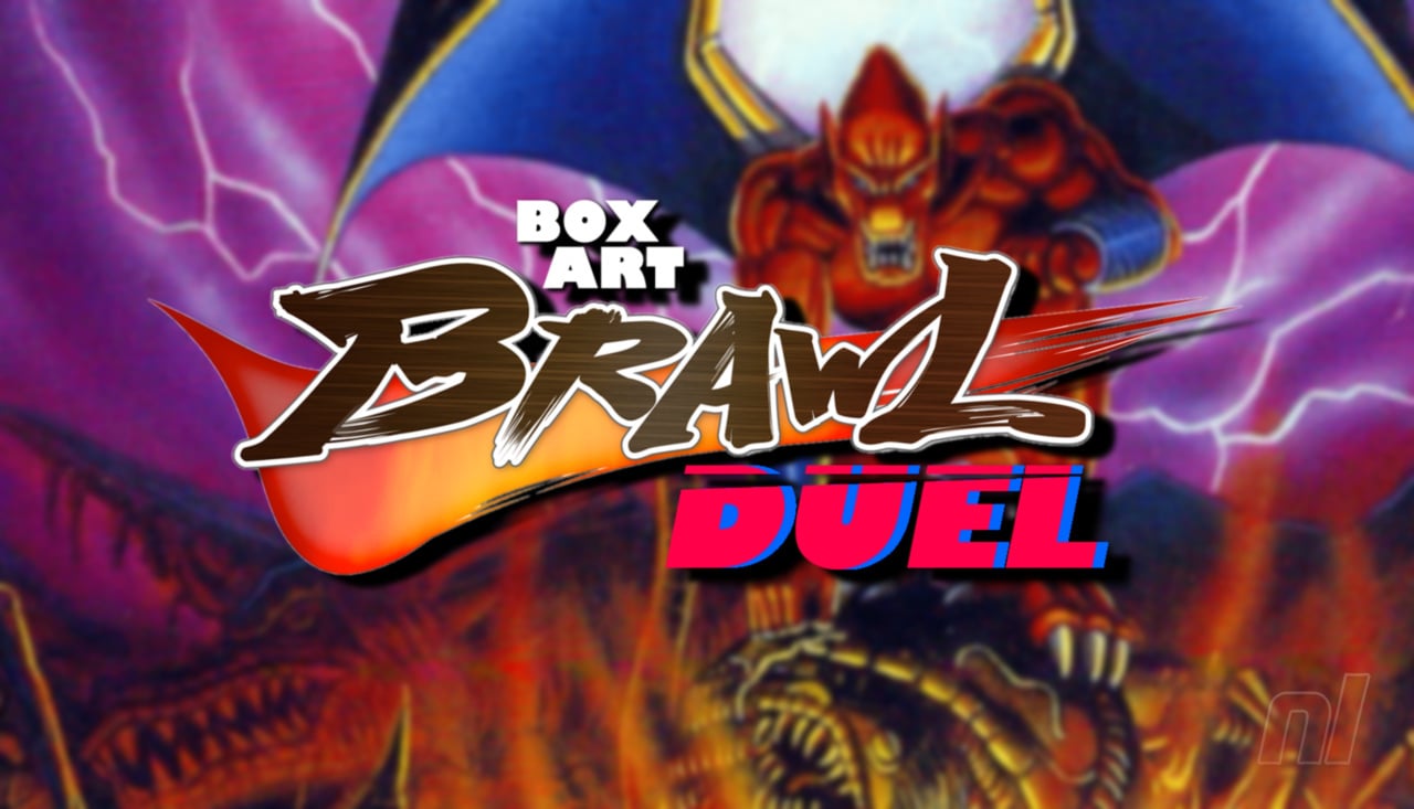
Hi folks, and welcome back to another edition of Box Art Brawl!
Before we get cracking with this week's battle, let's see what happened last time. We looked at Mario Paint for the SNES, with North America and Europe taking on Japan. Rather predictably, the Western design won the vote comfortably at 89%, proving that colour and whimsy will always win the day over clinical, 'modern' designs.
This week, we're sticking with the SNES to check out Capcom's Demon's Crest (or Demon's Blazon in Japan). Released in 1994 ('95 in Europe), the game is well regarded for its side-scrolling gameplay and is one of the many titles currently available via the Nintendo Switch Online service.
It's another duel this week, despite slight differences between the Western designs here; they're simply too similar to judge separately. So let's get on with it!
Be sure to cast your votes in the poll below; but first, let's check out the box art designs themselves.
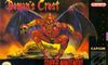
North America / Europe
What better way to advertise Demon's Crest than with an image of a demon? Seems straight forward, and it makes sense given that this is the game's protagonist, Firebrand. It's quite striking and we love the pose; a badass character clutching a skull will never get old.
Japan
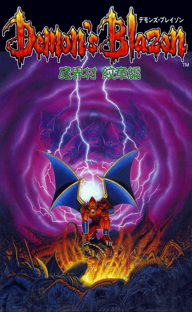
Utilising the portrait orientation of Japan's SNES games, this image has a lot more to play around with. You've got Firebrand front and centre again, this time staring down into what could only really be described as a gateway into Hell itself; at least in our eyes. The use of colour here is wonderful and the thunder bolts just make it all the more impactful.

Thanks for voting! We'll see you next time for another round of the Box Art Brawl.


Comments 31
Japan without a doubt, has more characters and is so much cooler!
Japan just kept getting better and better the more I scrolled down the page.
No brainer that one! And this week the majority actually agrees with me for once! Woo!
I only now noticed they gave him clothing in the western boxart to cover the nothing below the belt.
Yeah no arguments from me, Japan easily takes the cake this week: great composition, far more visually striking and Firebrand himself actually looks like a cunning monster rather than....whatever the hell his facial expression is trying to convey in the Western version XD
North America/ Europe looks like a classic.
Demon’s Crest = “Rar! Me scary!”
Demon’s Blazon = “I’m here to rock your underworld.”
I wonder what will win....
Box Art Brawls Current Total:
Europe: 78
Japan: 74
North America: 87
Australia and New Zealand: 1
Seems this one’s closer for me than most. After the cartoony green Firebrand on Gargoyle’s Quest’s box, I always liked the more serious looking NA art here. Side by side with Japan’s though, I have to admit ours looks a little Halloween Adventure-y.
I for once prefer the Western one, but I would love the japanese cover art to be the game logo admist a wall of fire (like the title screen… that would have been amazing)
It's nice to have a week where both logos are awesome. Japan's might be a clear winner, but the wests is still a great box art that just has to work within it's limitations.
This is always so fascinating. I'm working as a graphic artist for over 10 years now and sometimes I'm very sure people would pick a certain option and then it turns out it's exactly the opposite...
I was sure people would pick the western version .
Great A/B testing
By the way, this game is great. I tried it for the first time on the Switch NSO app earlier this year, and it really took me by surprise how good this game is. It plays like a cross between Mega Man X and Castlevania. I highly recommend it!
I voted for the Japanese cover, I like the vertical composition better. And I don't like that there's a screenshot on the front cover of the PAL cover, what's the deal with that lol. Screenshots are for the back.
Japan’s artwork is so metal
This one is an easy vote for the Japanese artwork.
I like both honestly. I cast my vote for the western box. I think the pose is what really won me over.
I think the NA and EU ones were different enough to vote separately, the EU one is formatted so you can't read the title of the game
Hell yeah that Japanese cover is FIRE!
Oh damn, I've never seen the JP cover before, I think metal af is an appropriate descriptor.
Also this game rocks. Capcom needs to revive the series.
Japan for me as well. The framing might be a bit too close for the western covers. I also think the depiction of the character isn't appealing enough for the market at the time too. The Japanese cover might benefit from being framed a tiny bit tighter than it is, but it's good. I like the background and setting details, plus it has a nice use of color.
Edit: I randomly was just thinking about Demon's Crest last night so it's quite a coincidence to see it in the morning for Box Art Brawl. I hope it's a coincidence....
@EarthboundBenjy Yeah, it's a very good game. At first I was mixed on it because it was obviously well made, but it was also tricky to know where to go. It's got a bit more exploration than I expected and more than I was looking for at the time. But I came back to the game when I was in a different mood, and could appreciate it more. In my opinion, it's one of the best looking games on the system. The organ music is a nice use of the SNES sound capabilities. The secret final boss is absolutely brutal. I thought "how much harder could it be?" and it turns out, insanely hard.
Definitely Japan's box art, it looks a lot cooler in comparison with the NA/EU one.
Good one. I went NA/EU and was mildly surprised at the result. Personally I have nostalgia for that style so resonated with me, feels more classic fantasy the JP felt more comic. Both great though
Japan’s hits so hard
@JohnnyMind
yeah while i do like the other one the japan box art gives me some awesome 80s metal album cover vibes.
Japan box art, no question.
"Better to rule in Hell, than serve in Heaven."
Sometimes less is more… this is not one of those times.
Amazing game!!!
Japan box art is my favorite (the NA box art is good but Firebrand never had that loincloth).
Amazing on both really. But the Japanese one takes it.
There has never been an easier choice. the JP version is badass and metal as hell while the NA version is a flying monkey man in a rubber suit.
For anyone else wondering what 'blazon' means (and sounds like - it rhymes with 'raisin'), it refers to a coat of arms or a description thereof. It can also be used figuratively for an ostentatious display. I had to look it up after seeing the Japanese title.
Tap here to load 31 comments
Leave A Comment
Hold on there, you need to login to post a comment...