Hi folks, and welcome to another edition of Box Art Brawl!
Last time we took a look at one of the Sega Genesis' finest games, Castlevania: Bloodlines (also known as Castlevania: The New Generation). It was a close call and it looked like Japan might have run away with the crown, but ultimately, the North American variant - with its bold colours and busier composition - took home the win with 42% of the vote.
This time, we're going to check out the GBA racing classic, Mario Kart Super Circuit. Released back in 2001, it received significant critical acclaim for its visuals and slick gameplay. For this week's edition of Box Art Brawl, North America and Europe will be teaming up against Japan, which once again utilises a horizontal landscape for its GBA box art.
Subscribe to Nintendo Life on YouTube845k
So let's get cracking!
Be sure to cast your votes in the poll below; but first, let's check out the box art designs themselves.
North America / Europe
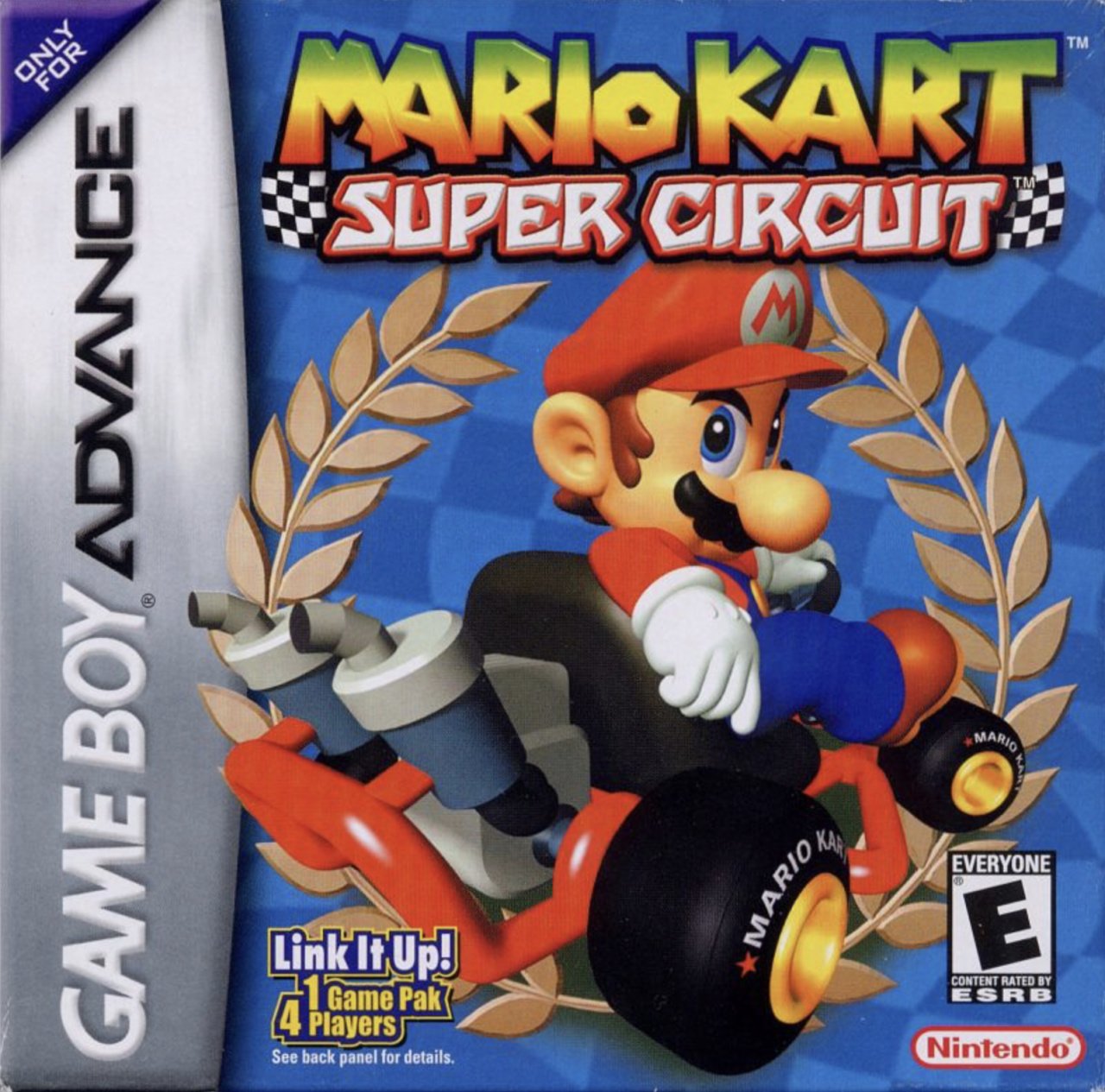
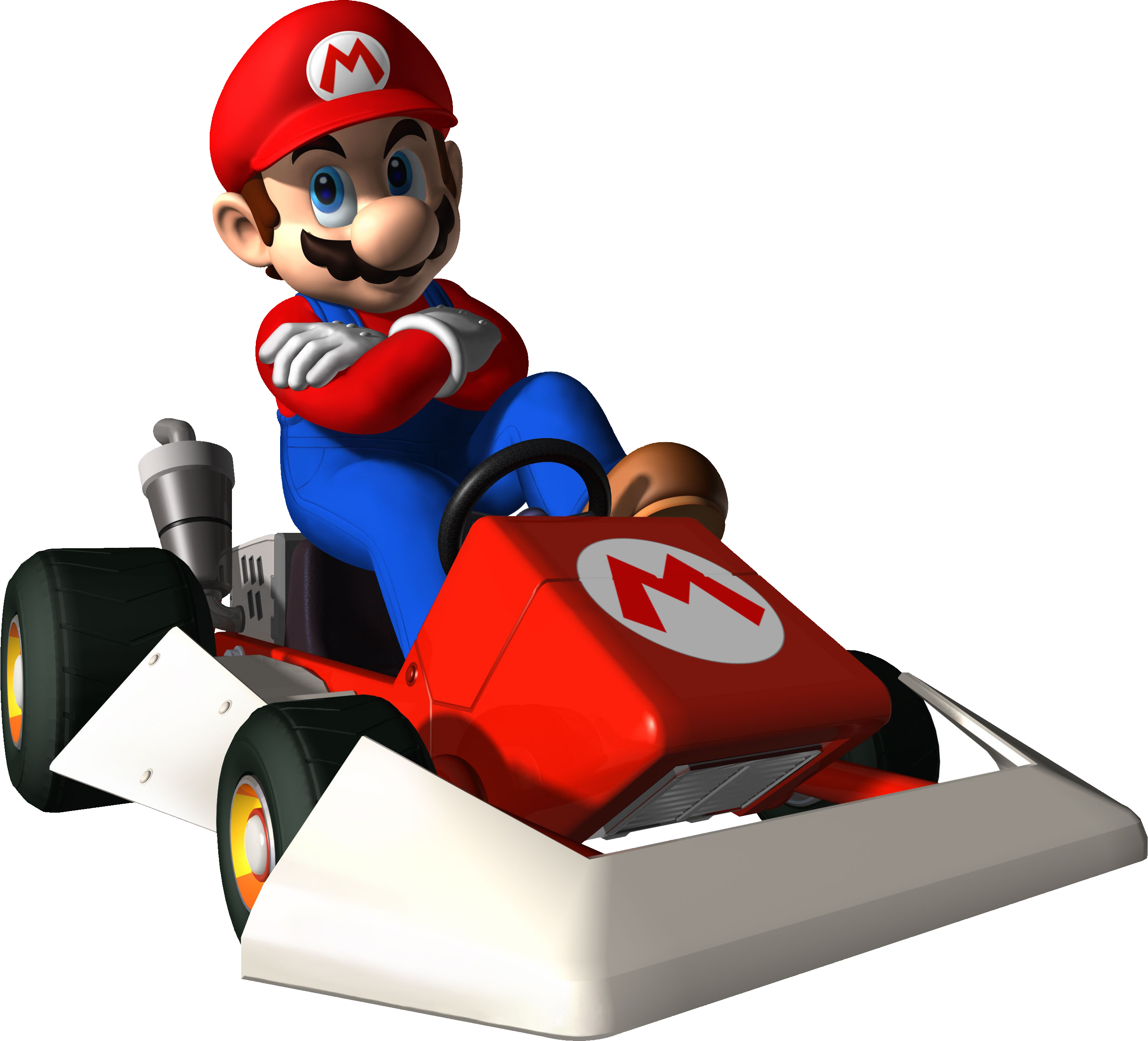
So this is the one we're probably all familiar with, right? It showcases Mario himself chilling out in his kart, looking back at the camera with a look of, uh... Determination? Seduction? We're not sure, but it's a striking image nonetheless, even if it lacks the inclusion of other characters from the game. The blue background is nice and we like the logo at the top, too - nice and bold.
Japan
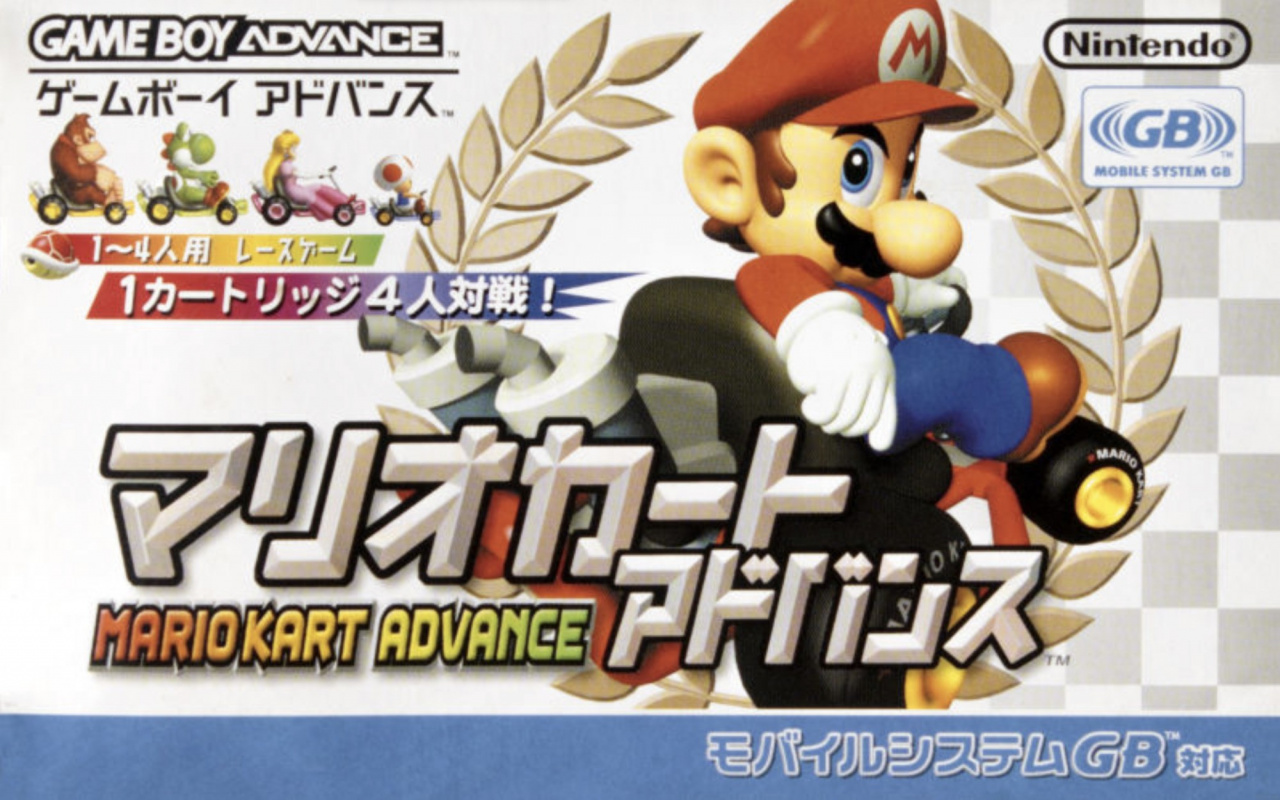
Japan's cover features the same image of Mario, but the landscape orientation allows for a bit more to be added in, including Donkey Kong, Yoshi, Peach, and Toad in the top left corner. The white background here is a nice contrast to the western design, and the Japanese text is very striking, indeed. We're kind of glad it wasn't called "Mario Kart Advance" over here, mind.

Thanks for voting! We'll see you next time for another round of the Box Art Brawl.


Comments 41
Going to have to go for the Western design. I like the bilingual text on the Japanese one, but the Western one just looks cleaner to me. Also, is it just these images, or does Mario look a bit desaturated on the Japanese one?
The white background just has more class.
@Zybrissa That is probably just from the quality of the scan
Europe/N America for the win.
I never liked these early 3d renders trying to look cool being used as "art".
Still have my copy in awesome condition in my GBA library 🥰
@GX_64 : The images are likely from different sources, by different people, with different scanners/settings etc.
The Japanese box scan looks a lot softer too.
I've been a lurker for a while, but I've finally signed up and this is my first comment!
Went for Japan since it shows more racers, they at least look like they're racing and are probably a reference to Super Mario Kart which is quite fitting for this game!
Although I wouldn't mind if North America/Europe won because I quite like the blue background.
There's hardly enough difference between box arts to garner a vs poll for this game's cover art. It's basically choosing between Japan format/white background vs NA/PAL format/blue background.
This is the worst games in the Mario Kart series imo.
@Axecon a Box Art Brawl is always necessary! But I agree that they are similar.
Not all that invested in this one, as I never owned a GBA and haven't encountered Super Circuit at all (sounds like I didn't miss much!), but I'll go with Japan again.
It's got more room for Mario's passive aggressive stare, and I'm not a fan of that big gray "GBA" overlay that eats up 1/4 of the NA box art.
Easy W for 'Murica
Japan, love that cover.
Japan all the way..... had this imported to the U.K back in the day, those tiny Japanese boxes were so cool, and those colour manuals.... with all that exotic Japanese text... those were the days...
I gave my vote to the North American cover.
Mario Kart Advance was supposed to be Super Mario Kart but portable.
both r kinda meh but japans looks way better. I think the title screen with all the characters would have made for an awesome cover.
I can't vote for either of them. They're bland and simple.
@LillianC14 I haven't played every Mario Kart, but I'd say the original is the worst
Western cover easily. I think the blue background looks better, though the Japanese cover image I've seen elsewhere had better color saturation than this one. But I also prefer the western layout as you can actually see most of the vehicle, which is covered up on the Japanese one. The extra characters in the corner don't really add anything interesting either.
The text covering Mario and his kart kinda ruin the Japanese one so I voted for the North American one.
I like the white color better but the text covering the kart is a little annoying so I voted NA/Europe. These are much more similar to each other than we normally see in these box art duals though since the central picture is identical.
I do like this game, it's kind of like a new game and a remake of Super Mario Kart at the same time, probably because it also includes all of the SNES tracks.
As for what box art I prefer I'll probably go with the western one. The blue background does the Mario render a favor. If only the box arts looked like the Japanese commercials https://youtu.be/FQxyOXZf3MA
Blue is my favorite color, and I think it "pops" more!
The western cover brings back some good memories. And it looks pretty neat too.
Box Art Brawls Current Total:
Europe: 44
Japan: 48
North America: 53
Australia and New Zealand: 1
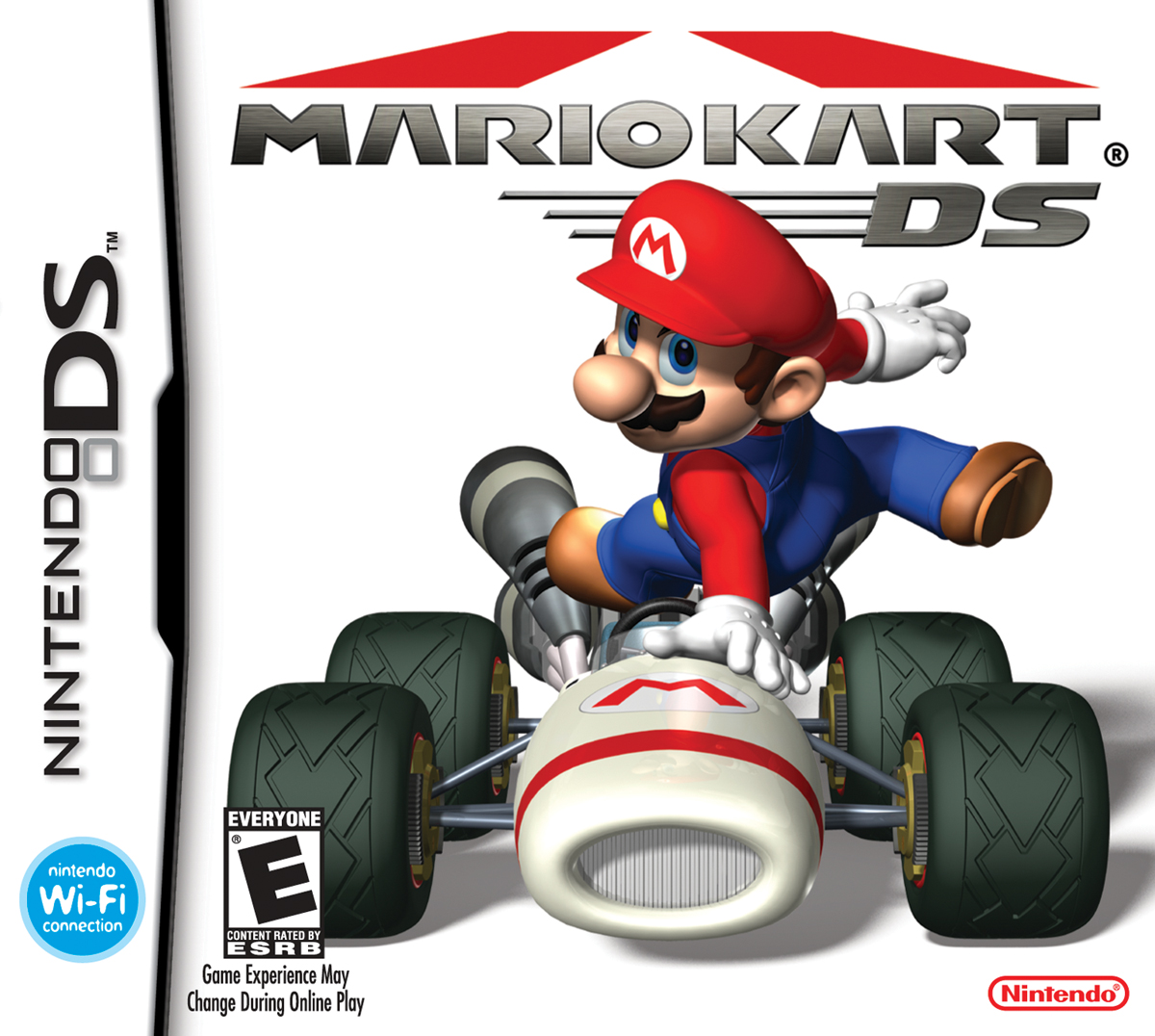
I recall the DS version having very similar art.
Recycling!
I'm defaulting to the Western artwork because I prefer the squarish shape (and the GBA banner) and I think it looks slightly better overall. But I never particularly cared for the artwork.
The authors of these posts should make sure to show good quality pics. Not desaturated scans. Some people will subconsciously be influenced by that.
I’ve thought this for a while, but Japan’s covers to me look more like posters than actual box art, and as a result, I’ve found it harder to pick them as the better box art since, really, it doesn’t seem like that’s what they’re even aiming for.
In this case, it seems especially apparent, as both use the same mario render, but where one uses it in a style that looks like a box cover, the other uses it in a manner more reminiscent of a movie poster. So, to me, the choice of “which is the better box-art?” seems pretty clear: the one that’s actually trying to be box art.*
@Shambo 3d modeling is art.
@KingMike You were probably thinking of this artwork:
because the cover is quite different despite portraying Mario "in" his kart:
don't like both that much, but japanese has at least some style
Gotta have to go with NA/Europe for this one. This Japanese box art looks really cluttered imo
Probably the most challenging Mario Kart, when going for the highest rank.
@SonOfDracula that's arguable. But that doesn't mean I need to like it.
@Shambo I’m just stating the facts, nobody is forcing you to like it 🥰
@SonOfDracula As sort of a creator myself, I understand the argument, but I think everything you create is a creation, and it only becomes art when someone else excepts it as such, on an individual basis. Which is why it is actually impossible to call yourself an artist, in my opinion. But if it's art to you, than yes, it is a fact that it is art. But not a fact that is necessarily true for everyone. I do recognise it takes skill to do it right, skills that I never learned let alone mastered (if it is possible to truly master a skill), and some people's mastery of those skills has me in awe.
But not the early 3d renderings, or any rendering, as that is done by a computer. It's not always clear where the skillful use of a tool to create something makes that creation a work of art... Maybe it's arbitrary, maybe it's ignorance or just a lack of understanding that leads to underappreciation or overappreciation... Fact: I don't know what's fact and what's not, I'm only quite convinced that nobody else knows either.
Glueing a banana to a wall or painting a canvas blue is definitely not art in my opinion and no one can convince me otherwise, however it can be argued that the act of convincing people that it is art, is an art. Not one I appreciate as beautiful or creative, but an art nonetheless. A con-art.
I just want to be clear, I'm not being hostile or whatever, simply enjoying the comparison between opinions about what art is. Letting the thoughts flow. But renderings never touched my "soul", you know... Not like a painting can. Just like how electronic music can never touch me the way an orchestra or live performance can. And I made electronic music myself in the past, I appreciate the technical skill, the input... but not the rendering, the output.
Ah well, I probably took this way too far already just to conclude that we agree: don't let someone else tell you what to enjoy and what not, as long as it's harmless, more joy is better I suppose.
@Shambo Very insightful post, deep thoughts. It feels like you are sharing your heart, and I respect that. It's interesting that you say you are "sort of a creator," when I would simply say that you are a creator. I agree that it takes another person's appreciation to help feel a connection to the depth that the various artforms we participate in can help us feel. You nailed it when you said that it needs to touch your soul, or in my case, make me feel something meaningful. I appreciate that you took the time to write all that, since most of the conversations on this site resort to pointless arguments and trolls trying to rile people up.
I'm a different kind of artist (martial artist) so I understand where you are coming from. I'm also a long-time musician, but I'm in a position where I don't perform, so I just play for myself. It works, even though I miss performing. One day, I will return. But, thank you for the meaningful post.
@SonOfDracula I had a period where I made abstract birds from anything I could find, leading to many different pinecone "owls", a black demon bird that is the smoke of a molotov cocktail he's holding himself, made out of mostly steel wire and wallpaper tape, and a voodoo looking owl made of the roots of a dead plant, some bark made into an owl mask, twigs, leafs, and a whole bunch of spider webs that came naturally. Together with a skeleton puppet carved from wood, of which the string is a rope he's hanged with, and the handle is a branch on which he's hanged, these are some of my favourite creations.
I used to do kick boxing and regular boxing, and I really appreciate the art of fighting, even though I stopped because I couldn't take it beyond friendly sparring since I cannot overwrite my nature of not wanting to harm any living being and not enjoying a competitive environment, and couldn't overwrite my reflex to bend my knees inwards instead of outwards to take a low kick. Whenever I wanted my fists to be somewhere, that's where they already were though, and being on an all fruitarian diet back then, still vegan and straight edge now, made me unbeatable in terms of raw energy, swiftness (while I'm typically slow in daily life) and taking punches to the guts and liver (no toxins in there), among the people I trained with. So I had my advantages, but some disadvantages that made it impossible to compete. I still have my gear, and punching bag hanging from a branch of a tree in my forest for some physical excercise, mostly bare knuckles though. As a kid I wanted to play saxophone or accordion, but I never dared to ask my mom as I knew she was already struggling financially to raise us kids. Now she tells me she would have found a way to make it possible if I had asked. But yeah, a solo artist just performing from the soul, whatever "mastery level" they're at, very easily touches my soul, so please remember that if you can do that, you may not always know it just happened, but you can always know that it does happen. I tried putting soul in electronic music (mostly either very chill, very dark, or extra-experimental-extra-trippy trip hop), but the output never matched the input in effort, and the input was too technical for my liking anyways.
As a creator though, I've always had people tell me to "do something with my gift", as in "make your passion your job" (because I'm already doing something with it, I create). I can't. I hate everything that is "just a job", and cannot let my passion become that. I can only create when inspired, and I cannot sell what I poured my soul into. I guess that's the curse of some "artists", and part of what keeps us "poor". Or rich, if you ask me. I have freedom, no price tag on my soul, small things can overwhelm me with joy (but also other raw emotions), and I have a lot of experiences and lessons money literally can't buy, as they come with "poverty".
Yeah even when you try to avoid bashing heads and clashing ego's online, human communication reduced to written text (other than poetry) seems to me as if it is DESIGNED to create conflict and only escalate it. Or at least the "new speak" "doublethink". Or it is just human nature to want to enforce one's own opinion politically as "law", while not wanting to have someone else's forced onto oneself.
Show Comments
Leave A Comment
Hold on there, you need to login to post a comment...