Don't you just love when someone applies scientific levels of study to something very un-scientific? It might sound a bit pointless, but that's how we end up with beautiful pieces like 4-hour video essay deep dives into a non-existent theme park — and Xelshade's wonderfully detailed examination on "What Looks Like A Pokémon".
Posted to the Pokémon subreddit on November 15th, Xelshade's analysis includes — like all good scientific theses should — a preface, experiments, data, and a summary. Honestly, our university essays never looked this good.
Subscribe to Nintendo Life on YouTube845k
Xelshade's experience with Pokémon comes from their own experience as a "fakemon" designer — the practice of drawing original artworks that look like real Pokémon designs. After deciding that Pokémon need to be neither animalistic nor soft and cuddly, Xelshade gets stuck into what they call the "four factors" of good Pokémon/fakemon design:
- Colour count
- Level of detail
- Anatomy and proportions
- Relatable features
We're not here to regurgitate the fantastic work that Xelshade has put in, of course — we're here merely to highlight it — so you should head over to the thread for the full insight. To summarise, though, it turns out that what most good (or recognisable) Pokémon designs have in common are these four things: 2-4 colours, a moderate level of detail, stylised anatomy, and relatable features, e.g. human features, like eyes and limbs.

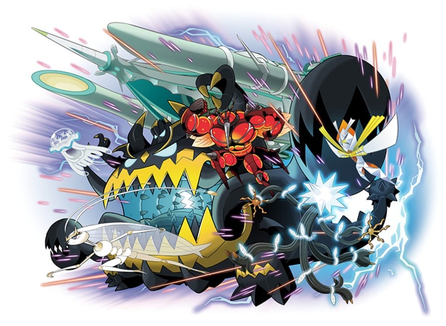
Of course, these aren't hard rules. Mega Pokémon, Ultra Beasts, and most notably, Ditto break most or all of these rules, and Pokémon's designs appear to be shifting over the years towards more colourful, detailed new creatures.
But Xelshade says it best in their conclusion:
What’s left is to answer the question….does it matter? Even if Pokemon’s style and brand identity are changing, maybe all that matters is that enough people like the new stuff. THAT’s the subjective part.
With Pokémon Scarlet and Violet due out this week — and with reviews coming in lukewarm — perhaps that's something that we all need to keep in mind.
[source reddit.com]


Comments 11
“Worthwhile-use-for-that-university-degree, I choose you!”
they sure did address the core of the matter at the very end: it's all totally arbitrary and to the whim of TPC
The recipe is simple: whatever GF says looks like Pokemon….looks like Pokemon.
So basically, it doesn't really matter how much you follow the rules, you just gotta fakemon it 'til you makemon it.
I personally prefer humanoid looking creatures so that's why I prefer the creatures design from Yokai Watch games than Pokemon games.
The rule is: Don't make it look like a Digimon. Less learned.
@Anti-Matter
I'm the opposite. Some humanoid 'mon look good, but I prefer creatures and monster designs
I feel so vindicated to hear another artist actually gets it!
Also, the "2-4 colors" and "moderate level of detail" suggestions are just nice character design rules beyond Pokemon. Comics and animations are already tedious work (especially if you're indie). The last thing you need is to add over-designed characters or creatures to the mix in most cases.
I definitely feel like newer pokemon tend to be overdesigned. I think the best ones are those that manage to look distinct without a bunch of random patterns and accessories stuck on them.
@Dom_31 Read the caption
Be the Pokémon, not the Digimon that follows all those exact same design rules…
Show Comments
Leave A Comment
Hold on there, you need to login to post a comment...