The graphical overhaul of the upcoming Pokémon Diamond and Pearl remakes for Nintendo Switch has been a major talking point. The sprite work from the original games has been replaced with cute 3D graphics and well...not everyone is impressed. There have also been some criticisms about the quality of the visuals.
It was recently discovered in the Switch OLED trailer how the game's graphics had been tweaked - with more detail and a lower camera angle, and now during this week's Pokémon Presents, we've got a proper look at all of these improvements.
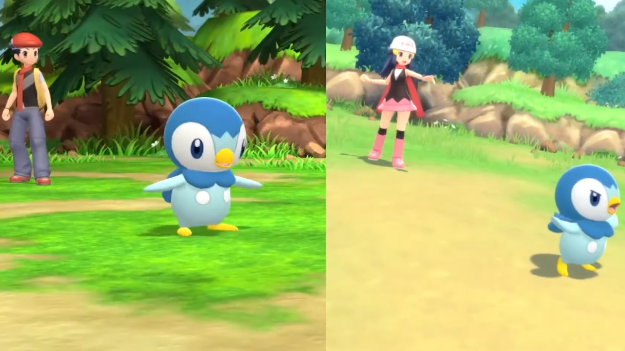
 Watch on YouTube
Subscribe to Nintendo Life on YouTube845k
If you're still wondering just how different the latest trailer is from the original one (dating back to February this year) YouTube channel Game Bash has now shared the following video (see the 5:00 mark above). The new trailer footage is much brighter and features more detailed graphics and lighting effects. You can also pause on certain parts of the video to get a better look.
So, what do you think? Are you impressed with the improvements on show in the latest trailer? Tell us down below.
[source youtu.be]


Comments 70
They improved the lighting, I will give them that. But the foundation is still very drab and not crisp at all. They played too hard into making it DS-style.
More detail? Those rocks definitely look better in the original trailer. I have to say I'd rather they hadn't upped the detail as it just looks so blurry. In my opinion the original trailer looks more cartoonish and a better representation of the series than what we have now.
Well, quite impressed i guess. 🙂
The fashion customization was pretty interesting for me.
@Kiz3000 Yeah, I thought the same thing.
I can understand now what they wanted to go for - multiple art styles to cater to any player. I believe the chibi style could still be improved, but the anime style in this game has impressed me.
Whether you like the changes or not, I'm still laughing at the people who are claiming there's no real difference between the first trailer and now. Models lighting and textures have changed all over.
IMO it's an improvement, with an attempt to land a more consistent, painterly art style throughout the game, whereas before the textures felt mismatched. Even if I do prefer the old textures in some cases.
It looked fine before, but now it looks amazing.
It looked okay before, but now it looks okayer.
I'm not convinced that any changes have been made
The colour palette and texture changes definitely make it feel more like Sinnoh, but the chibi models are disappointment for me.
I understand that it would force everything to be rescaled to match the characters but it would have made it feel more like a remaster. Right now it looks like a (well made) mobile game and then they added some blur effects.
The lighting is better but honestly they tried way too hard to make it basically look like the DS game translated to 3D and there's still a super plastic-y look to some of the environments
All the bloooooom
It looks amazing now. It looked terrible before.
Lighting is better now, but yeah I think there’s a lot of new screens where the brightness is too high. Not a lot of contrast
This trailer made me realize that I'm still burned out on Generation 4 battle music from all the online battling I did. So glad we're not stuck with one song now
Let's Go still looks graphically better than this to me. Honestly, Let's Go was pretty close to perfect if they'd just added the ability to battle wild Pokemon, throw a pokeball with a button press, and leave the original trainer's teams the same. Basically it just needed a classic mode. If they'd done that and just continued the series remakes as Let's Go games I'd have loved to see Gen 2, 3 and 4 remade in that style.
They could be running multiple concurrent series and hitting all the different kinds of players that want Pokemon games. Like an open world? Legends series. Older players looking for classic or tougher Pokemon? Let's Go. Younger players new to the series? Whatever the latest gen game is. For compatibility of trading and such they could even just say games in the same series are compatible with each other and Pokemon Home. Then use Home as the central hub for all things Pokemon. Or you know...keep throwing things at the wall and see what sticks or whatever.
Anyway, looking forward to picking up BDSP soon. It'll be nice to revisit Sinnoh.
I’m glad it looks better. And they added poke seals back which I am very excited about because I can make a Palkia appear with “BUTTER” appearing in bubble letters again so that’s nice.
I didn't mind it before, but I'm glad it looks better now
Having seen the differences I can safely say the first trailer looks better. I just finished Link's Awakening for the Switch and then the 1st trailer dropped. It was great. The enhancements on the models is a lot better but now everything looks washed out and drab. I just wish they could have an option to switch between the 2 "styles."
I thought it looked a little better when I was watching the most recent stuff, but I couldn't really put my finger on it.
I honestly think i'm gonna purchase the game now. I was kind of skeptical at first. It wasn't the graphics. It just didn't excite me. However after this Pokemon Presents, I have confidence in now. Heres hoping its good
Anyone claiming there isn't any difference from the first trailer versus the latest one is being extremely disingenuous. I'll acknowledge the comments about the brightness being up way to high in the newest trailer. But beyond that, the game itself looks dramatically better
Looks better. Still wont be purchasing though. Waiting on legends.
I can live with the changes. Though I prefer the higher contrast in colours and lack of blurriness the old version had.
I prefer the first, now it’s all blurry with pastel colours.
It doesn’t really matter though, as long as the gameplay is good. Hopefully they’re spending more time there than making it look all dreamlike…
@Kimyonaakuma I really don't understand you and other people comparing it to a mobile game. Most mobile games don't look nearly this good. Most of them don't even have comparable graphic styles or even an VFX budget to match...
I'm okay with the chibi design, but I wish they did a three-head tall chibi, instead of two. The super deformed look doesn't look good outside of like, merchandise. Also it makes things like walking animations looky doofy as heck
Lighting is improved for sure, but the character models all still have this “plastic” look
@xzacutor
I feel exactly the same
New is too bright and lacks contrast, plus looks blurry.
Models do look better/more detailed
I also like camera angle, but the other "improvements" are a step back in my opinion.
Mostly Lightning, i personally like it
Looks similiar to dream zelda game remake..????
I prefer the style of the more recent trailer. The games really weren’t on my radar after seeing the original trailer as I never played Diamond and Pearl as a kid, and I wasn’t thrilled about the chibi-esque art style, but the more recent trailer makes me want to give it a try.
Doesn't look wonderful. Fortunately it should be playable.
I didn't mind the original style in the first place, but this is definitely an improvement.
I wish the character models used in battle were the ones used in the overworld.
Still looks like a waste of $60. Hope they don't ruin Gen 5's remake like this
The colors are all around more pleasant to look at now, I'm glad to see them improve these remakes.
They definitely cleaned up BD/SP and Legends. Kinda funny, because I remember folks scoffing at the idea that these games could possibly be optimized when they were first shown.
It's improved A LOT since the first presentation. The depth and lighting are way better, and the colors are better used. Now it actually looks fine by me, it's more similar to the Zelda LA remake, which was awesome.
I still don't like the characters, though. And the game itself doesn't attract me. Will wait for Legends.
I don't like this game's particular chili style tbh. I'm also not super into buying a remake so I'm definitely more excited for the other open world title.
I think it looks better
The funny part about this is this is a JPN game not a American or EU game so why does people not think they would use chilbi design is beyond the pale. People already ragged when it was on 2/3DS cart and now are the same people ragging on Switch release. It's more of re-make for Switch to sell more Switches and to keep consumers invested in the Switch as well. So this is more about keeping Nintendo gamers staying with Nintendo and getting new Switch owners back to Nintendo. So this also plays a part in re-makes.
@Pokester99 But it's an improvement in the visuals, that makes the final product look better. The lighting itself was a pretty big change, but they also added a depth of field effect, and changed the battle scenes drastically. They fixed the hands on the chibi models as well.
If you think it's not a big enough improvement, then why not make your own game, and see how "easy" that is?
Beyond the lighting improvements and the addition of depth-of-field blur, I think the biggest upgrade is that the chibi overworld characters no longer have enormous hands.
My biggest gripe is the character models. They look so goofy. The Let's Go games did a much better job of translating a 2D game into a 3D environment.
I think it looks cleaner with better lighting, but I feel like the overworld while bright almost looks a little too blurry. I do appreciate the updated character models.
It still looks like an upscaled 3DS game but it is an improvement than before.
I’m not crazy about the overworld character design. Something more reserved liked link’s awakening would have looked more like the ogs
Way too much bloom or post-processing, everything looks overly soft now. Also REALLY don't like the Octopath-style DOF effect on the maps.
Looks like a cash grab to me.
Looks washed-out. In first trailer everything was more vibrant and poppy like OLED (1st trailer) vs LCD screen
@Pokester99 And you can just ignore people who like something as well, without telling them they're delusional for having hope. You also have the choice to ignore Pokemon, and play other monster collecting games if you're unhappy.
No amount of changes to the lighting is going to fix the terrible looking character models outside of battle. They basically tried way too hard to mimic the look of the pixel art in 3D, which just doesn't work at all. What looks great as pixel art, doesn't always translate directly into 3D.
The difference looks like night and day to me, thought it looked o.k on the reveal trailer, but now looks much better.
@VoidofLight Hey, it's fine to disagree with someone and offer a counterargument, but never go down the "don't like it?" road.
That's being dismissive and shutting down an opinion you don't agree with. Not trying to be mean or anything just saying.
Remember this next time some armchair game developer tries to argue that games can't look any better between its reveal and release.
When people said remakes, I'm pretty sure they didn't want it to look like a DS style game.
@Kiz3000 yeah I agree they more of a rocky texture while trailer two has more of an oval flat texture but they still just might go with the original but who knows
@Donkey-Kong-Fan Well to be fair here, it's not like this some cutting edge next gen game. I'm pretty sure with the time they had and the billions of dollars generated over the years, it wasn't that much of a challenge.
It looks a lot better and it will most likely be a great experience for those who never played the original games but for me this trailer didn't do anything to convince me why I should double dip, which is a shame.
I am just interested in the gameplay but that is all more than fine visually
I wouldn't say it looks a lot better. I wouldn't say it looks better at all. Just different. Different is not necessarily better. But I also don't think it looks horrible for that matter, in either trailer.
Still not convinced for purchase though, otherwise.
It looks...fine, I guess? I'm in the camp of being a fairly casual Pokemon fan, and I keep waiting for one of the new games to entice me back. This one doesn't do it for me, but I guess I'm not the audience for it.
So, it looks like GF finally got the hang of HD lighting and bloom. Dynamite. :-/
@Pokester99 Are you being serious? Do you think that the only thing they've worked on for five months is graphical improvements?
@Pokester99 Yes. There's also the ENTIRE REST OF THE GAME that they're still working on.
@Pokester99 I’m not really a fanboy, given I actually pretty much hate the majority of 3D pokemon games. Sun and Moon were probably the worst experiences I’ve had with this series as a whole.
I’m just tired of you telling people they’re delusional for having hope, or enjoying the games themselves.
@UglyCasanova
Cash grab ?
I don't think so.
@Pokester99
I saw some improvements of the graphics.
Still great enough for me as a casual gamer of Pokemon games.
HA. ya no. honestly i think trailer one for the most part still looks better. more detailed, dark colors. trailer 2 honestly in half the comparison images looks less detailed and kinda washed out.
this game is just wasted effort lol..
It's good to finally see anti-aliasing in a Pokémon game. Good...
Show Comments
Leave A Comment
Hold on there, you need to login to post a comment...