Welcome to Box Art Brawl, the battle between box art variants from around the globe scrapping to win your vote.
Last time we lost our collective minds in the company of Eternal Darkness: Sanity's Requiem, although we regained our composure enough to see the metaphysical North American and European version win with nearly two-thirds of your vote to one.
This week we're a day earlier than usual just so we can squeeze in one final spooky brawl before November arrives. Resident Evil 0 launched on GameCube on November 12th 2002, very almost twenty years ago. It was subsequently re-released on Wii and most recently in remastered form on modern consoles, including Switch.
Subscribe to Nintendo Life on YouTube845k
That launch date meant that the game just missed Halloween and, more disappointingly, this dual-protagonist prequel failed to strike a chord with most RE fans. However, we rather enjoyed revisiting it with the remaster. No, it's not the best RE by a long shot, but as one of a finite number of old-school games in the series, it provides plenty of the clunky-yet-effective survival horror thrills.
So, grab your partner, keep your inventories strictly separate, and let's board the fright train...
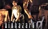
Japan
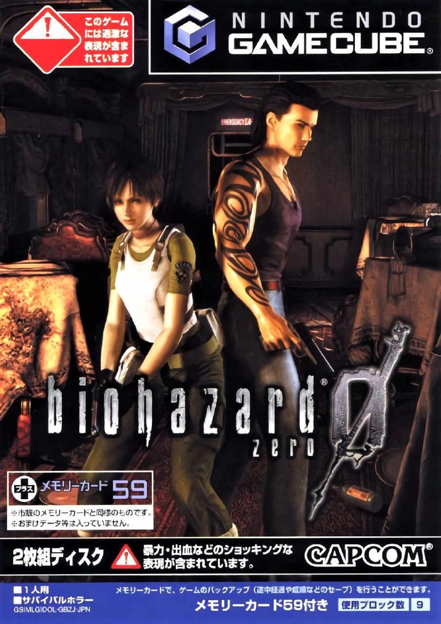
The Japanese cover puts Rebecca and Billy back-to-back in the middle of one of the train carriages from the start of the game, although it's not immediately obvious they're on a locomotive if you haven't played the game. Billy's tribal tats show that he's a bad boy, though probably one with a heart of gold, and Rebecca's S.T.A.R.S. shoulder badge will mean something to fans examining the cover.
The perspective is a little odd, and it's difficult to know if Rebecca's tiny or Billy's a giant, but the Biohazard logo is as cool as ever. Not bad, overall.
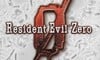
Europe
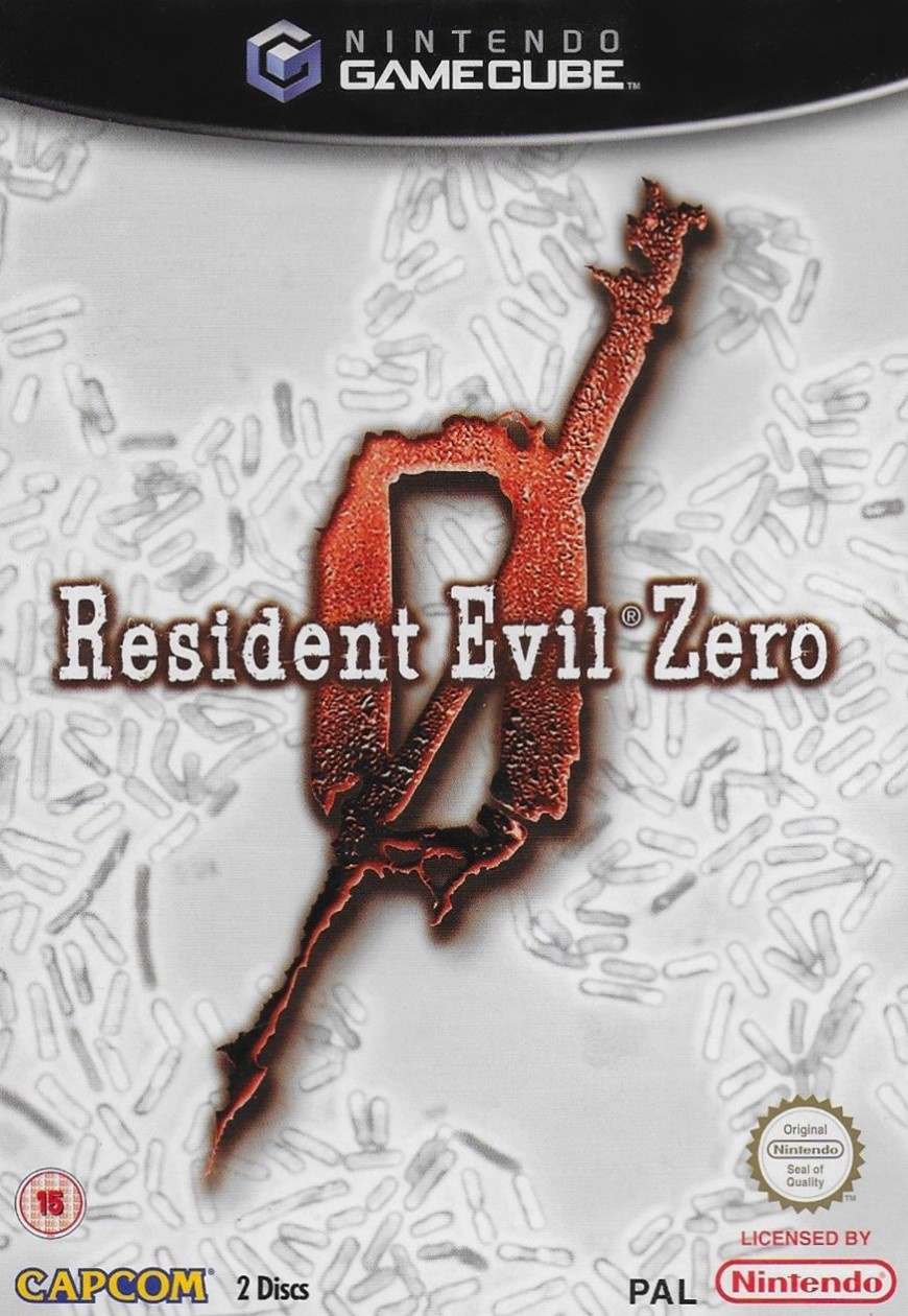
The European cover uses the classic typewriter font and the big red '0' logo over a white background showing a virus under a microscope. Which virus is it, you ask? Oh, just pick a letter — it's one of those.
Not much else to say, really. It's simultaneously striking and understated, but it doesn't really capture the imagination.
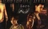
North America
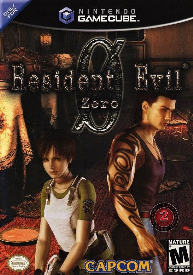
And finally, the North American variant uses the same key art as the Japanese box, but reframed with the logo centred at the top. In our opinion, the big '0' behind the logo font loses something as a typed character rather than a stylised scrawl, and the dark logo over a dark drop shadow against the murky train carriage background means the name of the game gets a bit lost.
It's a toughie this week, that's for sure.
So, you've seen the three options, but which is best? Pick your favourite and hit 'Vote' to let us know:
Enjoy Halloween, everyone! Stay safe, and we'll see you next time for another Box Art Brawl.


Comments 36
I think I would go with Europe as the other two are similar and look terrible - a better image might have been just the train car background with a zombie's hand opening the door, subtle and not too garish like the ones we actually got.
Europe's style just cannot be beat, so it gets the win this time around.
Guy 1: What should we put on the cover?
Guy 2: How about just a big zero?
Guy 1: That’s terrible
Guy 2: What if you put a stick through it?
Guy 1: !!!!!!!!!!!!!
I went with Japan on this one. I think there's probably a tad too much extra legal fluff on it, but it's the best of the bunch, imo.
@Robzilla
Woman 1: what should we put on the USA and Japan covers?
Woman 2: Let's just let the work-experience kid mess around with photoshop, what could go wrong?
Woman 1: Genius!!! Make it so!!! Also make sure you cut off their legs on the US cover.
@Lordplops Touché
No real winners this week, but the European cover is the clear loser.
I prefer the 0 in a bowl of rice..
The Europe one is so boring but none of them are really that good.
In horror, there's never a good reason to put the character on the box, as it often takes away from the overall eerie nature of the title. Europe's could have been better but it wins this round, not just for the simple design but for the really off colour palette. The other two look like terrible movie posters...
I like the actual art on Japan and NA's, but Japan has a bunch of legal stuff and the NA one feels too zoomed in, so I'm going to have to go with EU.
I'm not sure if any of these are winners...
All three covers need more Rebecca Chambers. Thus, the European version is completely unacceptable.
I'll have to go with the Japanese simply because "Biohazard" is a much better title than "Resident Evil"
They all kinda stink, but I went NA because it's the one I know and Rebecca.
Europe. The others, especially Japanese, are too messy.
None of them are really all that spooktacular, but I guess I'll go with the Japanese cover this week.
Man... they all kinda suck.
Happy Halloween folks.
Oh that European one is SWEET. One of the best covers I've seen.
The Japanese one has way too much text on the cover. Did it come with a bonus memory card or something?
Europe all the way. The cleaner the better
Not feeling any of them but I actually prefer the close up of the two characters in the NA one to the Japanese version. The white cover with the weird red zero and the e-coli type bacteria on that background doesn't all blend together for me in the EU coverart
NA for me.
Wow, these, all, suck.
Box Art Brawls Current Total:
Europe: 17
Japan: 21
North America: 18
Less is more.
They're all quite uninspired.
Europe looks like a placeholder image you find on online stores when the official art hasn't been revealed yet. But it goes straight to the point.
The other 2 are various degrees of "what should be do with that unused concept art now?".
Whoever designed Europe's box-art didn't do his/her homework: those are clearly bacteria, not viruses...
I don't think any of these are even remotely good. I find the European cover to be particularly horrible and the worst of the three. My pick for least bad, though still quite bad, is NA as I find the layout slightly better than the Japanese one.
@Laraishond And that is the one that is winning too.
I prefer the Japanese crop but I'm not a fan of the 3D models, much prefer the PAL box overall
None of these are very good . . . .
I'm curious about what all the warnings on the Japanese box say.
I quite like Europe but nothing will beat the cover for Resi 4 on Wii
@Robzilla That's how the military writes zeros so they don't get mistaken as an O.
I like Japan's cover. It has the train setting and the character models are the right size. On the US one, both Rebecca and Billy Bob are basically tiny haha
Show Comments
Leave A Comment
Hold on there, you need to login to post a comment...