Nintendo blew the doors off the Switch today with a special hour-long presentation which covered hardware, launch details and initial software. While the presentation also covered elements of the console's functionality, there wasn't much focus on how the system's UI will work, although images are now online which show the foundations of the interface.
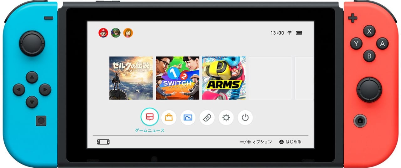
As you can see, the UI is quite clean and slick, with your games and apps appearing in the middle as large icons. The amount of unused space would suggest that home screen themes may well be introduced, just like they were on the 3DS.
Subscribe to Nintendo Life on YouTube847k
At the top there are three avatar symbols, which suggests that adding new users to the console won't be an issue. The icons on the bottom are "Game News", eShop, photos / screenshots (presumably?), Joy-Con, Brightness and Power. In the bottom right corner, it states that the plus and minus buttons open an options menu, while the A button is used to make selections.
While this is still an early image and doesn't necessarily mean it's the final UI, what's interesting is that there's no Miiverse option on this screen. Perhaps it is accessed elsewhere, or maybe Nintendo will add it in later on. A third (and we'd suggest unlikely) option is that Miiverse is being done away with.
What do you make of the Switch UI? Share your thoughts with a post below.
[source twitter.com]


Comments 80
Kind of reminds me of the PS4's UI in a way.
"Nintendo blew the doors off the Switch today" Well, you know, they kind of unlocked the door and left it a little ajar.
Looks nice, modern and clean.
I hope it feels like that too, and that it is fast as Sonic. Not like the slow OS on the Wii U.
I am very interested in the OS part. Can we expect other apps, like on a tablet? Netlflix and a Good Browser? Or is it only for gaming?
Is the OS build from scratch, or what kind of base have they used for it?
Also, how good does the OS work with the Touchscreen? Is there some kind of styles support, like with the Shield Tablet?
I still have so many questions....
No Miiverse = Bye bye Mii avatar ?
Well, it's okay for me...
As long there is a replacement for Mii with better details looking.
Is streetpass still there?
It was mentioned that the button on the left JC was basically a 'screenshot' button (to be expanded into videos), so it could be that the 'photos' icon is linked to this (and thus social features) rather than to real photography.
However you spin it, it doesn't seem like their pushing Miiverse like the with Wii U though, where one of the two screens was dedicated to it by default.
Well it looks nice just wonder what apps they will be using as i wonder if most of the rumors will be true.
Switch is just a portable Wii. Should've named it SWiitch.
Looks fine. Not much more to say really.
@Anti-Matter
Actually i think the Mii and miiverse will not removed. As if you look at the top you see three small balls of what appear to be Link , Mario and a Mii avatar
I like it. Looking forward to knowing more about the Switch's UI.
@Anti-Matter Not quite. Check the top-left of the screen, orange blob on the far right. Miis in back in action. In fact, this could just BE the button for the communication features, although then that brings up the question of how Mario and Link fit in. Maybe they're icons for specific communities? I can only speculate.
Now, I just want to play Zelda!
@Maxz
Oh, yeah. I saw that.
Because my thought like this. If Mii removed from Switch, then there is no Mii racer for Mario Kart 8 Deluxe, Amiibo costumes for Mii will completely don't exist.
Looks like a mix of DS and 3DS if you ask me.
Still not sold on the overly sterile look, but i think that themes can eventually fix that.
A little scarce on functionality though (assuming this is the final build of course):
No web browser ? MiiVerse dropped ? Nintendo Avatars instead of Miis ?
Imo, it would have been a smart move to embrace the "tablet" nature of the device, but thats basically high level nitpicking.
I have to admit though, the teased lineup DID convince me to consider the system, even though there are still some aspects that are questionable design choices
Looks a bit too clean for me.
Nice, simple and clean = perfect for me :3
Looks nice! Crisp, clean & looks nothing like the nightmare which was the PS4 XBM. All I really need to know now is what the catchy jingle will be when you boot the thing up.
Please not the launch-rave!!
They better bring in themes, its too white, needs a bit of character. If it has pictures, does this mean they have bought back the photo channel? That was one thing the Wii U disappointed me on was that removal. I liked seeing my photos on my TV
@teamshortcut I think they blew the doors off with the Switch but in the presentation people got the impression it was just left slightly ajar and not sure if they should come in or not.
Street pass is switching off as well I think. As it has been terminated at all open zones in the UK since last month.
A third (and we'd suggest unlikely) option is that Miiverse is being done away with.
I'm not sure if it's all that unlikely; they said that the "Share" button can be used to upload a pic to social media. They didn't mention Miiverse at all during the presentation, which has me a bit worried, since I only really talk about video games on Miiverse.
EDIT: Also, I really hope you can use a custom image for a theme, like you can with PS3.
@SanderEvers Darn, you're right
Well, that's one "concern" ruled out then ^^
Thanks for helping my bad eyesight out there
@Anti-Matter Actually, there's a mii icon in the top left. It's small, but we can see circles with characters in them. The third from the left is a mii.
I would be surprised if miiverse was removed because although it isnt a massively used thing it does make a great thing if specific games like Splatoon especially when Splafests were on and also Xenoblade when you are playing on the multiplayer servers so you get updates ingame about group objectives. I wonder if the browser, wiiu and 3DS service will remain the same and Switch games may have it within the games themselves to allow developers more creativity with it. Eg, Splatfest posts are viewed and created in game in a unique way but could also be viewed as standard posts on browser version of miiverse like they do now.
Simple and clean. Just the way I like it.
Looks nice and simple, I like it. I'll be surprised if they kill off miiverse, it's such a good social platform.
I think the interface looks too minimalist, the icons should be shinier and more detailed. But the games are more important than the menu!
I hope the background is customization. It looks way too bland for me.
I hope Nintendo adopt a Trophy/Achievements system to Switch...
Though, it feels like they're taking juuuuuust a bit too much inspiration from PS4's UI.
I like it, if you can customise like you can on 3DS.
And they better have Miiverse and Mii avatar pictures. Generally, I love Mii's. They are too great to get tossed away just yet.
Looks clean and simple, perfect for me.
About the trophy/achievement system or lack thereof... Meh, never cared for them and I doubt I'll care about them in the future. Bayonetta's and SSBB trophies, which unlock things are nice. Having trophies for the sake of it seems useless to me.
Nice and clean, the way it should be. Although i relly hope they bring back themes from the 3ds. it would be a nice customisation option.
I've a feeling Miitomo was part of this vision, as in managing your profile and friends via smart device. Switch will probably pull in its friends lists from FB/Twitter via Miitomo.
Miiverse, to be fair isn't really that great a USP
So there's less games on screen ... I prefer the home screen of the 3DS, honestly.
"At the top there are three avatar symbols, which suggests that adding new users to the console won't be an issue."
Thank you @Damo one of my major concerns relieved.
Side-note, I just gt a PS TV for streaming my just got PS4 but you can only stream the account linked to the PSTV, which stinks as the plan was for me and my kids to share it - 4 PS accounts in our home, just like Wii U - but now only I can stream my account. I'd return it, but it was only $23.98 at Target, so only I'm streaming, kids get the big tv for Wii U.
@Moon
Just like with the 3DS home screen, I am pretty sure you can tweak this to show a lot more icons / games.
Or at least Nintendo will release an update for this feature + folder support down the line. Exactly What 3DS and Wii U also got. In the beginning there will not be that many games or apps for the Switch, so no problem.
Don't worry
Nintendo better take my $$!! Rihanna voice
@Nintendian Swiitch. Very, very clever. It actually wouldn't have surprised me if they went with that. It is trademark-able too.
@zip I wouldn't worry about the interface being too clean. That means fewer resources for the ui, more for the games.
Looks like the PS4 UI which is pretty good.
But the Miiverse name is a play on the Wii name. If it's still there somehow, might it be renamed to something more Switch-related?
facepalm
Hey Nintendo, can you perhaps make settings and notifications NOT AN APP this time? Thanks
As much as I love Miiverse, it will lose much of its charm if you have to undock the system from the TV every time you want to post something =|
@dres Hopefully yeah.
I'll wait until they announce more...miiverse is pretty integrated into my Nintendo so hopefully they will keep it.
I hope Miiverse stays for Switch, I love uploading screenshots of my games to show other people. More often than not, I've met and chat to some really nice people there. It feels like a community where everyone matters!
@Vix Really? Well, with Nintendo doing ALL the innovation over tha past few decades, and the other 2 trying to copy and usually failing badly, so what if Nintendo borrowed an idea for once?
@akaDv8R I never said it was a bad thing. I think others should do the same, as it's a pretty slick UI. This looks even slicker.
I would love Miiverse back if it wasn't such a strict and censored service. I'd rather have Nintendo add a proper way of communicating and forming parties instead tho.
Miiverse died with the redundant retooling years back. Better to let it die and start anew, because it was really good back in the day. Certainly it was the best social media setup of its generation; never making you feel like you're shouting into a void of nothingness.
Orange + blue combination doesn't look too appealing. I like the black/grey much better.
Also I won't be buying the Switch. 300$, paid online, no games at launch except for Zelda, not enough third party support for future. Mario looked amazing but I won't be waiting till the holidays to play it.
Unless Nintendo drops the price, I can't see it selling either, in fact, I'd be surprised if it managed to surpass Wii U sales at this point.
@Dislikesfats Yeah and the PS4 and XBOX One are cheaper, including separately sold accessories. The general audience would probably chose either over the Switch because it has a lot of mainstream games, is cheaper and has a big userbase (most people pick up the system that's most popular in their social circles).
Looks nice! I'm not too fussed about Miiverse as I rarely use it anyway.
Looks clean, as long as it's not 2+years worth of accumulated lag like the WiiU UI was for no good reason I think it will work out great.
Orange and blue is kinda triggering me as a Celtic fan. Any green and white?
I like it. I think it's time to retire the Miis
I really hope Miiverse is added in by launch because it really gave the system a feeling of community for me. I am not particularly interested in posting to Facebook and Twitter.
I like the new UI, very simple and clean. Great Job
Looks like Miiverse could be the mii in the top left. But where's the internet browser?
Looks a bit too minimalistic. Only being able to see 3 icons at once is kind of crap.
Simplistic is a great thing for UI. It looks good to me, though maybe it has too much unused space.
I noticed a distinct lack of Miiverse artworks in the Splatoon 2 footage too. Of course the game is still in development so this might be something they work in later. I certainly hope it comes back though.
@Nintendian more like Nintendo Snap, with trying to make it a thing during the whole conference.
Top stuff. Switch is great. Love it.
It looks like there's multiple users, so why do the Parental Control setting apply system-wide regardless of user (as stated in the Parental Controls video):
https://www.youtube.com/watch?v=03bAayBtcb0
That makes no sense to me; I would think you should be able to apply settings relative to each user.
Nintendo never gives the full scoop and tricks you into buying a system based on hype, then when you finally have that system you realize what a pile of turd it is... That's the Switch in a nutshell
Very minimal but in a good way, I like it so far.
@impurekind I thought those "multiple users" were just friends online...
@duffmmann Ah, OK. That would make more sense if the comment in the Parental Controls video is accurate.
@Anti-Matter NOOOOOOOOOOOOOOOOOOOOOOOOOOOOOOOOOO!!!!!!!!!!!!!!!!! I CANNOT STAND THE THOUGHT OF THE DEATH OF THE MIIS!!!!!!!!!
https://twitter.com/BadMiiversePost/status/820013942261026819
Miiverse is dead.
Looks okay, that's all.
Clean. Sleek. Minimalistic. Pleasant but a bit boring. x)
Thank goodness, Miiverse was trash.
@Anti-Matter Nintendo Account/NNID has a Mii, and so MyNintendo. These are possibly the standards for a new era. Miiverse is gone for good, they'll probably let it rest with the Wii U and 3DS.
Looks good, but there's going to be a ridiculous number of games on this system, so they're going to have have some kind of zoom out so you can see more than 5 games at a time.
don't like it. looks too much like PS4, not playful enough. also no folders again like on PS4? lol. hopefully doesn't take 3 years to get folders like on PS4.
Nintendo has already announced that there won't be Miiverse or street pass. I'm not sure what the are going to do about Miis, but it looks like the third avatar(the yellow one) is a Mii character. ¯(ツ)/¯
Show Comments
Leave A Comment
Hold on there, you need to login to post a comment...