In the past, there have been a lot of conversations about ugly-looking Switch HOME Menu icons. Arguably the biggest offender was Snake Pass in 2017. The game icon was perfectly fine until one day it was changed to resemble something that looked more like a mobile app. Months later it was restored to its original state.
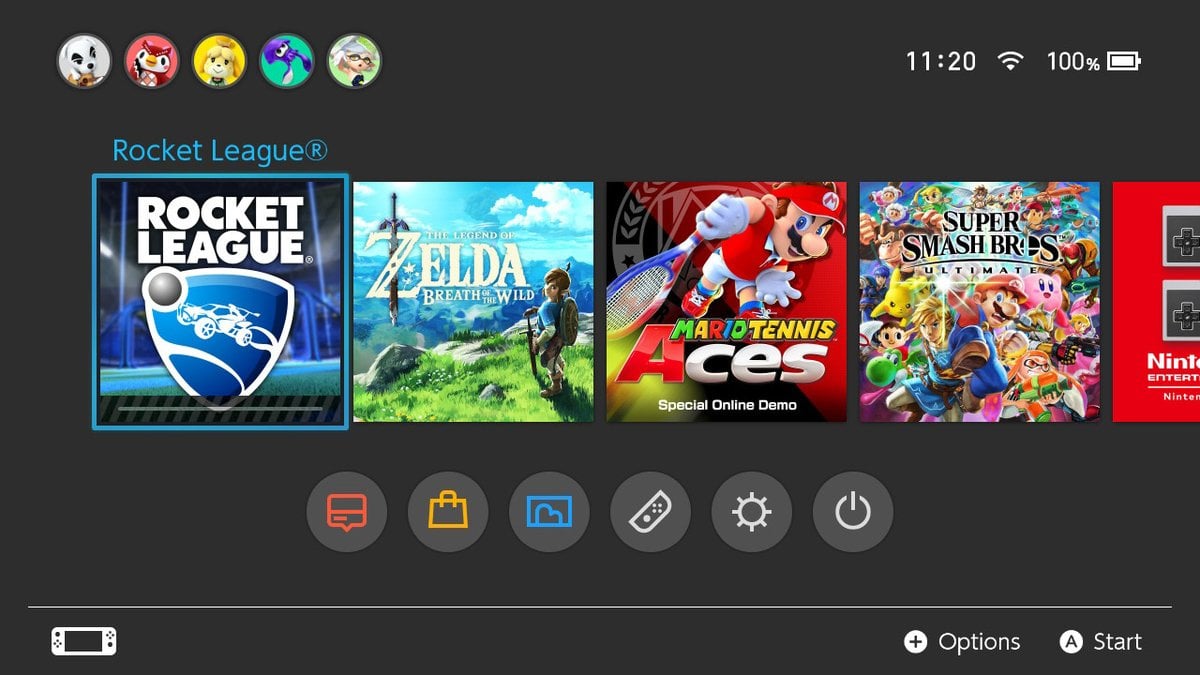
While there was nothing particularly wrong with the Rocket League icon in the first place, the game's developer and publisher Psyonix has decided to give it a slight makeover. As you can see above, the logo has been reduced in size and there are now three cars underneath it. For the sake of comparison, here's the original one:
Subscribe to Nintendo Life on YouTube848k
Apart from the new icon, Version 1.62 makes a couple of changes and updates to the game's audio and also resolves a number of bugs. For the full patch notes, click here.
What do you think of the new icon for Rocket League? Tell us in the comments.
[source rocketleague.com]


Comments 17
Here's hoping Sonic Mania gets a makeover as well.
If you look at the Switch clocks in the upper corners of the pictures, you’ll see there is a 36 minute time difference between when each of them was taken.
What does this mean? Absolutely nothing.
You should update the article to say that Sumo Digital did eventually (a full year after the ugly icon) change the Snake Pass icon to a better art made specifically for Switch. The way the article is phased leaves the reader with the impression they never fixed it (as opposed or compared to Psyonix now with Rocket League’s icon).
Is Rocket League filled with micro transactions? Or can you unlock stuff through progression?
The new icon looks way better and far more appealing, i like it a lot!
@mist there are micro transactions but they aren't necessary. I've been playing the game for years and never spent a penny on them. You unlock stuff by playing.
@blockfight
Thanks for that 🙂
@mist most items are visual cosmetics and don't affect gameplay. Only some cars differ slightly, but cars are equally good
Diablo III was my own personal favourite. Originally that was one ugly icon.
@kosmaty
Thanks for this info 🙂
@Deku-Scrub And 8% battery used!
@Dizzy_Boy
Thanks very much for the informative response. Very helpful
mist
Rocket league gets plenty of content updates as well, including music which is impressive.
Skyrim needs a better icon, so does Valiant Hearts, Velocity 2X, Dragon’s Dogma: Dark Arisen, Sonic Mania.
Those icons are all trash that can die in a fire. The games deserve to be represented better.
What region is that blue Zelda BotW icon from? The North American one is different...
I've always been really intrigued by this game and even played it a while back, and while it was fun, the learning curve seems too high and a lack of single player content just makes me worry that I'd never play it in favor of my pretty large backlog of single player games. Fantasy Life and Metroid Samus Returns will haunt me from the grave at this rate...
My breath of the Wild Icon dousn't even look like the one in the picture above. Is that a new Icon or something.
Show Comments
Leave A Comment
Hold on there, you need to login to post a comment...