WHAT'S UP EVERYBODY, WELCOME TO ANO.... *cough cough, splutter*
Sorry... We had to try the whole YouTube thing. Yeah, it's not for us. Welcome to another edition of Box Art Brawl, folks!
Before we get cracking with this week's undoubtedly heated battle, let's touch base with what went on last time when we looked at Donkey Kong Country for the SNES. Rather surprisingly, at least in this writer's opinion, the Western design for North America and Europe won comfortably with 72% of the vote. Y'all didn't like that gorgeous Japanese version, huh?
Subscribe to Nintendo Life on YouTube845k
So, this time, we're going to be checking out the delightful Puyo Pop Fever for the GameCube. Created by Sonic Team and published by Sega, Puyo Pop Fever is perhaps one of the more beloved entries in the Puyo Puyo franchise (and it still isn't on Switch?! Come on...), launching all the way back in 2003. The franchise itself is still going strong today with the latest entry, Puyo Puyo Tetris 2, launching on Switch in 2020.
It's a good old fashion three-way battle this week, so let's get cracking!
Be sure to cast your votes in the poll below; but first, let's check out the box art designs themselves.
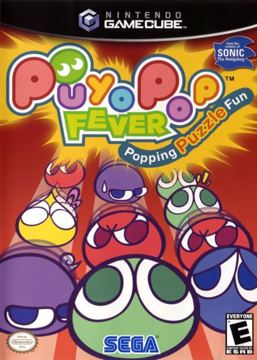
North America

Curiously, the North American release of Puyo Pop Fever is the only one not to feature the protagonist Amitie on the cover. Instead, we've just got a bunch of the signature, slimy Puyos lining up from front to back. It's perhaps a good indication of what the gameplay is like in the title, but we'd be lying if we said it was an exciting and bold design. It's fine, we guess.
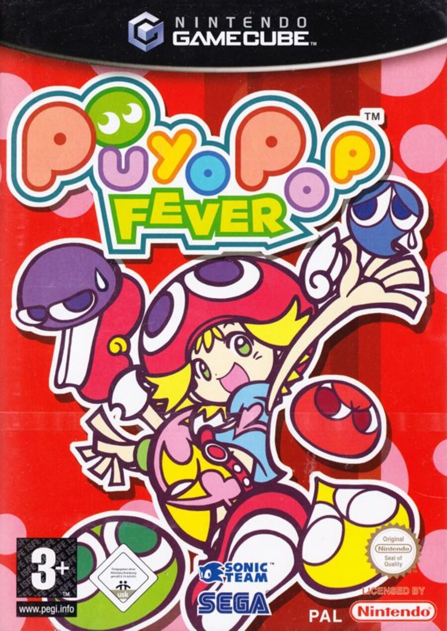
Europe

Ah, here we go, this is more like it. Here, we can see Amitie front and center, surrounded by those adorable Puyos. The red background is retained from the North American design, but it's a lot brighter this time with some pink spots dotted around to provide some nice variety. We like this one!
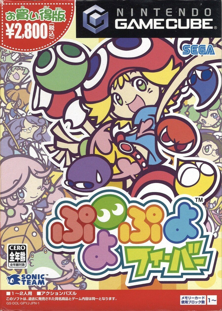
Japan

Japan's design is very similar to Europe, featuring the same image of Amitie along with the surrounding Puyos (albeit in slightly different positions and poses). The main difference here is that the background is made up of more of the game's core characters, and it definitely makes the overall image pop. Of course, the logo itself is also written in Japanese, which frankly looks awesome. We reckon this will be a close battle between Europe and Japan this time.
Which region got the best Puyo Pop Fever box art? (1,567 votes)
- North America

- Europe

- Japan

Thanks for voting! We'll see you next time for another round of the Box Art Brawl.


Comments 47
I picked North America. It's not as cute, but it actually relates to the gameplay.
None of them are great, but the American one is probably the least worst. The European one and especially the Japanese one just look like overwhelming mess to me.
I've noticed an interesting shift in Puyo game covers. Every game before Puyo Puyo 15th has characters on the box. Arle, Amitie, Sig, etc. While from Puyo Puyo 15th onwards, the cover art focuses exclusively on the Puyos and doesn't feature characters any more.
This is interesting because the USA version of Puyo Pop Fever here seems to be doing this early.
EDIT: Forgot about Puyo Puyo Chronicle which also has characters on the cover. I suppose that's an exception due to it having an RPG mode
US is boring. Japan is too busy. EU isn't great but at least it's better than the others.
Japan because of how many characters we can see on the cover. Arle, Amitie, and many more
While the North American box art is the best one at showing the Puyo Puyo gameplay - although only in general, not Fever specifically - the colorful cast is also one its allures and one of the distinguishing aspects of each game so I'm voting for the Japanese one.
I've enjoyed other Puyo games since but for me this was the real sweet spot and the one I go back to the most. I picked it up for the Xbox at the time, which I'd only just bought specifically to play Sega games, so finding this on the shelves as a new release with a budget price meant it was an insta buy. It was the first Puyo game I played since Mean Bean Machine, and I absolutely loved it. Completely addicted for months.
I really like all the illustrations and characters of the Japanese cover but because the front design and background design aren't separated enough it looks too busy and muddled, so I went with the European. If the front design was more bold and the background was even more pastel and washed out, I may have gone for the Japanese.
Japan for me. Recreates the zany vibe well. I LOVED this game. No idea what brought e to buy it because I normally don't even like these types of games, but glad I did. Shame I sold it.
Great Brawl this week.
Box Art Brawl is one of my favourite weekly articles. So refined and simple.
Gonna go with Europe for this one
I have vote the Europe version it looks the best version it is the full character design. It is beautiful. Happy smile to.
Was going to go with EU till I saw the Japanese cover. While it's too busy it also tells me there might be a story behind all the characters they show.
I chose NA cause its less busy, and I find amelie is just a wierd clusterf*** of a character design
I actually like the European variant the most this time. The other two in my opinion are missing centralized points that help tell you what this game is about it.
The pink and red of the European cover was hurting my eyes. The Japanese cover was too busy. Voted NA as I loved that they tried using Sonic to sell it and the fact it states it as a puzzle game on the cover.
I gave my vote to the Japanese box art.
The PAL cover looks the best in my opinion.
Jon Cartwright would approve 100% of this week's box art brawl
I went Europe, that Japan cover is just a little bit too busy for my liking. The European one is cleaner although the 7 different logos at the bottom are a bit jarring.
Just got this game on the DS. I suck at Puyo Puyo, but the art design is so great, I had to have it in my collection.
I went with JPN this time.
JP one for me. It features more characters than the PAL and NA ones.
Japan is too chaotic looking for me, but that’s why I picked it: chaos fits pretty well here.
Picked Japan cuz I love the characters of the Puyo series. EU one is also pretty good and probably better since it has a better balance of things going on.
Box Art Brawls Current Total:
Europe: 57
Japan: 59
North America: 64
Australia and New Zealand: 1
I cannot understand what is going on with her second leg (where is it), nor can I understand her shorts/skirt. I vote NA, even though it is bad, at least it isn’t a wild mess of confusion.
@Uncle_Franklin That’s an odd one out… Which one was the New Zealand?
@Koda1000 yeah, I couldn't make out her shorts until you mentioned it. I didn't notice her second leg at first either, because the two covers are so busy. She's got one leg kicking high next to her head, while the other is straight down with a bit of foreshortening going on. It's finally making sense to me visually, but it took some time.
The Japanese one is way too busy and the logo cramps the key art. I thought the European one was also a bit visually confusing at first due to the odd character design and posing. The NA one is the easiest one to understand visually, but it's also boring. I think the Euro cover does things the best with the most interesting concept and execution.
Europe. It looks fun and I love the colour red.
Japan for me. It’s a great representation of the zaniness that is Puyo Puyo. Also I love when the art represents the characters a whole bunch.
Japan is the best, then europe, the north america cover suck.
None of them have Rulue, so it's a wash.
@daftfunk
Rulue wasn't in Fever though.🤷
It’s like they go from too little on the box to way too much. So Europe for me this time.
They're all hideous.
Definitely going Europe on this one. NA one is just bland and the Japanese one is way too busy.
I prefer the more focused take of the European one. Including the main character keeps it interesting without being too busy.
This is a thesis on box art philosophy. It just perfectly illustrates the way it's always been.
US - NO ANIME
UK - Acknowledge the exitance of Anime, but keep it sparse
Japan - 100% ANIME
The only thing rubbing me the wrong way in the North American cover is the "From the creators of Sonic the Hedgehog" label. What about Dr. Robotnik's Mean Bean Machine or Kirby's Avalanche/Ghost Trap?
I know it was developed by Sonic Team, but it makes it sound like Sonic Team created Puyo Puyo and this is the first game in the overall series.
On the Japanese one, I don't like how Arle Nadja, the main character of Puyo Puyo much like Lip in Panel de Pon, is barely noticeable.
I guess I'm going with the European one this time.
The Japan one is truly awful
For a franchise that didn't establish itself yet, I think NA took the right approach.
But I really love the Japanese one, and went with that! ❤️
I'm not crazy about any of them. I think Europe is the most balanced, but Japan is the most "fun" thanks to it being so damn colourful.
I voted for Japan, but I'm mostly indifferent this time around as I don't care much for Puyo Puyo (but I've completed both Puyo Puyo Tetris games).
Going for NA purely because it's classic 'American Kirby is Hardcore' and that's always wonderfully daft.
Voted for the Japanese one, I always like more details.
Japan wins it with the background and a character model both in the artwork. Nice faded effect of the background I suppose but the boxatt is uninspiring all round to me frankly. Soz.
japanese looks busy but due to coloring i think it is ok... so it's better than the european.. amaerican not sure , agree with that it resembles gameplay a bit but it also doens't .. you don't dodge the puyos or anything..
Show Comments
Leave A Comment
Hold on there, you need to login to post a comment...