We do like our Switch logos to be nice, don't we? On the one hand it's understandable, as like all of our gaming systems it's a big part of our life - we want it to be as good as possible, and that includes the 'look' of our download collection on the HOME screen.
A few developers have fallen foul of this, with iffy logos ranging from games like LEGO Worlds (since fixed), SteamWorld Dig 2 (due for a change in an update) and then - most famously to date - Snake Pass. The latter had a nice logo at launch relatively early in the system's life, and then developer Sumo Digital changed it to one that's rather ugly; the internet then did its thing.
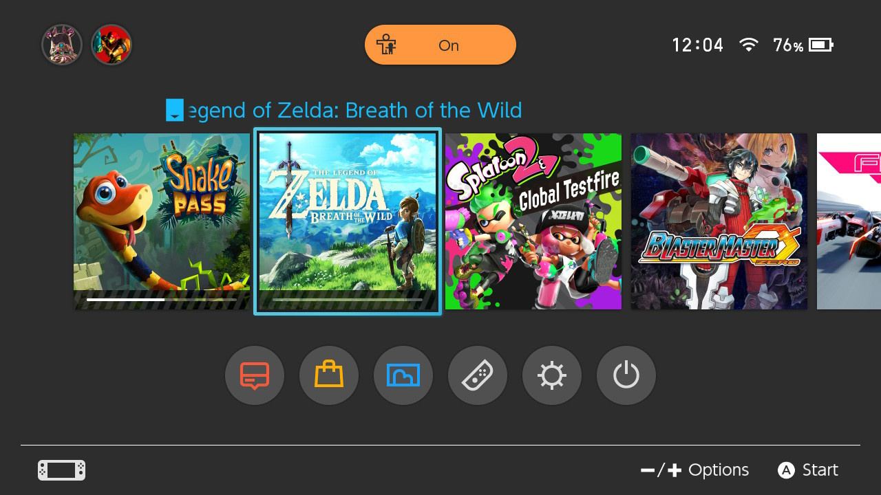
While other developers have bowed to consumer demand, however, Sumo Digital - which started the whole HOME logo saga - dug its heels in. It's been an odd little drama, but now the publisher has had a change of heart. It's told Kotaku that the decision has been made to change the logo back to the original, albeit it'll have to wait for an update that's due early next year.
The reaction to the icon change has been interesting, and as this is our first self-published title, it’s definitely a valid part of our learning experience. It’s also testament to the passion that players have for Nintendo and Switch that a detail like icons are part of the overall gaming experience and connection they have with the handheld.
We’ve definitely taken the feedback on board and will be changing the icon back with the next update which is due early next year. It’ll mean the branding isn’t unified but our focus is on our players and community so we’re OK with that.
Interestingly, that branding reference is related to the fact the same current logo is used on PS4 and Xbox One, but Nintendo gamers have made a bigger fuss. The Kotaku article raises an interesting point on that side - the reaction seems in part to be a resistance to the Switch HOME screen looking like "the bargain bin of mobile F2P games". Another perspective suggests the logo looks like a dodgy ad that pops up online. The interesting thing is that Nintendo fans seems to be more vocal about these things online, perhaps showing their eagerness for the Switch - as a platform - to be as good as it can be.
In any case, Snake Pass will have its nice old logo back, eventually.
[source kotaku.com]


Comments 104
Fair play to them for FINALLY listening.
Good, now people can shut up about a stupid icon and reinstall the game they uninstalled, again, because of a stupid icon.
Sumo Digital shouldn't have bowed down to this. It's not like a Mario icon being changed to 7 Grand Dad for Rosalina's sake!
@SLIGEACH_EIRE They already answered a lot of people on the initial complaints which means they do listen. Don't act entitled.
Now how about Bulb Boy?
Nice, now I just hope Image & Form games follow suit with the Steamworld Dig 2 icon.
These icons are meant to be like album covers or title screens, not app icons.
Well I might actually reinstall it when it changes back. I know it seems petty but when I had less games and it was in my face it bothered me more than I liked the game.
After only four months.
It's a minor thing, but it speaks well of the developer that they're changing it.
@OorWullie Was going to give Bulb boy a try until I first saw that icon. made it a no sale for me
Who is sitting on the home screen long enough for this to upset them? Just play a game and it goes away.
As unimportant as it is this is good news as they take fan feedback. Honestly I don't know why they changed it in the first place. Yes they said to keep it identical across platforms but seriously, did they expect PS4 & X1 owners to be jealous? They already had a better icon on the Switch so why change it? They could have said they were following Nintendo's guidelines.
I really don't understand this. A complete non-issue on other systems. Article worthy on Switch.
@NickOfTime90 Oh sorry your majesty, I should have wrote "Fair play to them for FINALLY taking action". Don't act so pedantic.
Good. Downgrades after purchase should be illegal.
Icons weren't something people criticized on previous Nintendo consoles. Why did they become such a huge deal all of a sudden?
@RupeeClock They have a new icon ready for SteamWorld Dig 2. They posted in on their Twitter. They've been aware of the icon issue even before their game was released and took action as soon as people first discovered the icon.
Bravoooo
It took only 2 months until response to users demand.
Maybe the next update will be release before x-mas. Just maybe...
I honestly don't mind the SteamWorld Dig 2 icon, especially not enough to hinder my enjoyment of the game.
Thing is, the new one just looks like an app on an iPhone, cheap and nasty. Good they have taken notice of this
Jeez its this kinda fuss that show how Nintendo fans can be THE WORST.
People who complain about stuff like this are an embarrassment to our community.
Yay! Finally! Justice!
Oh no wait. I don't care. Of course I don't. I'm an adult.
It's not that the new logo is ugly; it's that the new logo doesn't match the general look and feel of all the other logos on the system, so it causes a lot of stress for people that are a bit OCD about this kind of thing. It would be like the American SNES Mini having on of the controller's face buttons be fluorescent green for absolutely no good reason--it would just look/be wrong! Technically, it's just a different coloured button, not big deal--right? But NO! It's frikin' WRONG! Switch owners basically don't want their game menu to start looking like some kind of messy and cheap-looking mobile App store, with a bunch of generic in-you-face icons trying to grab your attention over doing the more important job of clearly informing you of what game you're actually viewing at a quick glance. And there's a lot to be said about design consistency, particularly with user interfaces. If stuff like this wasn't important then companies wouldn't hire expensive designers--but it obviously is important.
@OorWullie @BarFooToo They already changed it: https://twitter.com/Bulbware/status/910509178099290112
@DrkBndr Ha, nice one. Time to update it
I do feel many changes are made just for the sake of it rather than for a purpose. This was fine/not broken in the first place. Why bother changing it at all?
I liked the old version. I do prefer the "box art" rather than the "iOS icon".
Next... Sonic Mania?
@PtM they need to change the icon back to the original. I don't like Mario winking
@DrkBndr There's no update available for me. Version 1.0.0 is the latest version. Strange.
Edit: Ah, update is on the way. It's not out yet.
@SLIGEACH_EIRE Thank you. I will act less pedantic next time. Good talk:)
Sumo give me OUTRUN!!!
Honestly, the Switch HOME menu already looks like butt, with no theme, no music, no Miis renning around and a measly 5 games in view, so why have ugly icons on top of that? If we wanted crappy games and crappy icons, we'd play Clash of Clans or any other "angry guy screaming" icon game. But we bought a sleek-looking game system for quality games (with a crappy HOME menu), so we'd love it to be as nice as possible.
Honestly, the 3DS menu is so cool with the themes and the badges and stuff that sometimes, I just put it in sleep mode just to get another theme and enjoy it several times.
@Untempered-Link I'd argue it makes Nintendo fans the best - we care about quality. I'd never have deleted the game - that's a ridiculous reaction - but I'm delighted it'll be an 'album cover' not an iOS 'app' again. Nintendo's guidelines are worth following - the icon did aggressively dominate over the appearance of the other games - and why? - we had already bought the game - no need to shout out with advertising design at that point. This is a good thing for Switch UI integrity.
Thank goodness. Now we can move on to sort out world hunger and climate change.
Wow. I really can’t believe they’re doing it lol. I like the new icon better. Thanks everyone.
Console gamers usually swallow everything they're handed, unlike PC gamers. I'm legitimately surprised they fought back against this to the point where it actually got changed.
I barely noticed how bad the SteamWorld Dig 2 icon is because the game is so great... but yeah, the icon is REALLY bad... I also had faith in I&F to change it because they seem into stuff like that. (EDITED)
Update: Dig 2 icon update is live!
@holygeez03 You don't like SteamWorld Dig 2? I thought it was great.
There's actually an update with a new icon available now, it's much nicer.
Great news. The old icon was x100 times better than the iOS app looking one.
@RupeeClock they already tweeted the new version, unless they are trolling we should see the new sd2 icon soon.
@RoomB31 Not trolling, the update is available now.
Don't really care. Don't see why it's something to complain about
"The reaction to the icon change has been interesting"
My favourite line oof the week. I'm glad they're changing it, Switch menu will look better again.
Maybe it's about lack of themes on Switch indeed, after all? And PS4/Xbone users just have something else to turn their sensory organs and "aesthetic standards" to, while we sit there and stare at icons? Poor poor us.
Now go on and celebrate developers' shotgun "good will". I have never even been part of this implicitly obscene "feedback", so why am I stil feeling ashamed to be a Switch owner right now?
Sumo Digital gave us fans a thumbnail, I just hope they can hold their ground when we try to chomp off an arm in response.
"It’ll mean the branding isn’t unified..."
Um what?? Not sure how having your Snake Pass logo on the icon goes against unified branding.
@Late Because the icons on Switch menu are much bigger.
YESSSSSS
I honestly didn't buy this game because the icon looked terrible.
There's nothing wrong with that. I'm actually proud of the consumers attitudes and the studio's decision to hear what PEOPLE WHO BUY THEIR GAME want
The Sonic Mania Icon should be a pin badge
@BenAV Woops... I wrote that at 8am and completely goofed it up.... comment has been edited...
I actually bought my Switch in order to play SWD2 on Day 1... and also in preparation for Mario.
Good, the game was virtually unplayable with that old icon!
@holygeez03 Haha that makes a lot more sense.
Pretty cool of Sumo to do this. The minimalist icon would look fine on a smartphone but as the Switch icons are much bigger and have more space to play with minimalism feels bland and empty. The box art style icons give it a more premium feel.
Wowowowowowowow!!!
Haha! This is great!!!
I cannot understand why they thought the current ugly and generic icon was more suitable and descriptive for this game, and went through the process of changing something that was good into the garbage that the current icon is!
I can think of worse things, like people complaining about people complaining when something they love was good but became worse.
I complain because I care. The game is good and I would like its face to be a good representation of the rest of the body and its qualities.
@Untempered-Link
"Jeez its this kinda fuss that show how Nintendo fans can be THE WORST.
People who complain about stuff like this are an embarrassment to our community."
It's not a big deal to me, but I will be glad to have the old one back. It just looks better, and I never understood why they changed it in the first place.
Uhm I'm sorry but this seems like a real non-issue to me... It's just an icon for heaven's sake. Snake Pass is just as playable with or without that original icon so I don't see what the fuss is about.
Maybe I'm just at age where I just make do with minor blips. e.e
I don't own the game nor do I plan to get it but it's good they listened to feedback and decided to change it back. The old icon was a lot better and maintained the Switch sleek interface look. Also a reminder to those being needlessly hyperbolic, it's possible to care about something like this AND major issues like the humanitarian crisis in Puerto Rico. It doesn't diminish the others severity. Humans are capable of caring about more than one thing at the same time.
It is good these developers are listening to the people...
but I think people are being ridiculous. I can't stand the icons being the same as the box are. I loved the minimalist look of lego worlds, and to "fix" it they could have just slapped the logo on it somewhere. Now it is just a cramped version of the box. Let the developers be artistic people! But whatever, an icon honestly doesn't effect me in any significant way. 1st world probs I guess.
It's pathetic that people complained about this in the first place. Is there really so little to play on Switch that you have to moan about the icon designs?
Cool. Now Sega needs to fix Mania.
@Untempered-Link you are completely right. Just play and enjoy great games. I couldn't tell you what steamworld dig 2 icon looks like since I'm just playing the game and not looking at my menu.
The SteamWorld Dig 2 icon has now been updated. Shame about the border 🤦♂️
@Pod According to Kotaku, they’ll actually be changing the Snake Pass icon in the new year.
@Aerona Sonic Mania is not even the worst example, it still has that album-coverish feel to it with the menu background present. It does miss the title image which is against Nintendo’s recommendation for Switch games.
EDIT: Of course I meant to say it’s NOT recommended to have a menu icon without the game title on Switch!
@Switch99
That's pretty funny.
I do understand though that you need to distribute and entirely new build to change something like an icon, and that this is unlikely to be achieved as easily as you can do it on iOS or Android.
First-world problems at their finest.
LOL. Now they want to change it back, when no one cares about it anymore? Or are they just after publicity?
Also, it says a lot about their dev skills (or lack thereof) when it apparently will take them several months to just change the logo (sarcasm).
But it's fitting to the whole game's experience. It's pretty boring and unimpressive, I already uninstalled it a few weeks ago (not because of the logo, but to free up some memory). Really regret buying that game...
That logo is their brand? Who do they have for branding a google playstore AI?
@RupeeClock Already updated!
These articles are my favorite to see the reactions in the comment sections.
@AlexSora89 I'll be honest, I have had quite a few conversations about the Switch with people who have then gone and played my Switch to be pleasantly surprised at it and want to buy it..... However, several of those people have specifically seen the Snake Pass logo and said things along the lines of "is it like all mobile games" or similar comments... It really does cheapen the feel of the experience. If the main screen looks nice, it just feels good to pick up and play.. the big cheap logo really makes the whole system (my first experience whenever playing each day) feel a bit like I've picked up my mobile phone.
So, Im absolutely in understanding of why it would be good to change back. It all comes down to user experience, even if just the home screen - and in this case, the chosen logo was an eyesore as it stands out against the rest of the good ones on the same screen.
Not to mention, I believe it goes against that document that Nintendo apparently has that advises on how to make a correct logo for Switch.
The icons at least need the game’s logo on them. Glad they are changing it.
The design of that face is also the least appealing part of that game - just looks so generic and horrible. The game itself is great and pretty though!
Cool, maybe they'll fix the whole "game crashing every time i start it up" thing
I'm puzzled, because my Snake Pass icon is and has always been the old 'good' one. I got the game around the time it launched and I've had every single update on my Switch, and it's always connected online. Guess I'm just lucky.
@shani Sarcasm doesn't work like that.
Thank goodness. I can't believe some people didn't have a problem with the "new" logo. The blame lies with Nintendo for not setting an actual standard for icons on the screen. They clearly INTENDED a standard, but didn't write it in stone which was a big mistake.
The design is not a grid of app icons like a phone or Windows desktop. The design is a fanfold of tiles that resembles a library of physical game boxes. There's a tacticle feel to navigating the list in that manner where you see conventional box art complete with title/logo. The Snake Pass one went out of its way to break the seamlessness of that design, to force itself to stand out with the white border, to adopt mobile icon design (which is used because the product is represented by the icon with the text BENEATH the icon as specified by the system settings itself.) I.E. Mobile design explicitly doesn't include text in the iconography, while Switch design clearly intends text on the tiles, displaying system generated text for it only when it's the selected item.
It was an attention grabbing design that broke with the system aesthetic, and it shoehorned the appearance of mobile design into a game that isn't even available on mobile while actual mobile games got the icon design right the first time.... Worse Snake Pass had it right then broke it to "unify branding" to something that honestly looks bad on any system but a phone (which Snake Pass isn't available on.)
Glad to see they came to their senses....I'll never understand how they lost their senses so big for so long. The XBox Metro design is tile based and matches it's Windows 8 counterpart with text-less icons in tile frames. So the new logo was ok there. The PS4 design...well....it was broken there too, but that design is so horrid and grotesque who would notice a NEW LOUD AND IN YOUR FACE OBNOXIOUS ThInG ALoNg with ALl the OTHER loUDAND ObNOXIous thiNgS CRAMmED in thERE AT VAryiNG SIZeS?
Good, if the gaming developers listen, then maybe we can stop getting Kids DVDs/Blu Ray where the cover is just a close up of a main character's face (I'm looking at you Disney.)
Is a restaurant with good food good enough? NO. Ambiance / lighting / music ect. it all matters. They're a businesses selling a product.
@Totaldude911 Then I guess you don't know how sarcasm works.
I know they could update the logo quickly (but instead opt to do it when the next regular update is due to be rolled out).
But I pretended not to know that and instead questioned their skills because they 'apparently' need several months to update the logo.
That's really a textbook example of sarcasm...
@FTL
And stories like yours is EXACTLY why I do care about such a 'non-issue' as the appearance of a 'silly' icon. The Switch is a tricky enough sell as is being a tablet as that automatically makes the average consumer think it's just another iOS/Android machine. The gaming icons certainly do not need to be assisting in that perception by resembling the cheap, pixelated, gaudy and low effort messes that plague app stores. It'd be a bit different if the Switch had themes like the 3DS that take up most of the aesthetic and the icons aren't so prominant but with the interface so minimalistic and the icons SO huge, ugly mobilesque travesties stand out as big eye sores.
Even without considering it's appearance to others, I just frankly don't want my sleek new gaming console looking like something out of the appstore bingo strip whenever I'm on the homescreen. There's guidelines set in place to prevent this and I'm glad the community has been speaking up.
This makes that stupid twit that they wrote about this look even stupider.
I imagine this is largely in part due to the fact the switch has absolutely no way of organizing content. If this was on wio u, they'd hide the ugly thing in a folder. On the wii? Shove it to a back page. With the switch the only way to move it is to delete it.
Can I just point out the fact they have Parental Controls on
I'm glad they're changing it back. The new icon was trash and I have no idea why they were so adamant about keeping it.
Edit: Another thing to the people that felt like this wasn't worth getting upset over. It's not the most important thing but it is important. Presentation matters, a lot! If you were choosing a restaurant to eat at and the place looked like crap (stains, crumbs, dirty plates everywhere), I doubt people would eat there, even if it did have amazing food.
@Slaz True, but it's the only one that I own.
It's a sad day when a icon becomes center of attention over the game, what a bunch of, I will let you guys figure out last part of the sentence, spoiler alert, it rhymes with blunts. Man it's only a icon, why even give a toss, some ppl on here need to get out more, very sad indeed
@electrolite77 how dare you sir- it's a picture of a snake that looks like an App Store icon. There are children in this country living on the streets or sold into the sex slave trade but I couldn't give a damn if my switch has an ugly icon. Go and look yourself in the mirror and contemplate the things that are important in this world. For shame sir. For shame. 😉
@EDF no some people need to stop being so self absorbed that all they care about is a bloody picture of a cartoon snake to actually think it makes their life worse. People deleting because of the icon. Put your dummies back in you bunch of millennial twonks.
@Oat it amazes me you can say that and actually think it's a rational argument.
@WinkSugoi what unlike a sleek 700 quid iPad Pro.
@Oat
No, that's not nearly an accurate analogy. it's like not going to eat in a nice restaurant because you don't like the font on the menu. Ludicrous.
@darthstuey
😂 I only wish I had so few actual things to worry about that I could spare a tiny bit of energy to expend on something as ridiculous as this.
@Oat You don't even see the icon until AFTER you've decided to buy the game, so your comparison is invalid.
Also, it's just an icon.
@darthstuey
Yep, can't believe this crap is news. Ppl need to grow the #?!+ up, very childish, they should be ashamed
You guys seem to act like all mobile games are terrible and 'cheap,' but that isn't true at all. Plus, it's only a logo.
I might actually play this now lol
@shani Ah, after rereading, so you're right. I thought you were being sarcastic about them being bad developers. I was like, 'no. If you wanna be sarcastic you have to say they are amazing developers.' but I was the wrong one. Sorry for arguing semantics lol.
@Totaldude911 Hehe no problem, nothing wrong with argueing semantics.
Btw nice avatar!
@FTL
I'm not a fan of the new, winking Super Mario Run icon either.
Doesn't mean I'm uninstalling the app any time soon.
@AlexSora89 There are many things that could be better about this game... it doesn't mean I'll uninstall it.. but it also doesn't mean that they shouldn't fix things.. especially when the change is extremely simple.
They could probably put anything they want as the logo and if the game is good, I'd keep it.. but it doesn't
change the fact that I purchased it looking one way, and they randomly changed it to make it look like a mobile game.
@FTL
Exactly. Just as fixing things is easy, it's also easy to resist the urge to uninstall a game users paid for.
I don't like the new icon, it really DOES look like shovelware. In my mind, this is due mostly because it doesn't have the Logo/name of the game in the icon, which is a very needed thing on the Switch.
This logo change can't come soon enough.
Show Comments
Leave A Comment
Hold on there, you need to login to post a comment...