Update: Seeing as so many comments revolved around the ability to have a view where all articles are displayed in the same way, chronologically, we've added a new timeline view that is dedicated to this purpose. We'll monitor usage of this feature and if popular perhaps make this an option for the homepage. The timeline view is linked on the homepage and news page. Thanks for the feedback!
Original Article:
Regardless of what happens in the coming months today is a significant day for Nintendo. Just over 10 years ago there was a Revolution in gaming that was called Wii. It was that console that kickstarted our founder, Anthony Dickens, into setting up a website he called Nintendo Life.
Subscribe to Nintendo Life on YouTube845k
So, we're red now
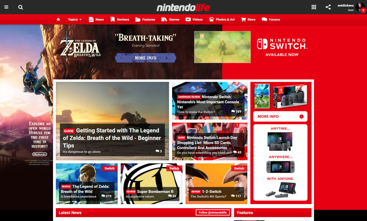
The logo, design and branding for said website had always taken inspiration from Wii and used the distinctive white and blue colours synonymous with the system. Whilst our logo has had some subtle changes over the past 10 years our default colour scheme has not, "Wii blue or go home" we said.
Last year we noticed that Nintendo have reverted its core branding back to its hey-days with a strong red. We figured that "NX" would continue in this vein and sure enough, it did. Nintendo Switch was announced with a lovely red and white logo.
Seeing as we're a website about Nintendo we discussed the possibility of changing our core branding to red as it was probably time to leave behind the legacy of Wii and Wii U once Switch arrived. The conversation didn't last long, we were unanimous in favour of the change and we really hope you like it too.
We've also updated the design
Those of you who visit our sister PlayStation site Push Square will have already seen that we rolled out a new design around a month ago, which we have now adopted on Nintendo Life.
In lots of ways the design is very similar to what you are used to on this site, the article pages are pretty much identical, we've just added some extra bits in the right hand rail that should be useful - especially on reviews and news articles as this contains info on the featured game.
The biggest change is on the homepage and other listing pages. When we launched our last redesign just over a year ago the area that drew the largest amount of criticism was the "tile" format of articles that didn't include the lead-in text.
We accept that perhaps this wasn't the best, so we've changed back to a format much more like the previous generation of the site that lists things a bit more traditionally. We've also grouped content by day and highlighted the most popular articles on previous days, meaning if you've not visited for a few days it's super easy to get back up to speed. The homepage also contains almost three days worth of content - much more than the version we've just changed from.
The mobile site has also had a big update, gone are the full width pictures in listings making it much quicker to scan through lots of articles. The "Featured Articles" is now present at the top as a slideshow, again making it easier to find new stuff.
There's more to come
Whilst there are plenty of other little changes (eg, table view is now back on game listings) we still want to hear your feedback. We've got heaps of other changes we plan to implement in the coming months, but please tell us your ideas and we'll see what we can do.
Let us know what you think about the new branding and your ideas in the comments below, (be gentle).


Comments 179
I don't like it.
I do like it.
EDIT: just realized I'm on mobile so my opinion doesn't matter until I see it on my computer.
I like it too. It feels fresh and change can be a good thing.
50/50 so far then.
All of that bright red is a bit harsh... and the layout is confusing... where is my option for things to be in a vertical "list"... everything looks like an ad now.
I like the color re-design, and for me, the structure change is okay. I've been using NL for quite a few years so it may take some getting used to. However, I preferred the older view for the mobile site. I do like the fact that it's easier to find a specific article but everything's so... Small.
Love it! Great job and let's make this year the YEAR of the SWITCH.
Honestly, I dislike the style Push Square has. It makes it harder to catch up on news, because it only highlights the "biggest" stories, rather than just list them all in order.
@Yasume These are hardworking journalists, be more respectful with your criticisms.
Best new look ever.
I liked the old design better. I preferred the blue.
Edit: Also, I'm finding that newer stories are disappearing and older stories appear in the headlines. And can't find them either unless I search through my comments.
Color change is great, however I liked the old design better. But I suppose it's only due to the sudden change, so I suppose I'll get used it to very soon and like it more and more
Congrats!
@RainbowGazelle we want to add a more "timeline" view for people that just want a single chronological view of content. Watch this space.
Not bad, my work firewall blocks out the giant advert at the top of screen so only get the nintendo cartoons where it should be I do like the way the right hand Latest news follows down the screen
I don't like it because it seems harder to navigate to recent news that wasn't just posted.
Will need time to adjust. I'll slowly get there.
But as always great work👍🏻
You've redecorated, I don't like it.
I like it! As always I'm not a big fan of change however the important thing is that the great content stays great. However you want to dress it up is fine by me.
@THENAMESNORM however we want eh? we'll remember that.
@jefflemon the struggle is real
@Xaessya hopefully you'll actually find it easier, once you've adjusted give it some time!
Is the early day Wii coverage still available to read? I'm sure I found this website by accident when I was searching for one N Gamer recommended. Since then I've never gone back, love Nintendo Life and I'm here a lot. Thank You guys!
Not sure on the new layout yet. It will take me a few days to decide likely. I'm missing the blue though.
It's still good ol' NL to me.
@Pj1 yep, all our content since day 1 is still available
@Yasume Cue my shocked face.
(context: Safari user on iPhone):
I like most of it, but never really been keen on featured articles at the top of the front page, and the overlapping of the logo/drop down menu makes it feel a little unfinished.
But otherwise: nice job, well done
I find that reddish red a little agressive. Two suggestions :
(click "CHANGER LA COULEUR" right below forums)
I like it. The red makes sense with the Nintendo branding. I didn't quite like the first redesign, but got used to it and grew to really like it. Many people just don't like change. I suspect once people get used to this, the feedback will be better as well.
Looks very Nintendy!
@antdickens Thank You
Love it!
I like it. But the font is kinda small on an iPad.
http://imgur.com/HvB7i9d
@Tibob that's not a bad idea, we might take you up on that
Aside from the obvious colour change I did for a split second thought I'd logged onto push square by mistake with the new design 😁
I'm sure we'll get used to it
Why do both sites default to the desktop site when using a mobile? Is it my browser? Its only happened since you updated
@Yasume You don't like anything. So this is hardly a surprise.
@holygeez03 that is the idea. You will never know if you are opening an article or giving money to Nintendo life...
on mobile the layout is not good.
@neuroticbiotic try going to nintendolife.com/mobile you may have activated desktop mode on your phone.
i dislike the new design but don't mind the color change.
it looks fine to me kind of like the colour it would change to when you went to the DS section
on a side note i still love the Wii U too but honestly it really did feel like a HD Wii kind of what the PS4 Pro is to the PS4, that kind of thing
Why do I have a feeling today is the turn of a new video game industry chapter, one that will bring plenty to all?
I like the color change - the previous light blue was a bit eh, specially when PS is the brand associated with blue. Now, it does differenciate itself nicely from Push Square!
It'll take a while to get used to the new redesign though - the old one was a cleaner on the screen, so you didn't have so much info at once. Being ordered by day is nice, though!
Congrats guys!
Like the new theme. Visually striking!
You'll never please this lot.
@antdickens @neuroticbiotic Whenever my phone or tablet show desktop mode - I always change it to desktop for the live chats, still haven't figured out how to get the live text comment box in mobile mode - then I just change www in the address bar to m. www.nitnedolife.com to m.nintnedolife.com and then it stays in mobile mode. Feel free to type Nintnedo correctly. I'm using Opera lite on my phone and dolphin on my tablet.
Can you get Nintneod to add some red to the Switch dock, Grip, and Pro controller, too black and gray. Neon Joycon help I suppose but that Pro is molded out of a tar ball.
@WiltonRoots lol
I'm still blue. I only have a Wii U
Cannot approve this. The grid layout is a definite turnoff on all sites visited. An option for a single chronological line layout is a must for any site, even if it has to be split into separate channels. Blah.
Colours are fine, though.
I like it. The way news is split up by days is appealing.
I have no problem with the change.
Now PushSquare is blue and you guys are red. It all works out.
It looks great,good work Ant.I preferred the new Push Square look over NL's so I'm glad to see it brought over here too.
I loved it when Nintendo returned to the classic red logo. I dig the new NLife look, too.
Red is my favorite color!
I understand why you're using red but I like blue better just my personal preference
It's great! And makes perfect sense.
To be honest I didn't notice.
@Yasume Are you this negative in real life too?
I like how the review scores aren't immediately revealed at the top anymore!
So Switchy
I like it even though Blue is my favorite color.
But as long for Nintendo Switch, I will try to like Red color for Nintendo.
@Yasume
Hi. Still being negative as usual ?
@SmaMan haha, you're the first to notice that
Colour is fine, but the front side articles I find to be ordered better now, personally.
The red's gonna make us all aggressive! The blue was nice and strategic!
In all seriousness though, no complaints here. In fact, I don't even remember what the old layout was already, ha ha.
Nintendo is red, Playstation is blue, Xbox is green, so what works for you?
looks worse than before. where is the benefit? seriously. ask that yourself before changing the design. all you really need is the news listed. i dont care for all the other stuff. never used these tiles and what not...
i miss the old version already. this is the second version of the site that i had seen since i started looking around this web site.
i forgot when i first started browsing this web site. so far i liked the first version the best and welcomed a few of the changes that were mad over the years. (both in looks and site navigation)
so far i do not like the new version of the site even though red is one of my favorite colors. the site looked better in blue. and besides the blue is easier on the eyes. however, i am sure that i will come to like some of the changes on the new version of the site. afterall it is just day one of the new version of the site. i can't say i hate the thing until i get a look at all of the changes and as we all know there will be more.
i used to have my own web site for a blog that i created. i am sure a lot of you guys may have hated the default them of the web site, but unlike nintendolife, the site was fully customization so that the user could pick the look and feel of the site. creating the code for that was one of the reasons why i took down my blog. the customization feature of the site was in pure HTML with some javascript and was over 400,000 lines of code.
if nintendolife let me help them with creating their web site i could make a lot of changes to it that everyone would love. of course then everyone would be able to change the look and feel of the site for themselves but creating the code of that would take about 5 or six months. add an extra month or two if you want perfect compatibility within all web browsers.
i have never seen the mobile version of the site. i don't even think i knew about the mobile version of the site since i only view this site from my laptop. of course then i have a dislike towards mobile versions of web sites, but that opinion changes from web site to web site.
I kind of like the red, and the layout makes certain stories jump at you. I can understand it beign jarring to those that are long time members, but having been here just over a month, it's not hard to change for me. Here's to hoping for a great year of gaming and Nintendo news!
Hm! I wondered why things seemed different. lol Guess I needed it spelled out for me. The website equivalent of me saying, "Hey, something's different about you... did you get a new haircut?"
I don't like it, I think it's too cluttered. The color is nice, though!
I looooooooooooooooooooooooveeeeeeeeeeee it!
Feels a bit on the cluttered side, but workable.
Very nice, congratulations guys.
@Yasume What DO you like? Besides not liking things?
Anyways, preferred the cool blue over this bright red. I'll surely get used to everything else.
Mobile looks good, haven't seen desktop yet
Is there a way for me to list all the articles on the News page as a simple list I can actually easily scroll through, rather than some stuff on the page being in a list and other bits not and whatever the hell else?
@impurekind we're going to add a "timeline" view for those that can't handle it
@antdickens add a poll fella. Base the categories on the feedback here.
Looks good on mobile, I only ever browe on mobile so that's all I can add!
I always hate design changes.
So I hate this.
You should go back to your 2010 design:
http://web.archive.org/web/20100323180449/https://www.nintendolife.com/
Love the redesign to be honest. Also the reason for doing it now makes sense in my opinion
Oh my, didn't know you even had a sister site for playstation, may give it a look. But I am and always will be for Nintendo.
Much better layout and, indeed, a more pleasant colour. Well done!
@antdickens That's me, and good.
It will take some getting used to, but I think I'm going to like it!
To be honest, I'm not really a big fan of the new layout. Colour is fine, but trying to navigate older news posts that I missed would be a bit more difficult. The organization in days is nice to have, but having 2 large, 4 medium and the rest small makes it feel really clustered and unorganized.. had to look at it a few times to get how it works
But like with all redesigns, I'll be able to get used to it eventually!
I'm using mobile and when I look at the home page, I don't like that the box containing the number of comments on an article is so big that it kinda ruins the thumbnail. And please bring back the tagines to show on every article!! I noticed that when I change my phone orientation, I see every one, but I use my phone portrait almost all the time on my internet browser!
The home page is messed up.
It's not adjusting it's content properly and it has this tiny horizontal scroll thing which is annoying.
@Yasume congrats beating that Sleigh guy for first comment 😜
I don't mind the color switch (Edit: Pun unintended) as red is also one of my favorite colors, and it makes complete sense. I wasn't initially as fond of the layout change on mobile (haven't tried it on a PC yet), but it's growing on me.
The search icon is either floating off the right side of the page or sitting over the site logo in IE on Windows Mobile, though (I know IE can be contentious with web pages).
One of the best things at NL are the sub title lines (or however they're called). Sadly they are not visible on the frontpage when browsing on a mobile device.
Other than that, I dig the new design. Good work Anthony.
My only suggestion is to make the gray in the logo just slightly lighter, because the saturation and value in the red and gray is too similar.
I like it, it's just weird..
Number 100!
Naturally as an Everton fan I hate this. But I'm sure I will grow to appreciate it! Nintendo is one of the good reds!
@antdickens Thank you! That was my main concern, along with the heading vs sub heading style (feel like it's a bit harder to tell them apart). Otherwise great stuff
Looks great! I've always enjoyed the Red Nintendo color scheme.
Bloody hell, I don't like this new layout.. Why change something that wasn't broken. Oh well never mind
NO! I DON'T LIKE IT! IT'S DIFFERENT AND CHANGE IS SCARY! BOOOOOOOOOOOOOO!
Nah, I'm joking it's fine.
@antdickens Thank you. That'd be great.
Nice little poetry in the title. Though for the subheading "Better Red than Dead" would have been appropriate in the Wii to red transition
Visually I love it. Nintendo has been red since forever. Red on Black was back in the NES days, Red over grays, blacks, or other colors in the SNES days, back to black for N64 and GCN....then the blue on white that was Wii and WiiU (but still red on 3DS.)
The Blue on white was the color of Wii, not the color of Nintendo. And as the Wii iconography is jettisoned as it should be, it's nice to see NL take on "the Nintendo Look." All that said, the color scheme itself was quite nice before....a part of me misses it a little, not because i liked the Wii brand tie-in, but just because the color scheme was nice and fairly unique.
The tile layout was GAWDAWFUL. I actually stopped visiting NL entirely for several months between the change and E3 time last year because the tile format bogged down my browser and was terrible to read, so I love the proper leader text returning!
I agree with a few others though that rather than grouping just the most popular articles it should indeed display ALL articles. As is I still need to visit other Nintendo news sites to catch the latest news in case I miss it with the headline layout here.
But overall, it was nice to load up today and see the SWITCH!
I miss the old already. Timeline in order was good.
Safari mobile user
I don't like how far it takes to scroll down from the homepage to the "Latest News" section, but other than that I'll get used to it. I like that the home page now has more days worth of news.
During the Wii U era, we were all a little blue...
nice job with the update.
Looks fine to me 😉
I'm okay with red, but the fact that the site doesn't auto fit to window width is a huge annoyance. I see that it's optimised to 1280 resolution on my system, but not everyone uses their browser full screen. Horizontal scrolling is NOT good.
I really enjoy the red, Sony is blue, micro is green, so nintendo should be red. Hum...who will choose yellow?
That said I like the design
I like it guys! Still the best site for news! Love the unique charm of the writers.
Don't mind the color, but not a fan of the new layout.
I'm enjoying the color. The layout is too cluttered for me though (I'll blame it on turning 30 this month ).
@Yasume
You don't like anything.
The site went from Democrat to Republican.
Blue > Red, but I am a Wednesdayite.
Up the Owls!!!!
I usually prefer blue but the red (especially with the NL logo) is way cooler looking. Now if only this site could have fan published blogs...
I like it but I'll miss the old site. I still miss the old older site too.
Happy Switchmas everybody! Loving Zelda so far!
Huh? ...Oh, maybe I'm so used to visit only the 3DS pages (all my bookmarks are on the 3DS section) that I didn't notice a color change. I've seen red all the time I wasn't aware of the blue at all.
Well, I love the red. Excellent choice there guys.
As for the layout.... ehhhh... I wasn't much of a fan when they switched on PushSquare and I don't think my opinion has changed. It's not as bad as tiles but, a single chronological list would be preferred... if at all possible.
The sites looking awesome. Good work guys.
I don't care about the colour (although I'd like more pink).
But why are some bits of the main page side by side articles then the next section single articles before going back to side by side? Any chance of the option to shove it back into a single only format like the blue page could?
Now I can't even remember what the old site looked like now, which is embarrassing, but impressions for mobile use leave me feeling that both the text AND pictures are too small currently. I'm not exactly squinting at the pictures, but they don't pop off the page like they did, and the smaller text makes all the articles kind of blend into one.
I think the last design had a full-screens worth of picture, with the same width allowed for text underneath it. If I'm honest, I significantly preferred that to the current 50/50 side-by-site split. The old design seemed to showcase each article really clearly. This one feels a bit less comfortable and friendly. I suppose it involves less scrolling down, but I never though that was much of an issue.
The bold red is definitely less cool and crisp than the old blue, but that's probably something I'll get used to. One interesting idea above was a theme based on the neon joy cons. Although that would probably be bolder still.
I've noticed there's also a 'jump to top' button at the bottom of the screen, but my iPhone has that functionality on every website by tapping the top of the, so it doesn't have much use for me. I'm not sure how things work on Android though (although I assume it's possible).
I actually really like this new lay out, smooth and appealing, a great change!
I miss being able to see the light gray text (sub-title or something, usually includes silly and very British jokes) on mobile.
@Yhdekskymmenen hmm, leave it with me. Might add those back in on small mobile.
i dont like how there are blocks of other, random posts, in the stream of new posts on the homepage. id like just a listing of the new articles, in reverse chronological order. having it like this, with a few articles then blocks of "reviews" or whatever, is not good UX
Looks cheap
Depending on the type of news, it changes colors. Like blue, red, and even a darkish green I think. Lol it's pretty cool.
NL is now red? 2/10, would not buy again.
I like the colors, although the main layout is slightly worse.
Please offer a night mode where the background is black instead of white.
i really dislike the new design. the tiles on the homepage are so irritating. just give me a proper list of the newest articles. that's all we need.
Since red is my favourite I love that change. I think the topic headers or whatever you call them should be in a red box like on the photos and when you click on an article. Or make the text of those topic headers smaller. They're too dominant. It looks a bit too clean/boring as is. But I'm a print designer so I guess it's just my opinion vs a professional web designers work.
I can see that you guys made this in line with the Switch's launch to promote a new era for Nintendo and that's fine by me. But my only concerns are that it's a bit cluttered and a little hard to navigate through some articles. I hope you guy fix it in the future, but other than that it looks great. Keep up the good work.
I still miss having a convenient spreadsheet showing every game from a system, price and review score. The one for the Wii let you look at virtual console games, retail copies etc etc. It would be great if you could bring that back. All I can see at the mo is a list of games that you endlessly have to click and return from.
I highly dislike the tile layout, just like how I hate it on the PushSquare site (actually have almost stopped going there completely now), in turn how I disliked it the last time you tried this kind of change last year. While change is nice to keep things from getting stale, not all changes are for the better to everybody. I come here daily, so all I want is to see what the latest posts are, in order, then go from there. Now the front page makes it uglier to go through for me. Having all those groups taking up half the main page also a huge turn-off for somebody who never uses groups to begin with. Everything else is fine by me.
Would love it if we could still have a toggleable option on what layout we prefer to get on the front page. I have given this kind of layout a chance on other sites, but, it still doesn't work for me.
I like blue.so unhappy with the change
it's too chaotic for me, I would like the option to view the articles in just a chronologically orderered list. There's just so many article links on scattered the main page I don't know where to look after the featured few blocks on top. I feel like this way it's really easy to miss articles if I don't look at the site for a day.
I don't really care about the colours but I miss the straightforward chronological-by-time list. The tiles confuse me and I had them turned off and now that option is gone. It's now a mix of lists and tiles.
I like everything in this website. The new design, naturally, is taking some time to get used to, but we'll get there. I can say it looks beautiful, modern and align with the goal.
Well done guys.
Blue is one of my favorite colors (I wonder why...? ) but I certainly don't mind the red. Red is the color I think of when I think Nintendo; I like it!
I like the change to red.
Digging and loving the red however the new layout is a bit difficult on the eyes to navigate. It should match up perfectly with my touchscreen laptop once I get used to it though and I imagine would great on mobile/tablet when I access the site from those.
I don't mind the red, but about the design, just like last time, I'm looking for that one option where the articles are shown in a list, so it keeps looking like the previous design
I can't find or understand what I'm looking for
What kind of messed up order is the mobile site in? It certainly isn't the sensible Latest Articles first.
Really not liking this layout. I don't go on the Playstation site so I don't know what it's been like over there, but this is CONFUSING. There's random tiles of stories all over the place, and nothing is running chronologically, so the stuff at the top of my page is sometimes days old. That and some of the stories seem to change positions randomly whenever I refresh.
It's cluttered, there's no gentle empty space like the previous layout allowed for (and thus my eyes get worn down trying to identify stories). And while I get that the red is "thematic", the color being splashed all over the site is much more harsh on the eyes than the old gentle format. And really, trying to argue that blue specifically represented Wii-U when the system didn't have a spot of blue on it just doesn't make a lot of sense to me.
I realize I'm laying down a lot of salt here, but this layout has made trying to identify and read the new Switch news very difficult on the computer, and downright aggravating on mobile where it's just scattered all over creation. Sorry, but a pox on this mess. Refine the previous version if you must, but at least give us an option to opt back to the old layout or something similar please.
Please add an option to view articles newest to oldest. I love this site, and the last change was great, but this one just seems chaotic.
Ditto on bringing back the chronological list here. You gave the option of grid and list layouts in the last design, dunno why you took away the choice and made a cluttered mix of both
Idc about the color change, I liked the blue better but it doesn't really matter that much. Maybe have a bit less red in certain places center screen and just keep most of the red at the top and bottom
You should let people be able to pick their skin. All I see on the home page is red. It's hard to read the words. I'm saying this from a laptop.
It's too poppy. I'll adjust, but I dunno. At least the news stories still look fine.
It's good. I'm liking it.
I'm not sure I like how the "featured" articles pop out at me more than ever now; you'd think it was a new article.
But yeah, it's nice. The new red color's cool, I guess.
Nevermind the good things I once said. This new layout is utter trash.
I don't know if anything news has been posted on this site in the past 5 hours because new things are impossible to find.
Color scheme is fine, I just dislike the new set up
@antdickens: Just a heads up, the "Must Buy" category no longer shows up when filtering through game collections. The games that I've previously classified under that category cannot be changed to another as the selector doesn't show up on their respective page (Ex. Pokemon Sun/Moon in my case). Not a big deal as I'm sure there are more pressing issues.
@wiggleronacid same here. I don't have internet on my PC, but going on what I'm seeing on my phone I've gotta say they're doing Nintendo Today better than http://www.nintendotoday.com is lol
I like it.
I dig it man. I never liked the old design.
@Tyranexx @Cooligan thanks for spotting that, we've actually simplified the categories (I think there were too many originally). I've now updated the data accordingly so everything should be back - all the "must have" will now appear in "want".
@AlphaJaguar I think you need to respect that people might not like everything on this site.
@123akis @zip @Yhdekskymmenen thanks for the feedback, we've added the article taglines back in on all mobile views
@holygeez03 @RainbowGazelle @SLIGEACH_EIRE @Hikingguy @Kromikarhu @impurekind @Platina @NEStalgia @JaxonH @dAvecaster @dinkers @6ch6ris6 @SilentS @Mijzelffan @Paddle1 @Bobb @Benjamin @-DG @Rocossa thanks for the feedback on the homepage layout.
We've added a new 'Timeline' view that focuses purely on articles (with forum widget) in chronological order. We'll monitor how many people use/prefer this view and then perhaps introduce it as a customisation option on the homepage. The timeline view is also linked from the homepage and news pages for quick access.
If you've got any feedback/ideas on the timeline view just tag me in your reply.
@antdickens I prefer the timeline view. Thanks for letting us know. I'll just change my link to the site now.
@antdickens huh...well i will probably set the timeline page as my nintendolife-bookmark now.
it's funny how the mobile version of this site is way more clear and structured than the desktop version. usually it's the other way around. still can't understand why this has been changed in the first place. did someone need work? you should play more games and do less unnecessary work
edit:
oh btw the "features" are displayed two times on the homepage. first with the big tiles and second as a list on the right. i really don't wanna insult anyone here but...what were you thinking???
edit2:
alright let's keep going with the editing of this post:
instead of doing a crappy new design for the site why don't you try to implement a message system? that's something the community has been asking for for years. i know it's harder than just redesigning the site but a message system would REALLY improve this site and help building up a strong community.
okay that's it. i will try to shut up now...
@6ch6ris6 the mobile and desktop structures are identical, just the style that is different for the different screen size.
As for the "features being displayed twice" they're not. The featured articles at the top of the page is flagpole content of any type (news/features/reviews) that the editorial team want to promote. The latest features are... the latest features (chronological, no news or reviews). I can appreciate it if you can't see the difference, but they are indeed different.
As for the changes, they're done based on the feedback from the last redesign, that's why we've changed things. We like to try and improve the site for everyone, believe it or not
@SLIGEACH_EIRE you're welcome, thanks!
@lighteningbolt79 There's nothing wrong with mentioning your dislikes. Just don't be arrogant about it.
@6ch6ris6 as for a message system, yeah, we originally didn't want to do this because of spammers / abusive messages. That said, the notifications system would make it pretty easy to implement now. Just need to figure out the best way to prevent the spam/abuse issue. I'll put that back on my radar, certainly.
@antdickens
That works. Timeline link will do fine... Thanks!
Idk why (and I don't think I'm alone) but I just can't seem to wrap my head around layouts with featured content. The chronological timeline is an easy way for me to see where I left off and easily recognize all new articles since.
But I'm in my 30's. I'm sure these younger guys grew up on tile formats and featured content, and probably think timelines are the "old school" way of doing things
@JaxonH it's like people comparing windows 7 to windows 8. but i have yet to meet a person who prefers windows 8.
@JaxonH I hear what you're saying. The other side of the argument is the editorial guys not wanting content they've worked super hard on dropping off the homepage just because we've posted a bunch of short news articles. For example we want to get our Zelda review in-front of as many eyeballs as possible, hence it's prominence on the homepage.
There is also two types of users, those that come to the site hourly and those that come every few days or once in a while, or are new. I imagine if we made the timeline an option for your homepage it would solve both problems
@antdickens Thank you. The timeline option makes it much easier to keep up to date on the latest posts.
As for your point on the editorial guys not wanting their posts to drop off, to me that is a moot point because once a topic is already read, only those who want to keep tabs on the comment section will either keep going back or have a new tab open staying on that page. It may sound harsh, but because of the different tastes of everybody, catering to older posts rather than new ones seems counterproductive to me. Giving us the option on which format should always give better results than forced options/opinions.
So with that said, keep up the good work. Don't let our griping stop you from offering new changes here, just don't limit our options please. Being customizeable will always give better results.
@antdickens
Thanks for your response... and for being open to criticism.
The Timeline option is great, but it is quite possible that the majority of people won't use it since they won't know what it is, even if they prefer it. It should at least be called something more descriptive like "List View".
I understand that you want some pieces to stay at the top... I would love to see the tiled "sticky" pieces at the top, with the Timeline view underneath.
As I and others have stated, the red is just too glaring... step back from the screen and look at the homepage as a whole... all I see is red.
Still the best site for Nintendo news and smaller release reviews.
@antdickens Yeah, imo, that's much better. Nice and simple, intuitive, convenient, and it just flows. It makes viewing the site a pleasure rather than it feeling like you're just trying to use any modern marketing techniques you can to get those extra click-throughs and ad viewings. That's all that the marketing and web design dude who originally came up with the whole panels-randomly-all-over-the-place design (which so many sites have now adopted—just because) was thinking, "How do we maximise click-throughs and ad views, and get the highest money-to-user result? This graph, and that chart, and that stat, and this metric, and every human being is really just a number and a pound/dollar sign . . ." It's not what makes whatever experience any good for people, and I don't think it's ultimately what brings people back anyway. It's kinda like trying to sell a console based on a throwaway gimmick rather than a truly solid foundation of great ideas and design, superb software, and brilliant services; and if there is any success from the gimmick it's usually fleeting and unsustainable. Always thinking about what's actually best for the end-customer experience—what makes them walk away feeling most genuinely satisfied and happy—will always serve you best at the end of the day, especially in the long term. That's what I wholeheartedly believe anyway—it's why I've been visiting this site for so many years.
@antdickens
Thanks! I like it!
Everything looks like an add on mobile and the text is too small. Also screens auto-load to the bottom on my iPhone.
@antdickens: I wondered if that wasn't the case. Thanks for fixing that. Also, thanks for implementing the Timeline layout. I vastly prefer that one.
Personally prefer blue. But I do like the websites new design.
@antdickens Excellent work on the redesign, looks cool!
@antdickens Yep this is better, the time stamps are a bit strange though, most recent stories are in "minutes ago" and earlier ones show the time. Additionally the date is always in UK Time while the time stamps are local time. Midnight UK time is 7pm for me, so the first story of the day shows 7pm and then it goes to AM and then PM again before the day changes. I even tried changing my time zone to GMT but there's no difference. Maybe you could make it more consistent? I don't know though.
Ugh. It's EVEN WORSE THAN THE LAST CHANGE. I know there are those that don't agree, but I absolutely hate it now. Will be using timeline view exclusively; wish it was default. And the sheer amount of red...yuck
Edit: I realize this comes off as harsh, and I admit it's partly a knee-jerk reaction, but site layouts are super important to viewing and processing information, and I happen to feel very strongly about this one. While I think I could've worded it better though, I'm definitely not taking back what I said. I HATE the new layout.
@antdickens You guys are awesome! The timeline is much more pleasing to scroll through! I do still prefer the old site, because it's easier to read on mobile, ( maybe the text was larger? ) but this is something I can still enjoy looking at and reading on my breaks now. Super surprised at how quick the response was to our feedback, btw.
@antdickens love the timeline page, made that my bookmark instead of home!
I like it.
It looks like not all of the bookmark icons (Apple touch icons) have been updated with the new color logo. The 57x57 one is red, but all the larger sizes (72x72, 114x114, and 144x144) are still the old blue color.
I'm liking the new color, makes sense to match up with Nintendo's current branding.
Show Comments
Leave A Comment
Hold on there, you need to login to post a comment...