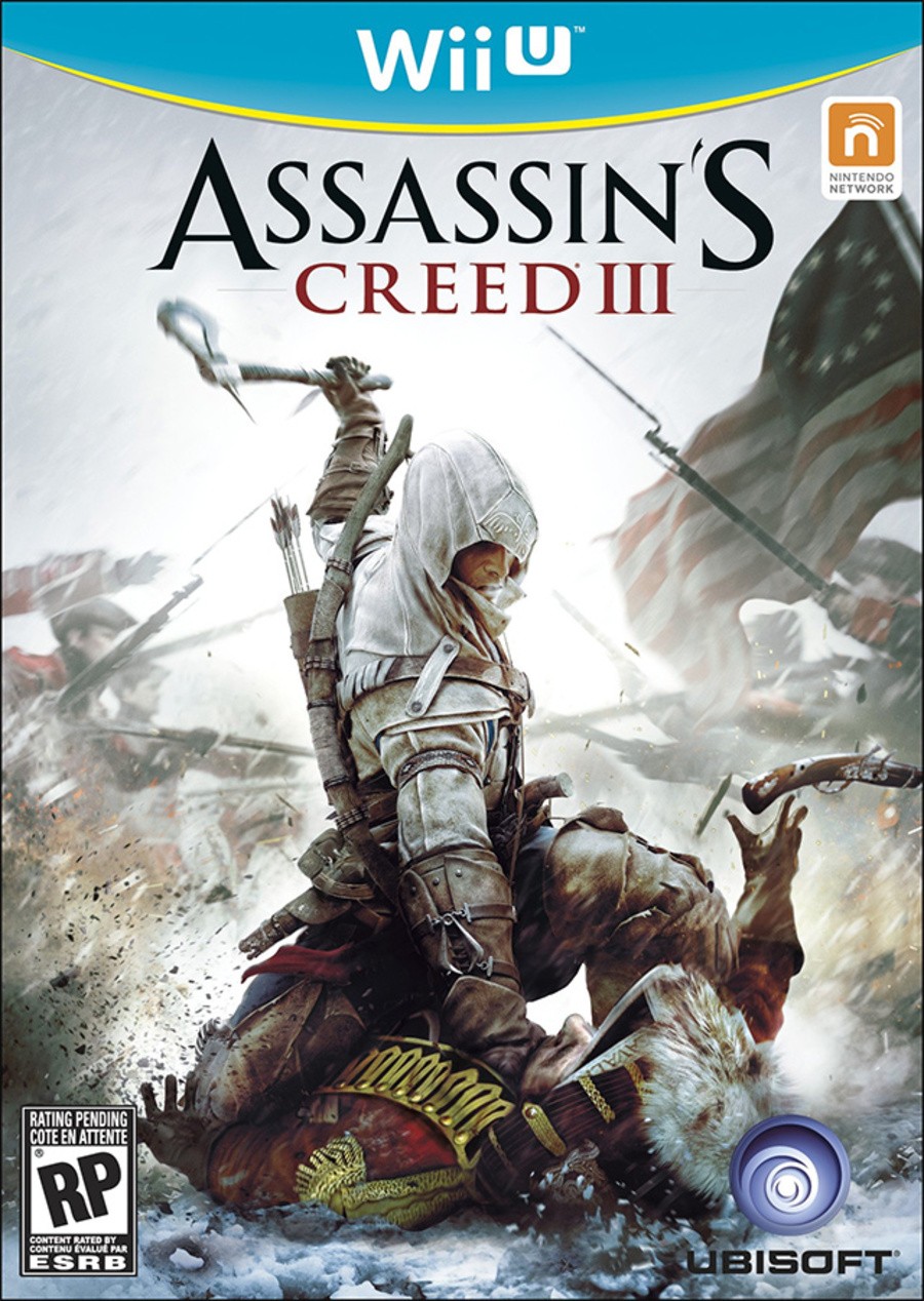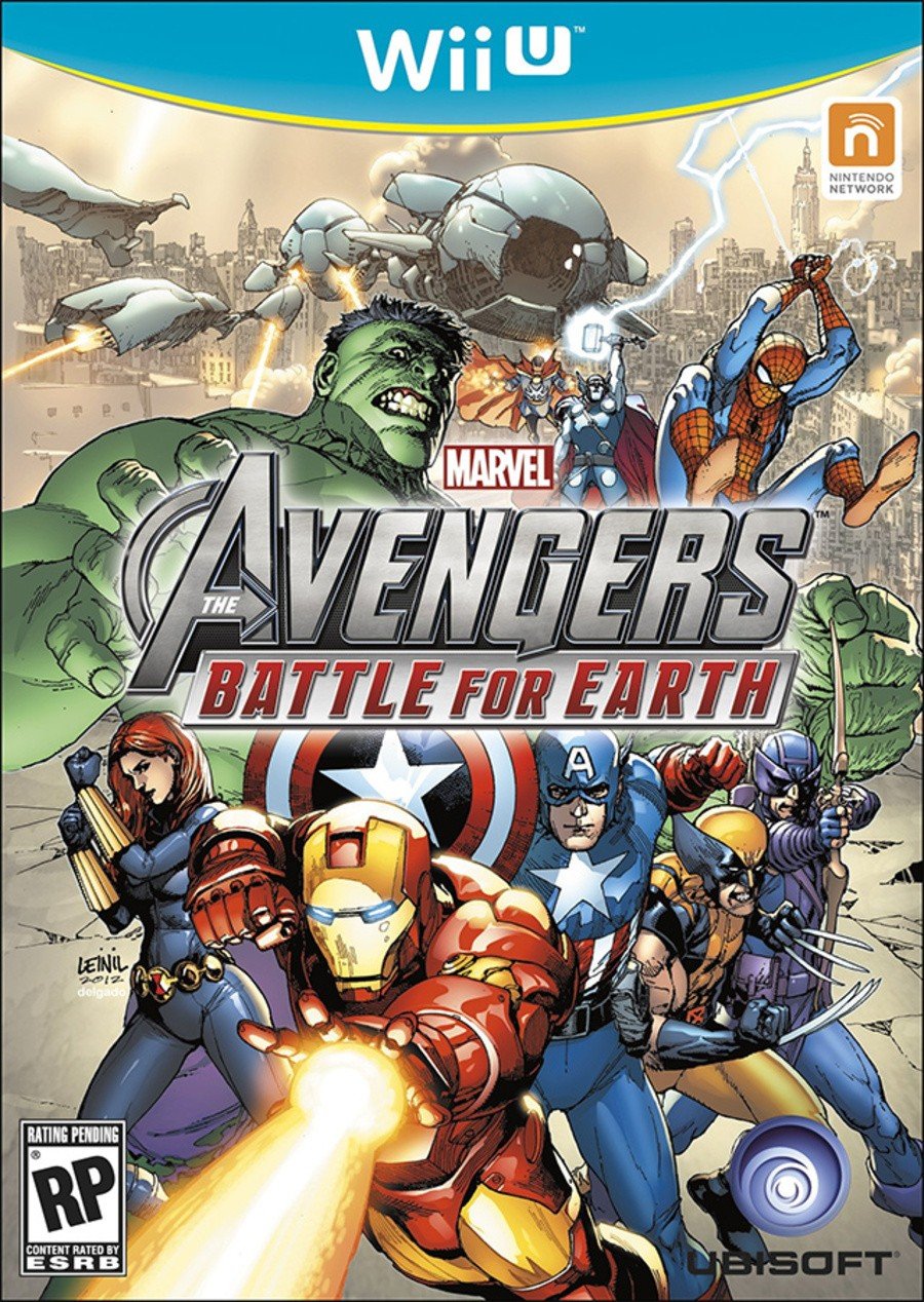
It seems almost childish to get excited about box artwork in this age of digital downloads and on-demand gaming, but we're not going to let that stop us from squealing with delight at the supposed final designs posted up on the Canadian arm of Amazon.
Listings for Ubisoft's Assassin's Creed III and Marvel Avengers Battle for Earth have appeared on Amazon.ca, complete with lovely box artwork sporting a distinctive blue and yellow Wii U 'swoosh' at the top.
Of course, there's every chance that these covers aren't final, and Nintendo could tinker with the look before the console launches some time later this year. However, the swoosh-like effect is perfectly in keeping with previous Nintendo box formats, and it's hard to imagine Amazon going to all the trouble of mocking up a cover when they could just use existing assets.
Subscribe to Nintendo Life on YouTube844k
What do you think of the design? Are you a fan of the blue and yellow colour scheme? The comments section awaits...


Please note that some external links on this page are affiliate links, which means if you click them and make a purchase we may receive a small percentage of the sale. Please read our FTC Disclosure for more information.
[source kotaku.com]


Comments 66
I actually really like it. Hope they use it. o.o
I think it looks great, and the Nintendo Network logo is prominent - I like that. I hope now that titles rated 15 and above come in a black box - that would be cool!
I like it too. Though I already liked blue and yellow. I cannot see why.. ;-P
It should be blue and white, that yellow is a bit distracting. But I like how that logo is in the middle.
I like it.
Looks pretty cool
dont like the colours
The colors look a bit cheap and gauche tbh. Also not sure about the return to the GameCube box's circle banner.
Maybe it'll grow on me or look better in person.
It's simple and saves a lot of space for artwork - that's good. Also looks very similar to GameCube box art to me, with different colours of course, which is not necessarily a bad thing. Those games need to look different on the shelves to avoid customers confusing them for something compatibile with the Wii I guess... Not bad, not bad at all. But still probably not final.
Reminds me of the gamecube covers. In any case, i don't think its official, but I like it.
Wow that looks really awesome, the blue & yellow design looks really good imo. Hope these are final.
looks a bit bananaman to me!
I like the colors. Their alot brighter than the Wii box art which I like. Do we know what region this is most likely for?
@Tasuki, North America. Since there's an ESRB 'rating pending' on the boxes & the article mentions these were found on the Canadian Amazon website.
This can only mean that we'll get reversible covers without anything but the actual artwork, right? Right?
If not it would be very hard to live with this. Looks like budget price boxart to me and makes the PS3 versions all the more tempting.
Would third parties really be okay with this?
And PS: So far i liked the box art for games on all Nintendo platforms.
Fits the Nintendo Life backgroud very well, so I like it. =)
Aslo, it's a nice touch that the N on the Nintendo Network logo looks really like an upside U, and only if you look closely can you see a little notch. Kinda cool.
It looks so much like the Gamecube banner, which I love. The teal and yellow look so nice together, it definitely stands out.
I really like it. Looks very inviting and easy to notice.
Gamecube fresh style, like it cool for every kind of game, i guess they did it that way for that.
It has to stand out to sell games at launch with all the squared banners on other consoles.
Soooo...looks like DVD box ratio, then. I think they could've made it so much easier for people to instantly know the games aren't for Wii by going with the slightly smaller boxes like Sony's been using for PS3 all these years. What a shame.
I like the logo well enough, and the colors are nice. I guess they need that extra box real estate to make up for it stretching down like that, though.
i love them. they look awesome
@jtt235 Next time use imgur please, a link that long is ridiculous.
I don't like the yellow, nor do I like the comparisons to the blu-ray cover thing.
That's just plain ugly.
Me likey.
This looks cool, now we just need prices and dates!!! Very excited!
I like it. Very similar to the Gamecube. Not a huge fan of the color scheme, but they could have done worse.
@Aviator If only the boxes were Blu-ray sized as well...
It's fine. Price is more important to me than box cover art.
Looks like they are going the standard DVD cover/case size. I would prefer the PS3/BluRay size cases. Just a preference.
I like it too, but I´m not entirely convinced, Teal is too friendly to me. I prefer more the contrast between black and white, or white and silver like with the Wii. The yellow line is cool, the design is very GC indeed, which is a good thing =)
I don't care how the box art looks, I'm only interested in how these games play (and when we can play them!).
I like the layout, but I'm not a big fan of the colours. (Assuming this is real.)
Surely it'd be better to pick some neutral colours for the banner rather than something like this - it's going to lead to some horribly clashing cover art.
Not great color choices.
That actually looks really cool!
Could this mean Wii U games will be coming in blue cases? Hmm.......
It looks pretty cool and it looks different enough from the Wii banner so hopefully this will prevent casuals thinking that they can play Wii U games on their Wii.
I hope, however, that publishers will be able to choose between a couple of color choices for their hardcore games, because something like Arkham City which is practically all grey and black would look a little silly in that garish bright blue and yellow.
Do we really need the ESRB to rate these games! Assassins Creed 3 is M, 17+ and the Avengers, most likely T, 13+
Why are people so concerned with the colors in the box art? It's not like you will play the WiiU with the box art, so it shouldn't be a big deal. The art work and labels look good to me 👾👾👾
I need new pants!!!
To bad I don't think I'll ever own one of those boxes, unless NintendoLand is box bundled, because it's all DL from here BABY!
Good lord that is horrible. That design reminds me of 1990 era websites.
Absolutely no way this could be official.
Nice design, but the colors...not so much. It'll depend on the color of the actual case though.
If the actual cases are blue, which looks to be the case (sorry ), this will easilly stand apart from Wii software on the shelves. Certainly this was intended seeing as 3DS packaging caused some confusion. Hopefully the Wii U cases are also thinner like the 3DS ones, as I kind of like that.
Hail to the victors, valiant.
This is awesome! I love It! It reminds me of the GameCube's box art.
That actually looks kinda cool.
I actually like that too, alot better than just plain white. It's, simple
@mudjo Me too.
Nothing says hardcore like turquoise!
Anyway not a fan. Give me the black and red combo of the late NES and SNES period anyday.
Looks like a box of a budget title! So in other words: Not that sweet!
hopfully its a more thin box size?
The banner itself is very good, but that yellow stripe might not blend with other box art.
Love it! But, I think it is fake....
It looks super cool, I really hope it's real. Best Cover art in my opinion.
Eh, it looks alright.
I don't like the yellow underneath it... the blue looks fine, but I think it's missing something, maybe the blue should look more shiny or glossy...
I had a feeling Nintendo would go for a light-blue case this time. Looks nice!
I really like it (though I may be a tad biased because I love turquoise).
That is very sexy.
I dont like it, recycling the banner shape from past consoles doesnt convey the innovation that WiiU stands for. I dont really like blue, but I can understand its part of WiiU branding, contrasts with the nintendo network logo making it more noticeable and it will stand out on retailer shelves, on the other hand I cant find any justificantion nor liking for the yellow line. I would rather go with a small U shaped banner (metalic aqua) crossing the upper left edge to the other side of the box, "n" logo on the upper right.
Holy crap I saw Dr. Strange on the cover of that Avengers box - insta-sale for me!
Box art doesn't mean too much to me since I'm hoping to be doing the digital download thing. Hopefully they'll have a full slate of retail downloads available at launch.
Looks a bit like the GameCube one.
I like it a lot. Blue and yellow is a good color combination. I hope it stays this.
Not perfect, but acceptable, It does bring back some memories of Gamecube... I hope you guys don't think this is lame...
Cover Review:
7/10.
Show Comments
Leave A Comment
Hold on there, you need to login to post a comment...