It's time to witness another clash of the covers as we dive into this week's edition of Box Art Brawl!
Last time, things got medieval as we matched up two different covers from the DS' Castlevania: Order of Ecclesia with North America facing off against the combined forces of Europe and Japan. Holy smokes was this a close one! NA just managed to seal the victory with 55% of the vote, while EU/JP took home 45% — that's some classic Box Art Brawl action right there.
This week we are sticking with the Nintendo DS and pitting three covers against each other from 2009's Might & Magic: Clash of Heroes. This fantasy puzzler RPG has just had a swanky Switch remaster courtesy of Dotemu, which we gave a 'great' 8/10 in our review. Now entering the world of Ashan once again, it seemed only right to look back to the source with a good old-fashioned cover match-up.
Subscribe to Nintendo Life on YouTube845k
There are three different covers to choose between this week but only from two different regions. Why? Because NA has brought a duo of fighters to this brawl — why didn't Europe think of that?
And so, without further ado, let the challenge... begin.
Be sure to cast your votes in the poll below; but first, let's check out the box art designs themselves.
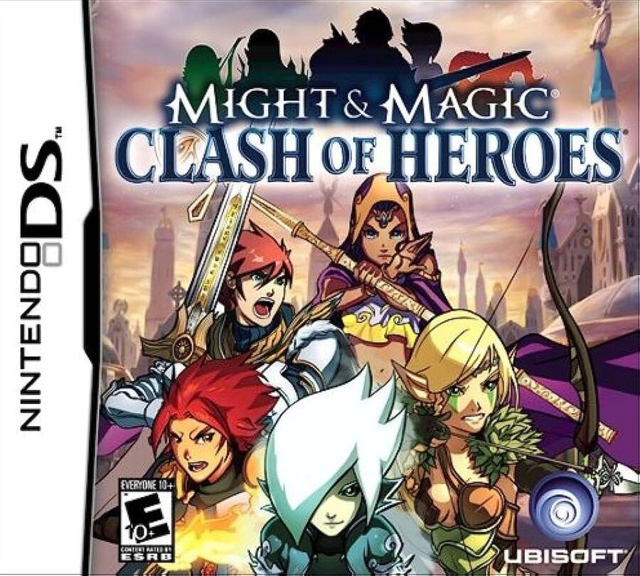
North America #1

The North American cover hits just about every fantasy beat that you could hope for. We see our main heroes along the bottom, each wielding their respective fantasy skill, small silhouettes of dragons and castles pepper the background and even the 'Clash of Heroes' font has a certain Lord of the Rings flare. There's no doubting what kind of world this game takes place in.
North America #2

North America's other box art is similar to the first, though there are some notable changes. The characters are now the main focal point, but the cream background returns, here adorned with towering buildings instead of dragons and mountains. The title font has also changed and now features a silhouette of the characters on top of it too.
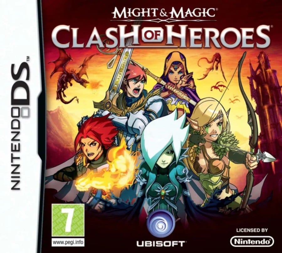
Europe

The European cover takes things up a notch. Gone is the cream background, here replaced by a firey red; The characters are again front and centre, stacked up like a modern-day superhero movie poster; even the dragons are clearer to see, being given more detail than in the first NA version. In fact, the only thing that seems toned down is the font, which appears far more standard than that seen previously.
Which region got the best Might & Magic: Clash of Heroes box art? (1,442 votes)
- North America #1

- North America #2

- Europe

Thanks for voting! We'll see you next time for another round of the Box Art Brawl.


Comments 29
The title logo of NA2 is absolute best, but I prefer the overall art of NA1. NA1 then...
Europe has got me all fired up! I actually prefer the logo too, with the quirky little “of” in the middle. Really like NA1, too, though. Maybe like the way the characters are lined up better in that one. But EU is just more vibrant.
NA2 is the worst all around. The lineup at the front is fine, but they smack a whole other lineup on top of a MASSIVE title logo. Seriously poor choices there.
None of the above. Ubisoft slapped the Might and Magic logo on their shonky mobile trash game and none of it is worth voting for.
Now that I think about it, how many western games, were never released in Japan?
I chose North America #1, because it feels upraising and the light gives it a holy feeling.
North America #2 for me because of the logo, but I also quite like the European one while I'm not a fan of the first North American one at all between the logo and that IGN quote on top, not to mention that a character is missing there.
Kinda hard to decide, because they all look so good, if you ask me.
I like NA 1 but cant tell why. I just think its neat
I take NA 1 this Round
I gave my vote to the European cover.
Box Art Brawls Current Total:
Europe: 60
Japan: 60
North America: 66
Australia and New Zealand: 1
I. Absolutely. Love. This. Game. I've completed it multiple times, and I own every version. I'm looking for people to play with online. Please hit me up. My friend code is SW-6529-6262-2997
@BreathingMiit it was made for DS. It wasn't ported to mobile until four years later.
Love this game dearly.
My relatives owned the US #2 boxarted cartridge and I owned the Europe one. There isn't much difference in standardnof the boxart but I think I prefer the Europe one for the chosen colour scheme in tbe background and character selection featured.
The North American version needed a male character as the dominant figure? 😂
@BreathingMiit Wasn't it originally a DS game before it was a mobile game?
NA #2 is my least favorite. The frame is way too cramped between the space taken by the logo and how the group of characters are zoomed in a bit compared to the Euro cover. The Euro cover is better with a nicer background, and a better use of the space. It has room to breathe. But, that little character with the white hair front and center looks out of place and draws my eye away from the other characters which all seem to be doing more interesting things. That composition looks poorly judged in that regard. NA #1 is my favorite. The composition is well done, especially factoring in leaving space for the logo. It's dynamic as the party looks like they're ready for battle. It's not exactly purpose built to be a cover, but I think it works best overall.
PAL one for me this week. I like how gothic version of Rosetta/Rosalina is shown more on the PAL one than the NA #2 one. NA #1 one does not feature her at all.
review quote on the front is ugh
Had to go with Europe for this one. It’s like a perfect merge of both North American ones and it’s own flair. Will admit I don’t think I’ve ever heard of this game and it does look slightly interesting so I may pick it up/
Removed - inappropriate language
All of these scream cheap flash game to me, so uh... I'll refrain from voting here.
@BreathingMiit Have you played it? Because it's certainly not trash, it's actually a great puzzle game. They didn't do any harm to the M&M name.
North America #1 is easily my favorite by far. It gives all the tonal subtleties that I would expect from a box art.
NA1 seems like it might be a reprint, with the IGN review quote on it. Regardless, I just like the nice balanced logo for the EU version.
@Doctor-Moo Yes I played it.
I went for Europe because the firey background really makes it "pop"!
Europe - the colour scheme and the dragons being more visible wins it for me.
@BreathingMiit do you think you would feel better if they had titled it differently? Like Might and Magic Puzzles, or Ashan: Clash of Heroes?
I hafta go with Europe, the sunset and clearly detailed dragons push it over the line for me. I've also never heard of this game.
Show Comments
Leave A Comment
Hold on there, you need to login to post a comment...