Mega Man has undergone a number of physical transformations over the years and in his next outing, Mega Man 11, he’ll adopt a fresh new look. In a collection of videos about the latest game in the long-running series, Capcom explained why exactly the iconic character has had a design tweak.
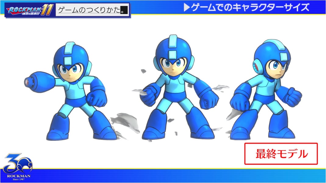
Apparently, it’s all because of a shift across to a sharper environment. The designers originally created a prototype based on the Mega Man 8 model only to discover this particular style was far too flat and featureless when presented at a higher definition. To overcome this, they decided to make a new version highlighting subtle details like the lines on his body while equipping him with a more detailed blaster. These alterations paved the way for his 3D form.
 Watch on YouTube
Subscribe to Nintendo Life on YouTube845k
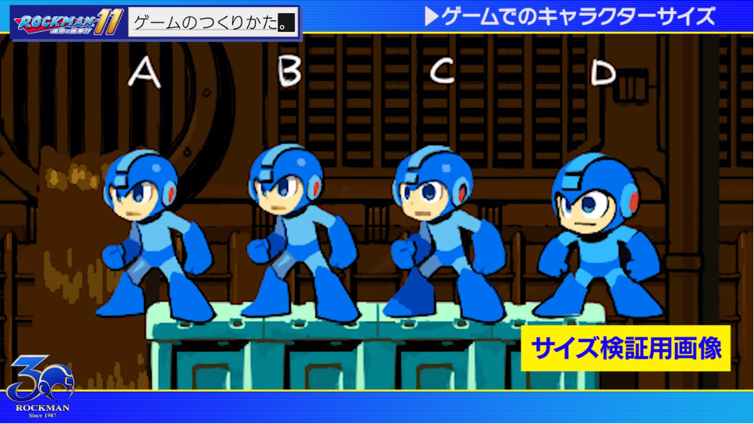
The size of Mega Man was also a hot topic during the development of Mega Man 11, with the team wanting to show as much of his face as possible. A rule of thumb was that the smaller the screen, the more distorted he should look to make the game feel less cramped.
How light reflected off the character’s model was another major talking point during the design process. It was previously an aspect of Mega Man's design the team had never had to consider. Eventually, each character for this particular entry in the series got their own lighting effects to bring their personality to life. Surprisingly, the game itself actually has no environmental lighting at all. Whether Mega Man should have outlines was one of the many other contentious debates as well.
The final design was a slightly distorted take on the famous video game character, with the style magnifying his head, arms, and legs. This was considered by Capcom as the ideal compromise between his 2D proportions and new look.
Capcom's Mega Man 11 arrives on the Nintendo Switch on 2nd October. Tell us below if you're a fan of the new look he's rocking.
[source siliconera.com]


Comments 34
So long as the game plays well I don't care how much they change his look.
He...just looks like Mega Man to me. :/
How about a reason as to why no physical edition in UK Capcom
@R96 What? Is that right? No physical edition for UK?
@GrailUK https://www.nintendolife.com/news/2018/06/mega_man_11_is_only_receiving_a_digital_release_in_europe
Sadly, yes.
@R96 Gah! Their physical releases are rubbish.
will they explain when will ace attorney come 2 switch tho?
So far I like what I've seen, looks fantastic I even like the new amiibo we are getting .
Can't wait for 11 - the minor chances are okay, I guess. Don't really care as long as it doesn't look like the new anime or has all the other changes like in the anime
Very good redesign that honors the original and prepping him for the HD visuala. The lines on his body are a nice touch.
Though I gotta say, the super deformed version looks the best to me hehe.
Just be grateful that they aren't streaming it......
He looks like I imagined him to look when I was a child. I approve.
They should have based him on the style used on the box art of the original NES release.
I would have loved the Smash model.
Watching the trailer again reminded me how much the music sucks.
Megamen and Nintendo consoles are a match made in heaven.
Does it even count as a new look?
I like the design
For a second I was afraid it was going to be about the new cartoon Megaman
... What's changed? He looks like Megaman 8 design to me.
Really it's MegaMan... But if you are choosing looks then I like the smash version MegaMan. They should use that look.
I'm more interested in the fact that he actually changes his appearance when he equips a Robot Master's weapon!
And the real reason is... Inafune isn't the artist anymore
I really like his new look, the environments will take a little getting used to but I have always been open to accepting a different art style, if I wasn't I probably wouldn't love Zelda as much as I do.
Nice. It looks a bit like Mega Man's design in the Famicom box arts, but more modern and slick.
@SomeWriter13 Those lines are even in his Smash design.
Kinda sad they feel the need to explain. Even Mario changed his look from title to title, especially in the early days.
Great article! Thank you Nintendolife for this. I'm sure there are aspiring graphic designers in the gaming world who like these kinds of details (and fans!).
As footage is slowly released, I'm growing more and more excited......
Looks way better than all the X games after (and including) MMX 4, where X was too big and complicated design wise IMO.
@Giygas_95
Pretty much this. XD
@GrailUK @R96 Worst case, you can import the US version. Had to get JP, Asia, and EU versions of some games myself already. (American)
But yeah, I know that feel. Just doesn't make sense sometimes, with popular franchises like this.
@LilVoidBoy I couldn't agree more! I love the amount of thought that goes into even the smallest changes in our favorite characters!
They should have lengthened his legs, covered him in tape... and colored his arms white
I give it a... blue thumbs up.
@moroboshi Don't give them ideas... People in Capcom apparently love that awful box art. I think he unintentionally looks like a typical Japanese joke "spaceman" character, the kind you can find in Dr Slump or similar silly manga or TV shows.
Show Comments
Leave A Comment
Hold on there, you need to login to post a comment...