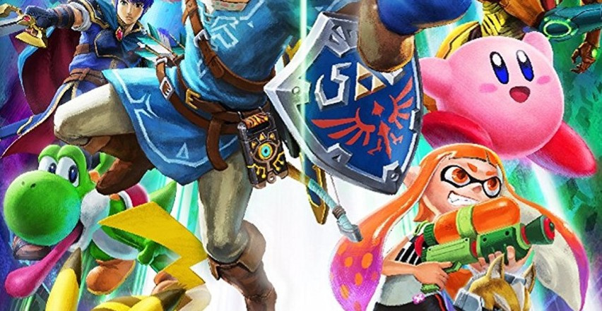
It's not unusual for a game's box art to be adjusted in various regions - and sometimes they're even completely different - but when it comes to a cover as character-heavy as Super Smash Bros. Ultimate, any changes means someone's almost certainly getting the cut.
For the German release of the game, it's fallen to none other than faithful dino pal Yoshi to take one for the team. The change was made in order to fit the German 'USK' stamp (USK stands for 'Unterhaltungssoftware Selbstkontrolle' and refers to the organisation that rates video games in Germany). As you can see, Yoshi has been removed and Pikachu shifted closer to Link.
Still, with so many other fighters still clinging onto their box art positioning, the game's cover is hardly left wanting. Share your thoughts on this change below...
[source twitter.com]


Comments 61
Yoshi's full name revealed as Yoshi Wazowski.
Poor Yoshi. First game gets delayed and now can’t even be on the cover of smash.
Rumor says in countries where there is no mandatory stamp Waluigi will be added.
So I might get hate for this, but I don't really like the boxart. Some characters look a bit too hand drawn (fan made) to me. The box art for Sm4sh is better, in my opinion.
Minimise USK logo problem solved. Discrimination against Yoshis is a crime and it must stop #prayforyoshi
And I would have gotten away with it if wasn't for you meddling rating boards and your pesky logo.
I didn't know Germany had their own rating system different from PEGI. Then again Germans are very keen on censorship and special laws about swastikas (though I doubt any would be appearing in Smash).
The USK logo has to be a fixed size (by law) and it is way bigger than the PEGI logo. Therefore, it makes sense to recreate the Box-Art.
By the way: A flip cover would be possible. There is no law that forbids having another cover without the USK logo inside.
By the way: Switch's Parents Control is the first program for protection of young people that is approved by the USK.
German's don't take tax evasion lightly.
LOL
USK Rating box was Too Big for Yoshi.
You think that's bad? Baby Mario is in a cage now.
Also Splatoon woman hs been moved left and fox up to fill in the space
@Saego I agree, also Mario looks deformed (his arms legs and body look stretched to make him more human like i think)
Oh no! I'm a big Yoshi fan.
@PsychoCrusher I came here to make the exact same joke.
o/
@riChchestM That's only in the American release
Pretty sure this has been known since E3.
I hate how big that thing is. Do these kids have 80 years olds for parents?
It looks better like this.
@GoldenGamer88 It is 3.5×3.5 cm as for all other media. It is the Switch boxes that are too small
Yoshi's absence isn't too noticable, it's the logo being downsized and put in the corner that doesn't look great to me. At least Samus has more cover space which is nice I guess
So basically game covers have a huge and awful USK logo in Germany.
Tht'd wjay you get for Tax Evasion...
@BlueOcean Yes, that is not new. The large USK logo is obligatory since April 2010.
@GoldenGamer88
We have many non-gamer parents and grandparents, that has absolutley no clue about games, but are very aware about youth protection from media. If you ever worked in a german store that sell games, you've see that the the charakters Mario and Pikachu, and the size of the logo are the best arguments to sell Nintendo games.
It's just a cultural thing i guess.
@Chandlero Yeah but I didn't know it had to be that big! It's awful.
I think that it should be on the back only in every region.
Its bad enough they until recently ruined the case on every Nintendo special Edition but now you wipe away poor Yoshi!
They clearly have preference for the electric rat.
@BlueOcean That is a German law for the protection of the youth and logo has to be that big and it has to be on the front cover in the bottom left corner.
At least we all get more of those sexy Marth legs!
@Chandlero I know but I wish it was mandatory on the back only, in all regions. It wouldn't ruin the art because covers are art and you can always check logos on the back.
@BlueOcean That is good discussion. The USK logo is not just an information that can be checked if wanted. It is an essential part in the selling process and controlled by law. The dealer has to inform, clearly and explicitly, about the age restriction and is not allowed to sell them to children under the age limit.
Of course, since parents (over 18 years old) are allowed to buy every game and often are not well-informed about games or even don't have any idea what is suitable for kids, the law could only be successful if the information is definitely and immediately recognisable. Therefore, we wanted a fixed size and a fixed place for all media. Now having the small Switch boxes, the logo seems too big. However, Nintendo could deal with it and having a second cover inside the box. That's totally up to Nintendo. Everyone could have a logo free version at home if Nintendo would spend the cents.
USK doesn't care... putting that SSBU logo NOT in the middle looks just cheap.
Probably because he comitted TAX FRAUD!
@Saego I agree. It's a nice bit of art but it doesn't look official.
Yoshi turned out to be the main villain for smash bros ultimate. Ultimate Yoshi! 😂🤣
I gotta say, I really hate all these ugly logos we get all over boxes these days. It spoils the cover art. One of the worst is that "download required" banner.
It's one big reason I love reversible cover art.
What few people seem to know is that Yoshi is a longtime and diehard member of the NSDAP/AO and that's why he's had to be removed from the cover in Germany.
Cya
Raziel-chan
@Chandlero I understand but the same information can be on the back, not necessarily on the front. Most safety warnings are on the less visible side of packages. I don't think that they should be on the front side ruining the art of covers, albums, etc.
[Insert tax fraud joke here]
@BlueOcean I disagree. I want that the age restriction is recognised immediately when the game is seen. The art is not ruined when there is a possibility of flipping the cover. Nintendo just have to do it.
@Chandlero We must agree to disagree then.
Horrible logo and why does it have to be so big!
Poor Yoshi!
Oh my. Once again "news" that has been in a nintendoeverything.com article 7 days ago...
Cheap.
Link to article:
https://nintendoeverything.com/yoshi-gets-axed-from-the-smash-bros-ultimate-boxart-in-germany-due-to-usk-logo/
@Saego
Well I'm with you. Though I personally haven't liked any Smash Bros. box art aside from the very first game.
@Ngamer
Because the Switch game case is so small, would be my guess.
Publishers likely aren't allowed to make the ratings notification smaller just because of that. And I could see why.
That's what you get for committing tax fraud
Someone needs to animate the difference between the box arts, making Mario jump of Yoshi, knocking him off the box.
😢
Good! A just punishment for a filthy criminal like him.
USK still ruining box art.
@RainbowGazelle To be fair, the USK people themselfs are not at fault here, they do not decide these things.
They just rate games based on a given rule set, nothing more.
@Spectra ...Ya know, all I see in the comments is you complaining about, well... just about everything. You bash Nintendo and call them a bad company, and any negative thing. Why is that? Do you have a grudge against Nintendo or something?
This is why Im SO glad I dont live in germany :') Aint nobody taking away my boy Yoshi
No representation without taxation
Good thing I'm not in Germany. If I was I would have gotten a different copy absolutely.
Well Yoshi is annoying anyway. Drop him in the pit!
Yoshi again? In favor of that stupid electric rat? Good grief man.
@BlueOcean What consumer safety and age retriction warnings are on the less visible sides of things? All the things I can think of are on the fronts of the packages and have been for years. Cigarette advisories, explicit content warnings on CDs, age ratings on games, alcohol content in liquor, all of them have shifted to the front, most visible side of the packaging by law.
What would be the point of putting them on a side that no one even sees?
In the german cover you get to see more fo Samus body. A compensation?
Oh well, it's better to cut Yoshi than Pikachu.
That big, evil USK logo is just sooo bad and unnecesary. Why not just use Pegi?! Crazy Germans, poor Yoshi!
Tap here to load 61 comments
Leave A Comment
Hold on there, you need to login to post a comment...