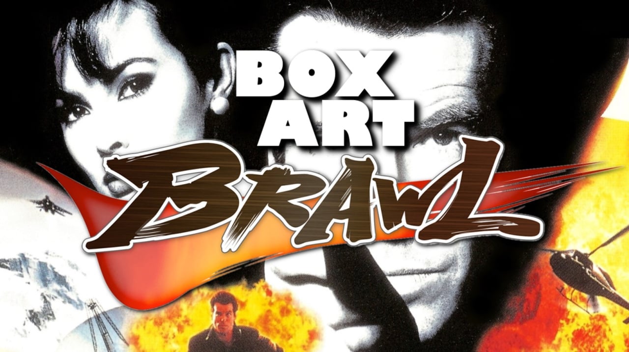
Welcome, one and all, to Box Art Brawl! We’ve reached the tenth round in the series where we present a bunch of box art variants and then put it to you lovely people to see which one prevails in the ensuing bout. In an effort to showcase some of the dross that will never make it to this hallowed arena, we took a midweek look at a small selection of the worst covers ever to sully a Nintendo system, but today we're back with a touch of class, a vodka martini and a distinctly low-poly cranium. You know the name, you know the number, you know our favourite multiplayer settings (Facility, Pistols, Licence to Kill).
But first, a recap. Last week we celebrated the launch of The Legend of Zelda: Link's Awakening on Switch by going back to the original colour remaster on Game Boy Color. Ultimately the stone-cold quality of the European version won out and it collected exactly half of all votes. The colourful Japanese version picked up one third and the North American gold box mopped up the remainder.
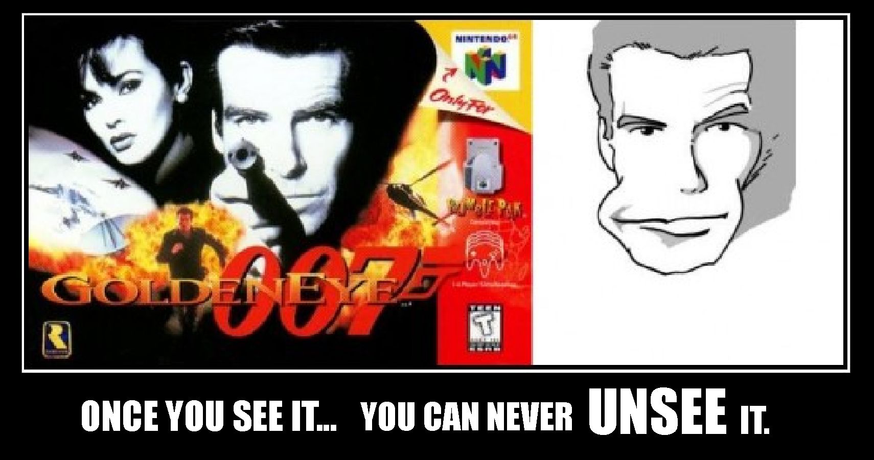
As the astute among you may have divined from our subtle references (not to mention the title and lead image on the article), this week we’re jumping platforms to the Nintendo 64 and Rareware's seminal console FPS GoldenEye 007. It's a classic that's never been rereleased thanks to a complicated cocktail of rights and licensing issues that will surely be shaken loose one day (these things usually are when there's money to be made). As well as being an incredibly influential game with a cracking local multiplayer component, the cover art is famous for something that once you see, you can never unsee.
Each of these covers shares some traits, but which one does it better? Which is stylish and suave enough to make it through the brawl and come out Onatopp? And which poor chap will follow the inimitable Sean Bean from the Cradle to the grave? Let's have a look at what tricks 007 has up his sleeve...
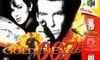
North America
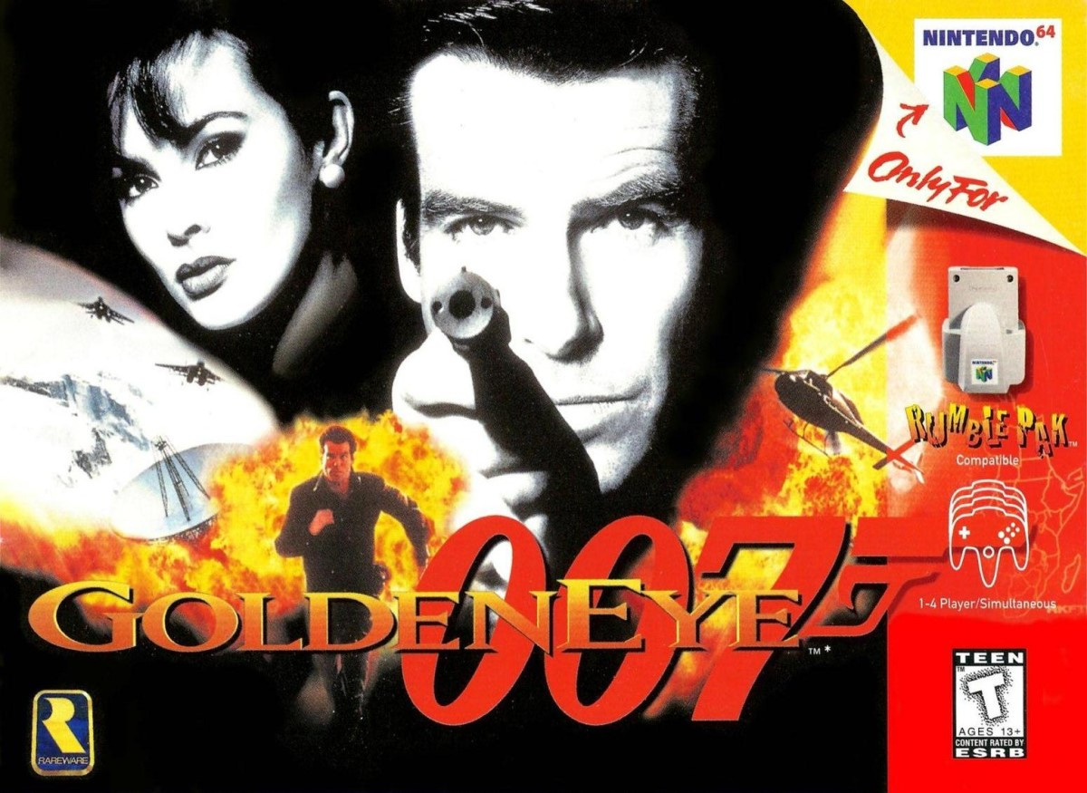
Combining classic black and white imagery of Bond and Natalya with yellow and orange explosions, fighter jets and a helicopter, it's got all the elements you want from Bond. The logo could arguably stand out a little better, especially where the red 007 gun barrel blends into the red strip on the right, but it's an effective cover and we've got a lot of affection for the way the top right corner folds down to reveal the N64 logo. The 'Rumble Pak' logo matches the colouring around it, although again it gets a little lost.
Perhaps a little on-the-nose, but this is a robust cocktail. It's big, it's brash, it's Bond.
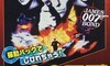
Japan
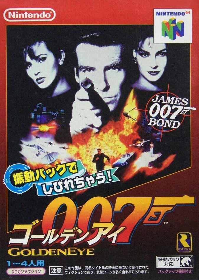
The Japanese cover uses the same basic ingredients but includes Xenia in the top right and an old-school '80s James Bond 007 logo with a crosshair just beneath her. The portrait orientation opens up the image and the logos and text shift to the bottom half while a red border gradually fading to black towards the bottom.
Certainly a more complex beverage than the previous - perhaps a little more traditional - but it still ignites the senses.
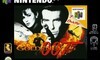
Europe
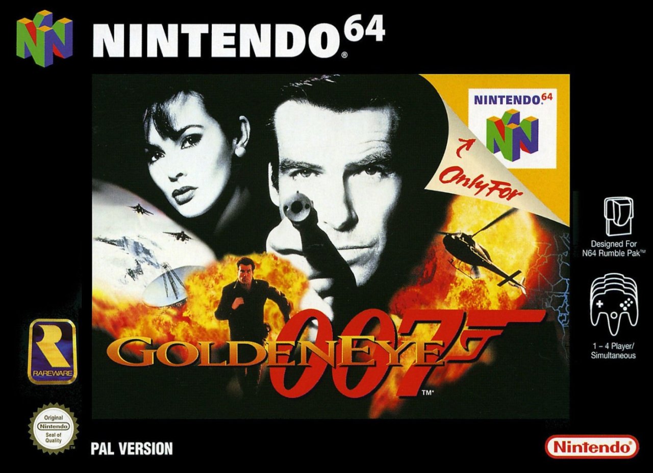
Using the same basic elements as the North American cover, the European variant has the classic black border common to nearly all Nintendo 64 games in the region with the peripheral logos and information pushed out to the sides. This frames the central image and makes the other elements like the Rareware logo stand out on their own.
Debonair with a hint of danger, not unlike a certain secret agent with a licence to kill. We forget the name...
That's your lot this week! An Oddjob it may be, but take a look below, click your pen three times as you click your favourite and shoot that 'Vote' button to let us know which version hits your target. The results will then be revealed for your eyes only:
That's all for this week - we’ve exhausted our clip of 007 references. Feel free to head down into the section below and let us know which Bond is your favourite.
Box Art Brawl will return.


Comments 55
Definitely NA for me. Japan's is a little too busy with all the text and Europe's is just NA's but worse.
Ooh. Much variation.
Honestly, it's not even worth debating this. The NA box is easily the best, and if I recall correctly, is virtually identical to the one that we got in Australia.
I love these features! I find myself looking forward to them on a Sunday. I hope that they continue for a while. I went with Europe for this one. Is a bit "cleaner" than the others.
NA for sure.
The PAL one is weird. Why shrink the pic and put a black border around it?
I clicked on the "once you see it, you can never unsee it" link and now I regret everything.
Oh I voted for Japan, the others are too logo heavy for my liking.
@StormtheFrontier Same.
None of them really - I just clicked the link and I hate that face - it looks so bad!
The only reason i'm voting for the Japan variation is because it looks like a movie poster. Which I think works well for this game specifically.
I prefer the black border of the PAL version than the red stripe of the American version.
In this case bigger is better the US by a land slide
these are all the same
Uncanny!
Come on guys, there are better examples of boxart to compare than this.
This is just one of the Goldeneye movie posters put on a video game box. Not much original about it.
I think North America is a no-brainer on this one.
I’m a sucker for that 007 logo on the Japanese cover.
US has the best composition, but man, I have to vote for the Japanese cover. It's the only one that doesn't make James look like some lovechild of Miss Moneypenny and Donkey Kong! Yeah, I know it's his hand, but it's not obscured in the Japanese version.
The European version doesn't have artwork cluttered with text. I think I'll go with that one.
That European box is lazy.
japan.
it has all the movie poster art on it.
eu and na are incomplete.
I like the Japan box, it looks like a thrilling movie poster! 😃
NA. Japan isn't bad either. But I don't understand Europe's cover. The border makes it look like they couldn't get a high enough resolution image for the cover art and made it smaller to compensate.
Box Art Brawls Current Total:
Europe: 3
Japan: 4
North America: 3
Not really a whole lot of difference between them in terms of the general design/artwork. I went with North America just because the Japanese one looks a bit too much like an advert in a magazine rather than a cover, and the EU one has the infamous N64 big black border (which was only ever on Nintendo-published titles for some reason. Third-party N64 games just had a nice simple black strip down the right-hand side. I never understood all that).
I’m biased towards the NA box art 😃
It’s the first time that Japan has the worst cover. I chose Europe’s that black frame really makes the art stand out.
This is going to be the closest brawl yet because the three covers are just different takes on the movie poster. Players will have an affinity for their region methinks...
You should have done Perfect Dark. Japan’s cover art for that game is completely different to the US/PAL versions and is amazing! These are all basically the same artwork.
I chose the EU one, it's all the same poster-pic, but the black looks nicer with it than bright red.
Going to be honest with you, NL. I really hate how you use the Brawl graphic for these pieces. It's kind of amateurish. Like a 10-year-old-using gimp for the first time amateurish.
If only the side bar on the North American box were black instead of red, the 007 logo and firey explosion effects wouldn't blend in so much and it would be perfect.
I have the Players Choice GOTY edition in my personal collection, and I think the gold side bar suits the cover a lot better than the red one. I mean, it is GOLDEN Eye, after all.
Are we really comparing the artwork here, or how the packaging was done for all games in different regions? Because it's the same artwork, but with a more vertical box in Japan, an "Only for N64" label in Europe and America, but with the latter adding the red stripe and louder Rumble Pak advertising.

Also, I can't unsee it!
It’s got to be the Japanese cover for me, it’s the only one that doesn’t crop out the lovely Famke Janssen. How can you have a GoldenEye cover without Xenia Onatopp?
My vote is for the Japanese cover. I love how it resembles a movie poster, including the 80's crosshair, and everything else.
Europe for me. I like the thick border because it's not so much in your face like the North American art, while the Japanese one is just the North American made tall.
Eh...not the most interesting set of box arts here. I picked Japanese because it has style, though I considered NA for a bit. The European one looks kinda amateurish to me; I'm definitely not a fan of the way that border is done.
Also, the apparent tradition of shuffling the regions around and showing a smidge of bias in the summaries continues. At least the bias is way less blatant this time around, making things more fair...but I suspect that has more to do with how similar the three are than anything else.
Just a bit of fun people, just a bit of fun
@Shiryu Thanks! I did not get the "you can never unsee it" line. Hilarious 😁
The NA box is a classic. The European version is the same thing essentially but it has a black border around it. The Japanese version has a bit more going on but it's also a bit too busy and not as clean looking.
@Shiryu Ha ha, never realized that.
@Shiryu True, I was looking them over and the Japanese version makes it really easy to see the definition in his hands so Bond doesn't look like a stroke victim. That and Xenia Onatopp doesn't have her face completely removed. There is a lot going on in the Japanese version, but I like the simplicity of NA box.
I don't particularly like any of these boxes, but I prefer Japan's. There's more of the artwork visible and I really don't like that peeling top-right corner on the other boxes. It's especially bad on the European box as it obscures more artwork than the NA version. Japan's seems least bad to me.
Wasn’t it remade for Wii?
North American cover, easily.
Why did all PAl games have that ugly border? Looks so out of place.
I've heard that Microsoft was going to have Goldeneye remade but Nintendo backed out because more people would play it on 360 than Wii.
@GravyThief Perfect Dark was a few weeks ago.
@ALinkttPresent It was a completely garbage remake where they changed everything, added douche bond, and tried to make it into a COD game.
"but includes Xenia in the top right " Ah, so that's the origin of her name Xenia Onatopp...right? Right?
I'm glad that Nintendo Australia saw that the US box was better and opted for that one. We usually get the EU design.
The North American version simply pops out to me more, though I might be a little biased since I don't personally believe that version could ever be topped.
Oh wow I actually really like Japan’s but didn’t vote for it due to A.) nostalgia and B.) I think that use of the retro 007 kind of makes things weird/confusing.
That logo was used a lot in the 90s for the soundtrack albums and all sorts of merch.
I love the unity and simple aesthetics of the European boxes. The other two scream epilepsy
'Murica (and Canada and Mexico)!
@Shiryu came here to post that. You cant unsee lol.
Still 100% on the series proper, although the worst box art "gaiden" did find me out of step. It was between two, and I spent forever trying to decide. When I finally pulled the lever, it was the other one that the majority had picked.....bollocks!
Oh well, still 100 on the main series.
There's a certain, I dunno, "tightness" to the NA box art, and a "bigness" as well that makes it all so much more dynamic. The JP one seems a bit more "cerebral", but a lot more "diffuse", and the EU one just seems like a zoomed-out NA with the N64 border logo not on the border, but seemingly just hanging out in space.
The European one as the black background border goes well with ol' Bond. The blue lettering artwork spoils the Japan one and the red background border doesn't do it for me with NA.
(A great game..loved the wii one especially)
Tap here to load 55 comments
Leave A Comment
Hold on there, you need to login to post a comment...