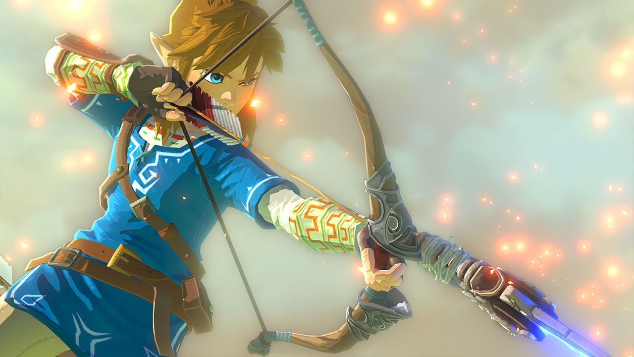
Changing the appearance of your hugely popular series mascot would be a pretty bold move for anyone, but that's exactly what the team behind The Legend of Zelda: Breath of the Wild did when the game arrived on Switch and Wii U last year. Gone are the days of the classic green get-up, replaced by a rather fetching blue number that even ditches that famous pointy hat.
So why was this change in design implemented? Was it necessary for the game in some way? Was it perhaps just to shake things up? Well, comments made by series producer Eiji Aonuma, lead artist Yoshiyuki Oyama, and art director Satoru Takizawa explain exactly that (the comments below have reportedly been translated from one of the game's recent art books).
Eiji Aonuma: “Link is the game’s protagonist, so I’ve always thought we need him to look cool. Yet, if we overdo it, the people playing the game might feel like they’re controlling an already accomplished hero, which I felt could get in the way of the players immersing themselves in the game. For that reason, this time I decided we should make Link a more neutral character in a variety of ways.
"We thought that the iconic green tunic and hat had become expected, so we wanted to mix things up and update his look. Interestingly, though, nobody on the team said, ‘Let’s make him blue!’ It just organically ended up that way.”
Satoru Takizawa: “Producer Aonuma-san declared that we would be revising expectations by updating Link for this game. He wanted Link to be a more neutral character that players could see themselves as. You can feel how energized and excited the artists were about this idea from the really interesting modern concepts they drew. There were close to one hundred designs presented within the team for Link, and the number of sketches was too great to count.”
Yoshiyuki Oyama: “The Link of this game was to be a traveler from the frontier who exudes a sense of adventure, which is why there are a lot of designs that feature capes and bags.
At the beginning of development we drew a lot of landscape concepts. Link wearing blue clothes appeared pretty early on because the blue stood out against the backgrounds we were producing.
As it turns out, then, it's a mixture of both. We certainly agree that the blue look managed to mix things up nicely, and the colouring does work tremendously well alongside the various locations in the game.
Do you feel that Link is a relatable character as the devs suggest? Do you like the new blue colour scheme, or would you pick Link's classic green attire given the choice? Tell us below.
[source nintendoeverything.com]


Comments 73
I feel like this was already explained
Okay, now if only someone can explain why Link has his BotW outfit in Smash while Zelda doesn't. Either the dress or the traveling gear would have been nice.
When can we stop hearing about this game?
I like both the actual design and the reasons behind it
@Dualmask Sakurai said that's because BotW Zelda doesn't have any actual skill, she's unexperienced in combat as well as magic. Kinda makes sense imo.
101 Linkmatians
@Crono1973 no, the game's too good!
I wish there was a few LINKS to some of these sketches so I could see them!
I'll see myself out.
@Crono1973 When the next one comes out.
@Natzore huh. I'm surprised there actually is an explanation... albeit a flimsy one.
@Dualmask It's interesting, I kinda said the same thing. The Zelda from A Link Between Worlds is featured while Link from BotW is featured lol. Options would've been nice at least
@Crono1973
When the next is announced.
@Crono1973 when they bring out the next one?
@Natzore Close - they don't use BotW Zelda in Smash becuz she's a reluctant magic user and more of a scientist.
"He wanted Link to be a more neutral character that players could see themselves as."
Having a female Link as an option would help there.
If one color was very hard to be chosen, why didn't put all the color to make like a rainbow ?
Oh, wait. It will be a Rainbow Link. 😆
I think it was a nice change overall. It pointed to Link being a Royal Knight and having an official position in the court. Just like I appreciate how the Soldier's Shield, Bow and Sword are the one's featured in the artwork.
I feel like it is a nice change to the expected grab the sword and magically get these green clothes because "Tradition", or convoluted story plot point to explain why Link dresses so differently than everyone else.
@Majora101 exactly... Zelda is my main too and remains so in Ultimate, but I really can't stand her look. And you're right, no Zelda incarnation stacks up to her BotW version as far as combat goes. Fighting for a whole century... But she's not really a combatant? Whatever you say...
@Darknyht Agreed. I really enjoyed the BotW Link being more ingrained in Royal Family than just a random kid from a village or a baby dropped in the woods
Eh. I bought a Link amiibo just so I wouldn’t have to play as genderfluid ponytail Link. Should’ve stuck with what works.
@Dualmask Interesting - I actually really like the Link Between Worlds design. Still though, I would like to see more options for different skins across the board - similar to how the Bowser Jr. has each of the Koopa Kids available. It would be great to see more of that, especially for the iconic characters like Zelda.
They were too worried if Zelda BOTW was included everyone would be remaking the booty shot.
didn't link have a blue tunic in the A Link To The Past end game?
@Dualmask
I've gotta disagree, absolutely love the Link Between Worlds Zelda design and I think it's cool that all of the Zelda characters have designs from a few different games (BotW Adult Link, OoT Ganondorf/Shiek Majora's Mask Young Link, Toon Link, and ALBW Zelda). It pays tribute to the series as a whole and seeing as Zelda is my favorite game series of all time, I love that.
Like Bobb, Subpopz and Darknyht, I really like the BotW Link. Blue and no hat all the way, this is now my preferred design. (And unlike some, I also enjoyed the new Zelda, even though the old versions of her are good as well.)
I bet Mario will be red and blue in his next game without that team wanting to mix things up.
@Bass_X0
I don't really think that's a problem. Mario is the mascot and face of Nintendo, like Mickey Mouse is to Disney. I was surprised enough that we even got a bunch of alternate costumes in Odyssey, but his original costume will most likely always be his default. Zelda is a huge franchise for Nintendo too, but not as much and for most of the games they each have a different iteration of Link, whereas Mario has been the same dude since the beginning.
@Crono1973 Probably never, unfortunately. Children and manchildren think in binary, not nuance. So if Kirby is anything to go by, expect every Zelda game in the foreseeable future to feel like a Bethesda game.
I don't care much for Link's default outfit in BOTW myself but some of the equipment you get in the game is pretty rad. I do always like when equpable armour actually shows up in your character.
@KingBowser86
Kirby feels like a Bethesda game? 🤔
@Crono1973 when something surpasses it.
So... in 20 years.
@Dualmask In the E3 2018 Direct, Sakurai said that the incarnation of Zelda in BotW preferred research over fighting, so they went with the A Link Between World's Zelda.
@Dualmask They did in the inital e3 presentation: "In [Breath of the Wild], Zelda is more into research than fighting, so her design is from [A Link Between Worlds]".
Slow news day?
@Crono1973 when it stops being so amazing. Sooo never.
Blue is my favorite color. I have no complaints.
@Spiders question was answered, thanks. I tend to avoid any pre-release trailers or presentations.
I don't believe it was a satisfactory answer personally, but it's their game.
@Dualmask The Smash games spent two games in a row mainly representing Twilight Princess, so I'm guessing for Ultimate they wanted a chance for one of every fan-favorite Zelda game to shine, in addition to the latest one.
BotW for Link
WW for Toon Link
ALttP for Zelda
OoT/MM for Ganondorf and Young Link
Strangely enough, Sheik is the only one who still represents TP even though she never appeared in that game (though her Sheikah Armor is based on BotW). I wasn't the biggest fan of the change, but after some thought I started to appreciate it. Especially because Zelda is sooo cute!
@MrBlacky Har har. Though if they made a For Kids 2D platformer, that might be accurate!
I've never had an issue relating to Link. While the blue was alright, I really would have preferred the iconic green. Fine with losing the cap.
@Dualmask Yeah, I usually take the "official" answer to these things with a huuuge grain of salt.
The whole "relating to" thing seems weird to me; never found Link unrelatable. While the blue was alright, I really would have preferred the iconic green.
Green tunic and cap is Link's iconic look. There is nothing wrong with equipping different armors or outfits but there's no getting around his iconic look.
And the Tunic of the wild doesn't cut it. It's not an upgraded look from Link's tunics in Twilight Princess or Hyrule Warriors. I hope LInk returns to that in the next Zelda.
It's long overdue that you get to choose a female or male Link. If they really want you to be able to see yourself as the character, why not let you choose 'Linkle'?
The obvious real answer as to why they made Zelda's design be that of ALBW is of course that they need to sell more amiibos. There's already one based on her BOTW getup afterall.
@Crono1973 When you stop clicking on links about it.
The blue tunic thing is interesting as it is essentially an inverse of why Luke's lightsaber in RotJ was green — so it would stand out during the blue sky background (and not be screwed up by the bluescreen tech) during the Jabba's sail barge/Sarlaac Pit scene.
I now want to see all the presented designs for the outfits.
@KingBowser86 Yeah, even if you like the game you have to get tired of hearing about it. I remember people never shut up about Dark Souls or Skyrim either, so tiring.
@Nego I'll buy ALBW Zelda and OoT Ganondorf in a heartbeat (although Grampadorf is fine). TP Link stays, though, flaws and all.
Hmm. I'm surprised that it was such a haphazard decision by the artists. I had always thought that the choice of that sky blue color was to keep Link inline with the game's visual language of color whereby orange means "incomplete" and blue means "done." Link gets the tunic after baking for 100 years and then remebering (or being told) his responsibility so he becomes, in effect, done and ready to go fight Calamity.
@The_Mysteron look man. Link should simply just stay male. Thanks.
Might as well make Samus a man while you are at it.
@Crono1973 It’s GoaT, so never
@Natzore Her magic was strong enough to keep in a stasis immortal state while also keeping Calamity Ganon trapped. That’s got to take very powerful magic and willpower
@mazzel And the original Legend of Zelda, if you didn’t get the Red Ring. It’s more of a periwinkle color though.
@Antraxx777 It’s GoaT
When you read abbreviations do you read the full words in your head? In this case did you intentionally write: 'It's Greatest of all Time'?
@Turbo857 You can get the Hero’s clothes in BotW, so it’s not like he ditched it for his new blue shirt. It’s awesome having a choice now
@Lizuka You mean Champions Tunic. Hero’s tunic is the original, classic look.
@Crono1973 Yup
@MeloMan Technically, there are other options for Link in "Super Smash Bros. Ultimate." You can choose "Breath of the Wild" Link, "Majora's Mask" Link (plus half of "Ocarina of Time"), or "Wind Waker" Link (plus a few other games).
@Antraxx777 You left out the word 'the'.
@KingBowser86
Oh definitely. I'm collecting all the LoZ related amiibos so if they'll actually make new amiibos based on the Smash Bros. Ultimate outfits, I'll be getting them as well.
My only beef with that is that the Champion's Tunic is clearly the best outfit in the game, but Hylian pants aren't. Also that there's isn't any headwear designed to go with it (though some art shows him in Hylian Hood). I went with Amber Earrings for it to look the most "official" without losing on protection.
Also the "of the Wild" green outfit looks rather bad, especially after one uses an amiibo to get a classic outfit to compare. I still beat the Hyrule Castle wearing it, because you gotta have the green hat
It makes me wonder if, going forward, Link is going to get more clothes based on his BotW look, a return to the green outfit or maybe the designers will allow themselves to experiment more with him (maybe give him leather armour or some half-plate similar to what Goblin Slayer is wearing, expand on weapons other than one handed swords etc).
@CrazyMetroid "look man. Link should simply just stay male. Thanks.
Might as well make Samus a man while you are at it."
The developers of BOTW have said they want you to be able to see yourself as the character. The developers of Metroid have said no such thing. My daughters are much more inclined to play a game if you can choose a female character because it makes them feel like they are in the game. It's not just thirty-something males who play video games.
@The_Mysteron I just don't see why we should change an established character. I rather have a new character/protagonist than changing an existing one.
Well it wouldn't change your experience of the game at all if they had an option for male or female at the start when you are picking your character's name. From that point on the game would remain exactly the same, and Link would be as you've always imagined him. They wouldn't be changing an established character (who has never spoken a word of proper dialogue in 30 years I might add) they would be creating a new one, just like you have suggested. Is the world of Zelda too small to have an optional female protagonist?
@The_Mysteron You make it sound as simple as a character model swap, but it isn't. Every encounter would need dialogue to support it, and a gender swap would mean interactions with Link would need to be adjusted as there are implied emotions with it. Then you might as well do four dialogues and interactions because then you need to support other viewpoints. The road is slippery and fraught with leaving out someone else (why doesn't like have my skin color, or my hair color, etc).
At the end of the day, you can see yourself in a game without having to literally see yourself. You can choose to act in line with your personality in the avatar regardless of the cosmetic.
@Lizuka
Ah, you mean the Champion's Tunic. Not a fan of it either. It never grew on me (though Botw is awesome). Looks a lot like a Link's first starting outfit before he gets the real tunic
@Antraxx777
Tunic of the Wild though is not a great design (he's wearing shorts with no gloves, arm guards or chain mail). It's more of a modern throwback to Link's first tunic in the Legend of Zelda.
If it was an upgraded/evolution of the designs of Link's Hyrule Warriors or Twilight Princess tunic, then I'd say... "it's awesome having a choice".
It's awesome that you can swap armors, but let's please see an "upgraded/updated" design of the iconic green tunic.
@Darknyht I'm not suggesting it's as simple as a character model swap, but I also think it's a lot less work than you are proposing. To have more than one optional player character in a game like Zelda - where there is little-to-no voice acting - is not beyond a developer as talented and well resourced as Nintendo. Even in BOTW there is very little spoken dialogue outside of the cutscenes. Two hours in the entire game, tops. Zelda is the ideal game for attempting something like this, because Link is such an empty vessel, and because there are so many female Zelda fans. Do you think a game like Mass Effect with it's branching story, and both male and female, fully voiced player characters was not a much more difficult task than what I, and others are proposing? If Overwatch's Tracer and Ellie from The Last Of Us have proven anything, it is that there is an acceptance and an appetite for more diverse representation in gaming, beyond muscle-bound white men and scantily-clad buxom women. I'm not saying we should completely throw out Link, but would it hurt anyone to give female players the option of having an avatar which more accurately represents them? If the developers of BOTW really wanted "a more neutral character that players could see themselves as" then why shouldn't there be a female Link? I've been playing Zelda since I was 8 years old (30 years ago! Holy moly!) and it wouldn't upset me in the slightest if there was a female Link option in there. It literally wouldn't change the game for me, but it would be huge for others.
@Dualmask FWIW she plays really well, and is a strong character.
@The_Mysteron I am all for more diverse characters in games, but let them be original characters (and why target Link who is about as androgynous as male protagonists come). Why is it so important that an already established character be retooled just because he is silent? Do you feel the same way about Chell needing a male version for Portal since she is also a silent protagonist with no personality?
Instead of trying to change something established wouldn't it be better to support the many great female protagonists out there. Show companies that characters like Samus, Bayonetta, Lara Croft, Tracer (Overwatch), Jill Valentine (RE), Aya Brea (Parasite Eve), Faith (Mirror's Edge), Lightening (FF), Jade (BG&E), Chell (Portal), April Ryan (Longest Journey), and many others have just as much value. Especially the ones that portray women well (and not just as sex objects), because some of these characters were mistreated over the years.
I would rather of seen a Zelda DLC where you took the role of Zelda, using your newly discovered magic and mad technology skills to challenge Ganon, or a story after the fact of her rescuing a Link in peril (again, using technology and magic instead of swords and bows).
@Darknyht Is there not room for both of these things? I really don't see how adding a female avatar to a game diminishes anyone's enjoyment of said game. I've been playing Zelda for almost 30 years now and it wouldn't change the game for me in the slightest if there was an option to choose a female Link. I literally can't see a valid reason not to do it.
Tap here to load 73 comments
Leave A Comment
Hold on there, you need to login to post a comment...