Nintendo of Europe operates independently of Nintendo of America, with the two regions often taking rather different approaches to messaging and online media. For its part NoE has now rolled out a new design on its multiple websites in the region, and it seems like a definite step forward.
Whether you visit Nintendo.co.uk, Nintendo.de or another European variation, the new layout introduces clearer categories on the left, tiles in the middle and Latest News articles on the right. It naturally scales down on smart devices - on our smartphone it defaults to Latest News with menu options expanded by a button at the top.
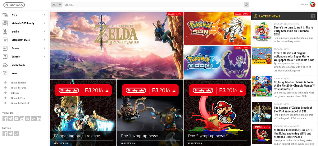
We'd suggest it's a solid update on the old design, which should also allow it to focus on recent and new games and be more dynamic than the old layout. Some sub-pages don't quite do what we'd expect, it must be said, with 'Nintendo eShop' opening a relatively bland page of articles; we still yearn for a dedicated web-based eShop, as opposed to the current system in Europe of searching for a specific game page and making a purchase there.
That quibble aside it seems to be an upgrade for the official regional websites in Europe. Tied in with My Nintendo and web-based eShop purchases in particular, in recent months we've seen notable improvements in Nintendo's online presence.
What do you think of Nintendo of Europe's new website design?


Comments 18
When will Nintendo learn? The eShop needs to be prominent! It's a mess at the minute and until only a few months ago, didn't even exist...
The US website is much better.
Do they deliver to Ireland though?
Erm, the site has been like this since yesterday
Or do they deliver to Finland?
(We get absolutely zilch here... lol)
It's about time. The last website was woeful.
Is it just me or did Nintendo of Europe desigin their websites to be very similar to the layout that has been used by the official Japanese website since March 2016?
Saw it yesterday, overall is a great new design, but it totally killed my habits. Used to check on it daily on the news section, but now is slightly harder to read, is it really the future to have news in "Tiles"? At least here on NL there is still a list option for list-freaks like me.
On the bright sight however there is a shining tab for the new games, having a quick look at upcoming eShop games never been easier!
They redesigned the home page (about time), but the whole thing is still messy.
Looks better, its a bit glitchy though. Now they just need a dedicated Eshop area on the site and it'll be much better.
I wonder if Reggie will take a cue from this and revamp the NOA website, or if he's content to let it continue being a pile of garbage like everything else he touches.
I wonder if @James had a role in this?
Don't like; It's just wall of random links initially, and then it goes to a kinda fugly design beyond that. It feels a bit all over the place. And the filter next to the search bar doesn't seem to do anything. If I'm using it wrong then that's because it's clearly not designed well enough that I know what to actually do. Also the navigation bar shown on the left in your image is hidden behind a dropdown menu button on my computer, which just adds an extra needless step.
Edit: The navigation bar was hidden behind the button because my screen was displaying at 150%, but that's only because I'm half blind and need all the text on websites to be zoomed up so I can read it without getting eye strain.
@Tasuki I moved from the online team to PR in September
only the home page has been redesigned which is weird :/ would have been nice to have the whole thing given a makeover
So basically it kind of looks like the Japanese site now. Finally. Some consistency you know. It has been bugging me for ages that all sites of Nintendo outside of JP look like shiiiet.
And the styling still looks like shiiiet because they hire shiiietty webdesigners.
Definitely a big step forward! Their old website was awkwardly dated and unintuitive to navigate.
@James Oh, well then congratulations!!!
Ofcourse the Scandinavian sites are ommited and still crap as usual. /facepalm
And still no Miitomo available either, so MyNintendo is still useless for us, as we can never reach any of the rewards.
Tap here to load 18 comments
Leave A Comment
Hold on there, you need to login to post a comment...